This solution allows a solutions admin to create and configure web projects for an organisation. Web Projects is a set of tools and builders to configure how the Zinier web platform will look and work for a web-user.
Web Projects consist of the following modules:
|
Module |
Description |
|---|---|
|
Applications |
First level navigation a web-user sees on the Zinier web platform (for eg, ‘Scheduling and Dispatch’ is an application) |
|
Modules |
Second level navigation a web-user sees on the Zinier web platform (for eg, ‘Technicians' is a module under ‘Workforce’ application) |
|
Pages |
The pages a web-user sees on the Zinier web platform. A module can have many pages. Pages can be defined into main pages or side panels. Solutions Admin can stimulate and test Pages that they build using the Page Editor |
|
Widgets |
Widgets are visualisations that are configured for a web-user to see on the Zinier web platform. They can appear on main page or side panels. |
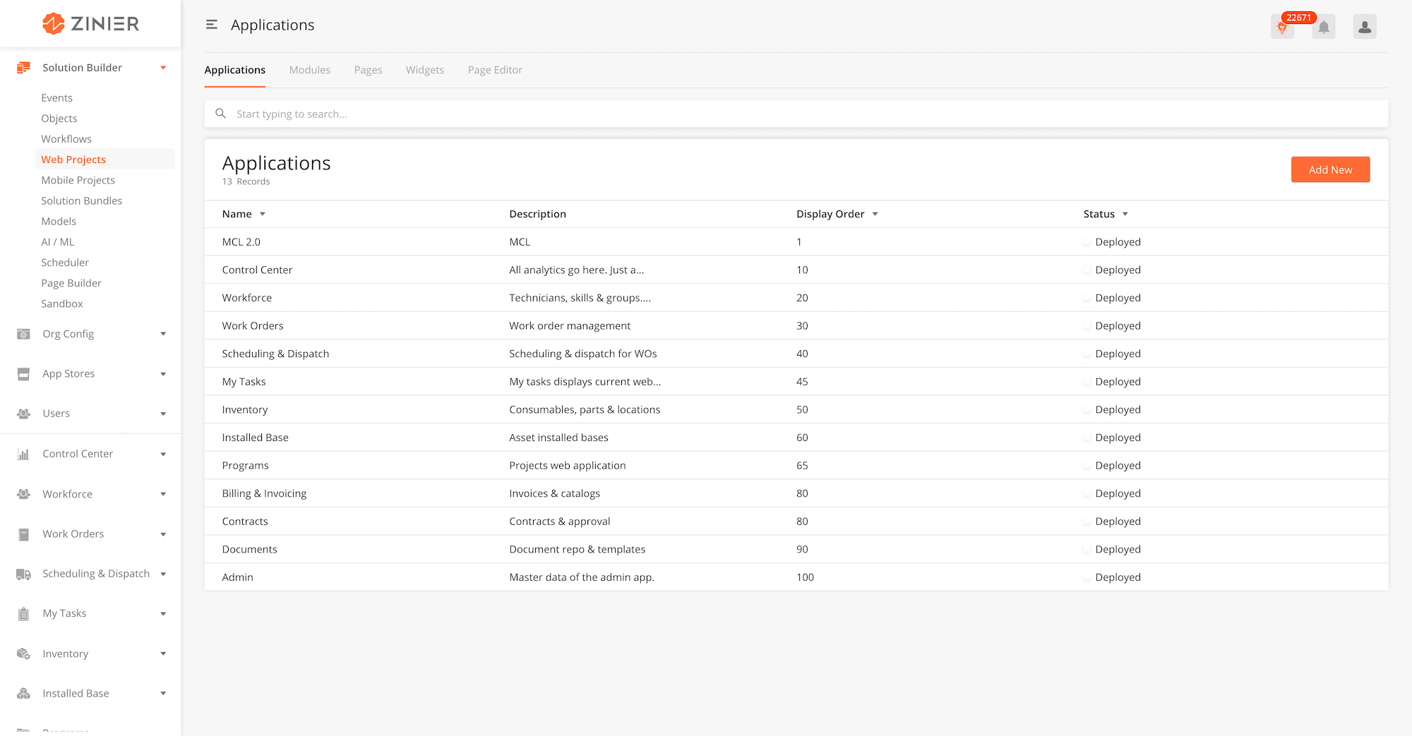
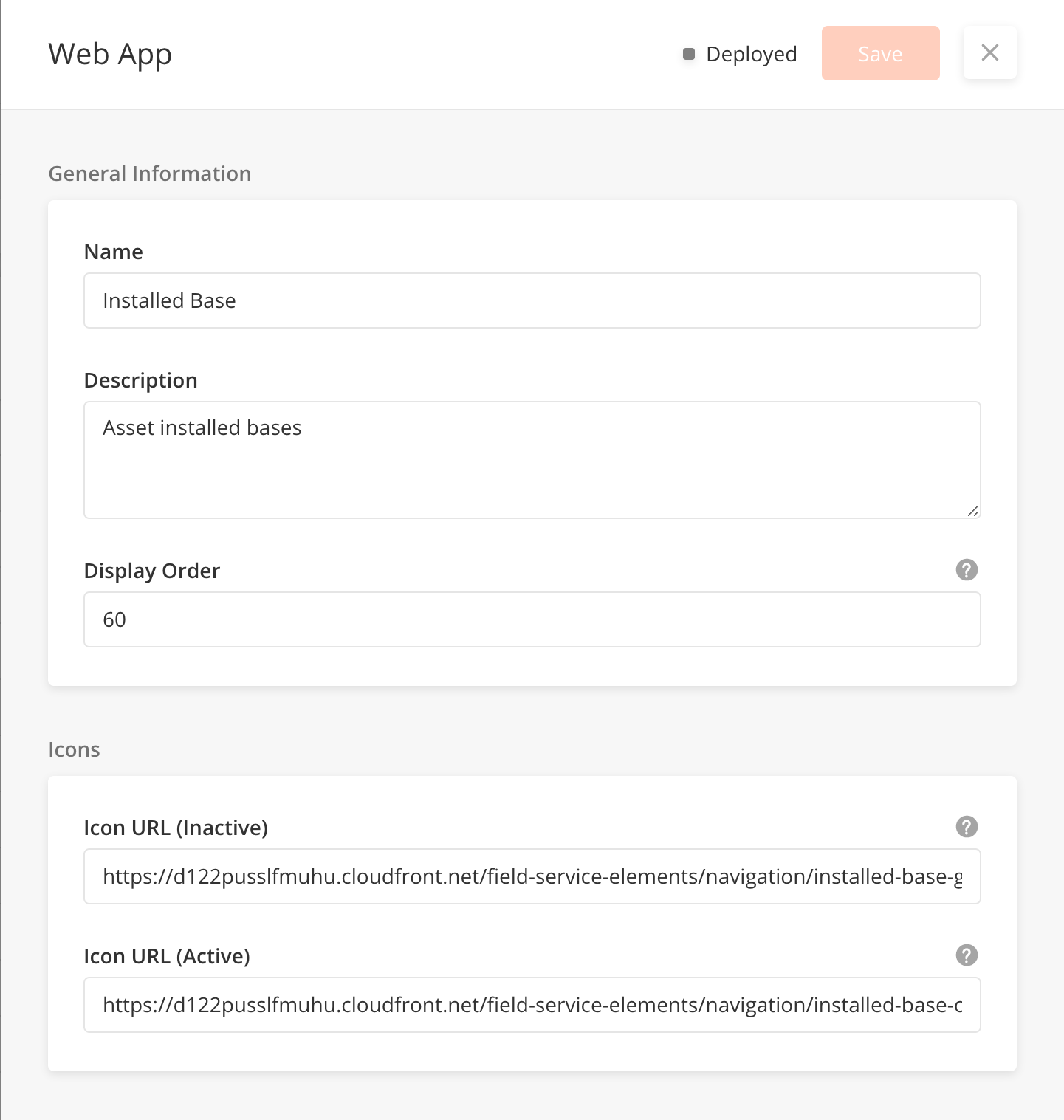
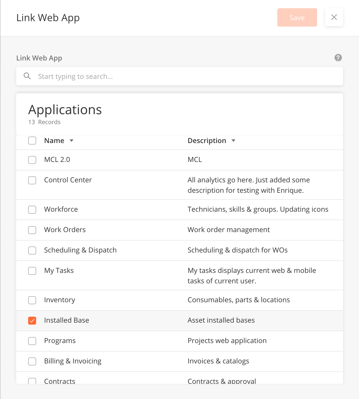
Applications are the first level navigation a web-user will see in the Zinier web platform. As part of the solution builder, this module allows a solutions admin to create, edit 'Applications' on the Zinier platform for web users as part of solutioning. Web Applications are made up of modules and pages. Solutions Admin can also assign user groups to each Application.
|
Module |
Description |
|---|---|
|
Add Web Apps into a solution bundle |
|
|
Assign Groups to web applications |
-
From the main page, click Add New to open the side panel.
-
Enter General Information of the Web App.
-
Enter Icons of the Web App. These are the icons that will appear on the left navigation of the Zinier platform.
-
Click Save to save the web app. Once a new web app is saved, it will be in Draft state by default.
-
Click Publish to publish the web app or close the sidepanel to remain in Draft status.
-
In Published state, click Deploy to deploy the workflow in the organisation. Once deployed, the web app will be active.
-
Close the sidepanel
-
To edit, hover over a record and click on the edit icon, to open the sidepanel.
-
You cannot delete web apps.
-
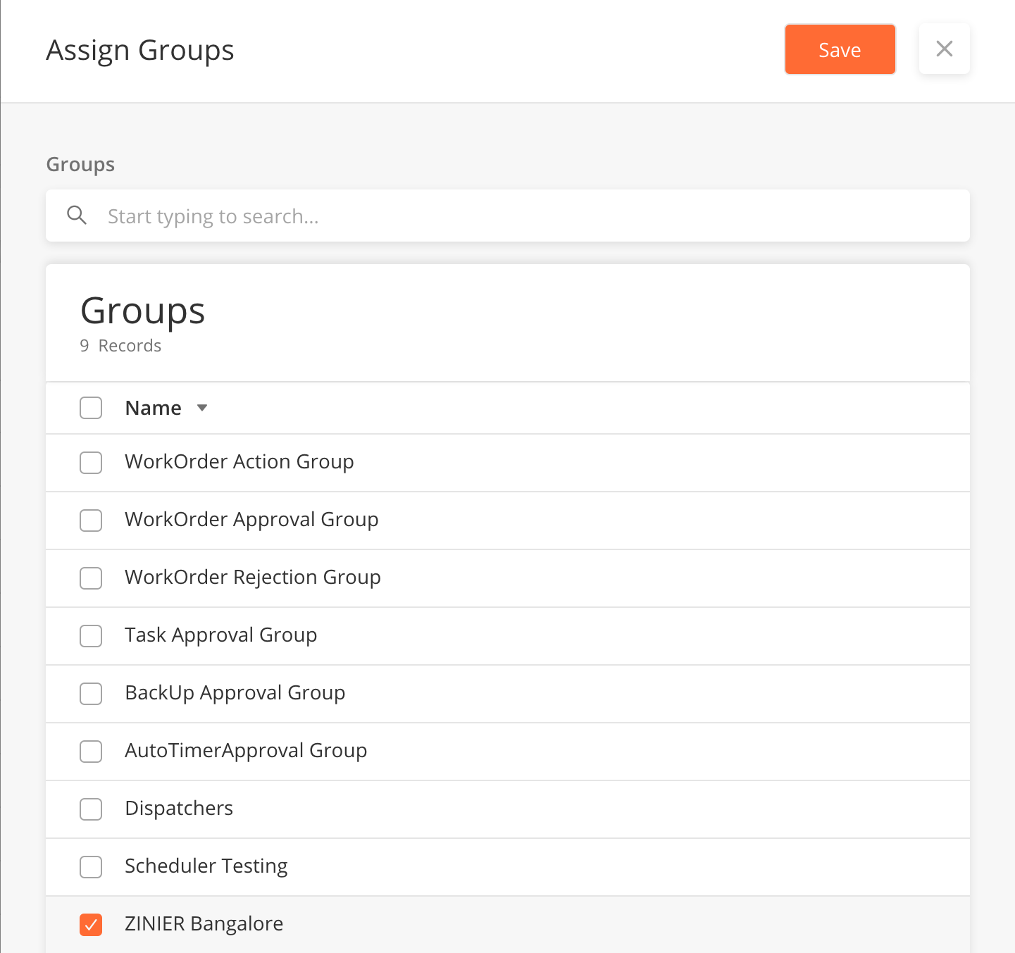
Hover over a record, and click on the
Assign Groupicon to open the side panel. -
Select the Groups which will have access to the web app. Groups are configured under Users > Groups.
-
Click Save to close the sidepanel
When Add New or Editing an application;
|
Field Name |
Description |
Example |
|---|---|---|
|
Name |
Name of web application |
Workforce |
|
Description |
What does the web application do? |
Workforce manages technicians and their corresponding skill sets |
|
Display Order |
The order (First (1) to Last) the web application appear in the main navigation |
10 |
|
Icons (Active) |
The URL of the icon for the web application when it is being clicked on in the main navigation |
https://d122pusslfmuhu.cloudfront.net/field-service-elements/navigation/workforce-grey.svg |
|
Icons (Inactive) |
The URL of the icon for the web application when it is not being clicked on in the main navigation |
https://d122pusslfmuhu.cloudfront.net/field-service-elements/navigation/workforce-orange.svg |
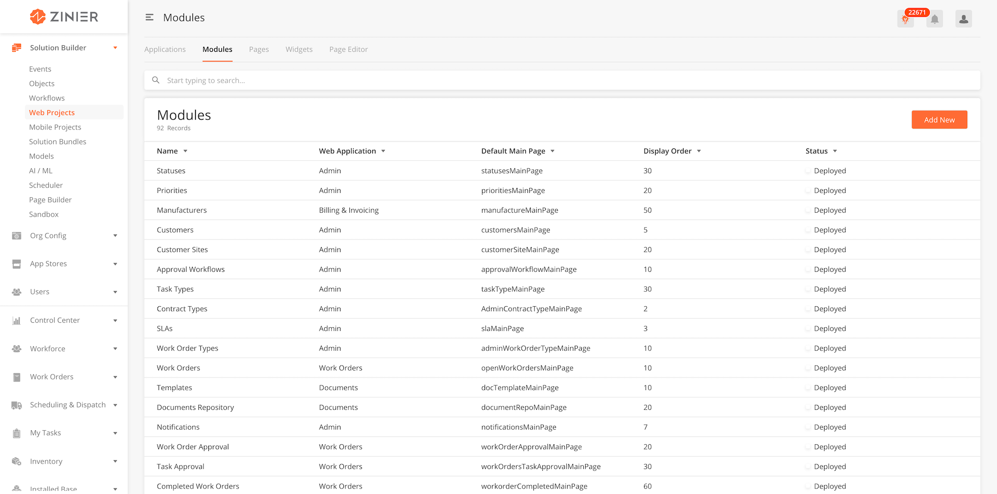
Modules are the second level navigation a web-user will see in the Zinier web platform. As part of the solution builder, solutions admin can create, edit and deploy 'Modules' on Zinier web platform. An example of a module is ‘Technicians' is a module under ‘Workforce’ application in FSE.
|
Module |
Description |
|---|---|
|
Tag module to a web application in the side panel of Modules |
-
From the main page, click Add New to open the side panel. To edit, hover over a record and click on the edit icon, to open the side panel.
-
Enter General Information of the Web App Module. It is important to select which web application the module is nested under within this section.
-
Enter Web module configuration section. More details on these fields are found below.
-
Click Save to save the web app. Once a new web app is saved, it will be in Draft state by default.
-
Click Publish to publish the web app or close the sidepanel to remain in Draft status.
-
In Published state, click Deploy to deploy the workflow in the organisation. Once deployed, the web app will be active.
-
Close the side panel
-
To edit, hover over a record and click on the edit icon, to open the side panel.
-
You cannot delete Modules
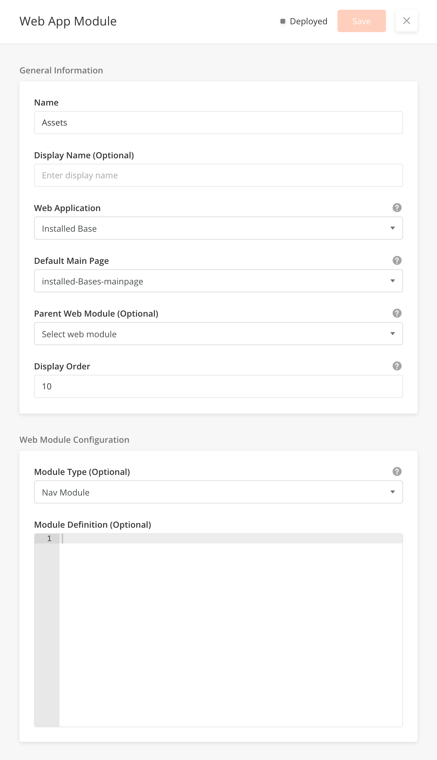
When adding new or editing Modules;
|
Field Name |
Description |
Example |
|---|---|---|
|
Name |
Name of Module |
Technicians |
|
Display Name |
Technicians |
|
|
Web App |
Parent Web App for Module |
Workforce |
|
Default Main Page |
Set default web page for Module |
Technicians |
|
Parent WebModule(Optional) |
Parent Web App Module. Select only for nested Web App Module |
|
|
Display Order |
Display Order for Module under Parent Web App |
10 |
|
Module Type(Optional) |
Module Layout Type |
Nav Module |
|
Module Definition(Optional) |
Pages are what the web-user mainly interacts within in the Zinier Platform. As part of the solution builder, this module allows a solutions admin to create, edit and delete web pages. After creating pages, the solutions admin can also link a page to a Web Application which they have created under 'Applications'.
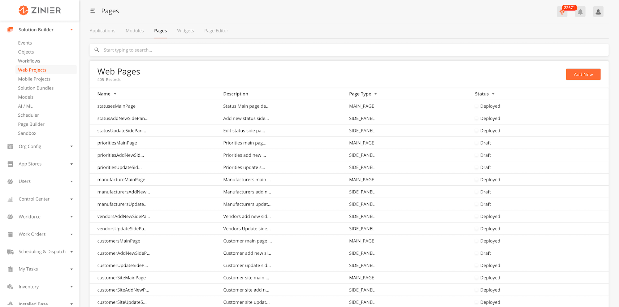
|
Module |
Description |
|---|---|
|
Link page to one or more web applications |
-
From the main page, click Add New to open the side panel.
-
Enter General Information section of the Web Page.
-
Enter the Web Page configuration section, which includes the JSON object which contains the entire web page
-
Click Save to save the web page. Once a new page is saved, it will be in Draft state by default.
-
Click Publish to publish the workflow or close the sidepanel to remain in Draft status.
-
In Published state, click Deploy to deploy the workflow in the organisation. Once deployed, the workflow will be active.
-
You can edit a record by hovering over the row of the desired record from the main page table and clicking the Edit icon. When you click Edit, the side panel will appear. Editing any page in Published or Deployed state will revert the workflow to Draft status.
-
You cannot delete web pages.
-
You can link a web page to a web application by hovering over the row of the desired record from the main page table and clicking the Link Web Applications icon. When you click Link Web Applications, the side panel will appear.
-
Select the Web Application where the Web Page will appear.
-
Click Save to close the side panel.
-
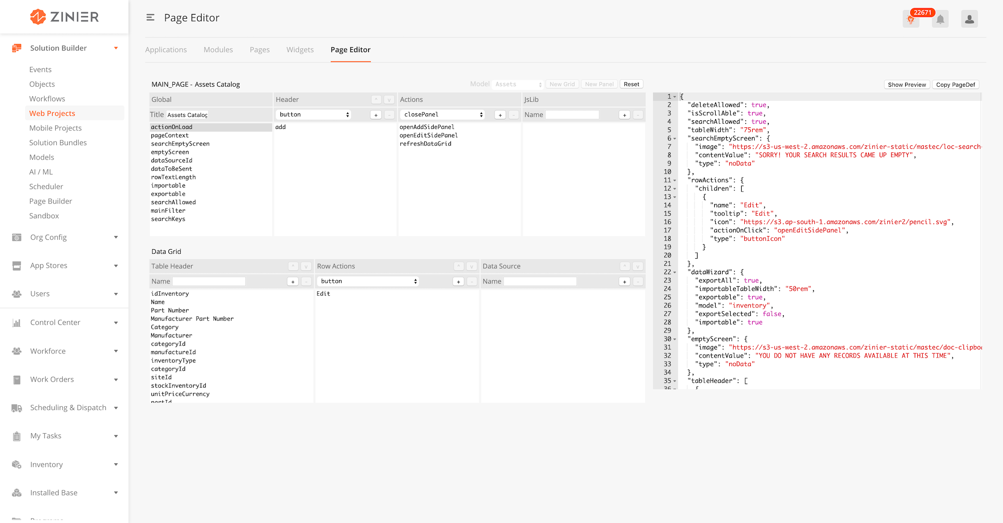
To use the Page Editor, open a web page sidepanel by clicking the Edit icon on hover of a specific record. On the Web Page sidepanel, click on Page Editor. This will redirect you to Page Editor with existing web page JSON input. Users can also enter the Page Editor directly by clicking on Web Projects > Page Editor
-
Edit the Web Page by editing the JSON page definition
-
You can choose the Model underlying the Web Page.
-
You can add or delete components,actions, JsLibs and Data Source used in the page def from the panels on the right side of the Page Editor.
-
Click on 'Reset' to reset to an empty page. You cannot undo this action.
-
Click on Show Preview to view how the current page looks like.
-
Click on Copy PageDef to copy the existing page definition. You must manually copy over the edited page definition into the Web Page side panel, in order to lock down the edits done on the Page Editor.
|
Field Name |
Description |
Example |
|---|---|---|
|
Name |
Name of web page |
statusesMainPage |
|
Description (Optional) |
Description of the web page - what will the page be used for? |
Status Main page details. |
|
Page Type |
Configure if the page is a main page or a side panel |
Main page |
|
Page Definition |
This is a JSON field used to build the actual page. |
{
  "pageContext": {},
  "actionOnLoad": [
    "@actions.initialData",
    "@actions.modelQuery"
  ],
  "jslib": {
    "isSaveDisable": "function(pageContext) {return ( typeof (pageContext !== undefined) && (pageContext.name === '') || (pageContext.targetModel === '' ) || (pageContext.colorCode === ''))}"
  },
  "header": {
    "children": [
      {
        "buttonType": "primary",
        "actionOnClick": [
          "@actions.onSubmit",
          "@actions.closePanel1",
          "@actions.clearPageContext",
          "@actions.refreshDataGrid1"
        ],
        "disabled": "@jslib.isSaveDisable",
        "id": "submit",
        "type": "button",
        "title": "Save"
      },
      {
        "icon": "@iconlib.Close",
        "actionOnClick": [
          "@actions.closePanel1",
          "@actions.clearPageContext"
        ],
        "id": "close",
        "type": "buttonIcon"
      }
    ],
    "title": "Add New"
  },
  "body": {
    "children": [
      {
        "children": [
          {
            "isRequired": true,
            "id": "enterName",
            "label": "Name",
            "placeholder": "Enter name",
            "type": "input",
            "value": "@pageContext.name",
            "hoverText": {
              "title": "Specifies the Status of the Workflow."
            }
          },
          {
            "isRequired": true,
            "actionOnChange": "@actions.modelQuery",
            "options": "@pageContext.modelList",
            "id": "targetModel",
            "optTitleKey": "name",
            "optValueKey": "name",
            "title": "Target Model",
            "type": "select",
            "value": "@pageContext.targetModel",
            "placeHolder": "Select model",
            "hoverText": {
              "title": "Target Model determines the Product of Field Service Elements to be associated with the Status."
            }
          },
          {
            "isRequired": true,
            "id": "color",
            "label": "Color",
            "placeholder": "Pick color",
            "type": "colorPicker",
            "value": "@pageContext.colorCode",
            "hoverText": {
              "title": "Sets the Color to be associated with the specific Status in the Field Service Element Modules."
            }
          }
        ],
        "label": "General Information",
        "id": "statusesSection",
        "type": "section"
      }
    ]
  },
  "actions": [
    {
      "name": "initialData",
      "type": "script",
      "actionDef": "function(pageContext){ if(typeof pageContext !== undefined){ pageContext.name = ''; pageContext.targetModel = ''; pageContext.colorCode = '';}}"
    },
    {
      "endPoint": "admin/zStatus/insert",
      "alertMessage": true,
      "name": "onSubmit",
      "type": "api",
      "actionDef": {
        "data": [
          {
            "targetModel": "@pageContext.targetModel",
            "name": "@pageContext.name",
            "colorCode": "@pageContext.colorCode",
            "status": "@pageContext.name"
          }
        ]
      }
    },
    {
      "name": "modelQuery",
      "outputVarMap": {
        "data": "@pageContext.modelList"
      },
      "type": "query",
      "actionDef": {
        "models": [
          "ModelHeader"
        ],
        "columns": {
          "name": "ModelHeader.name"
        },
        "orderBy": "name DESC"
      }
    },
    {
      "name": "closeModal1",
      "type": "closeModal"
    },
    {
      "name": "clearPageContext",
      "type": "clearPageContext"
    },
    {
      "name": "closePanel1",
      "type": "closePanel"
    },
    {
      "name": "refreshDataGrid1",
      "type": "refreshDataGrid"
    }
  ]
}
|
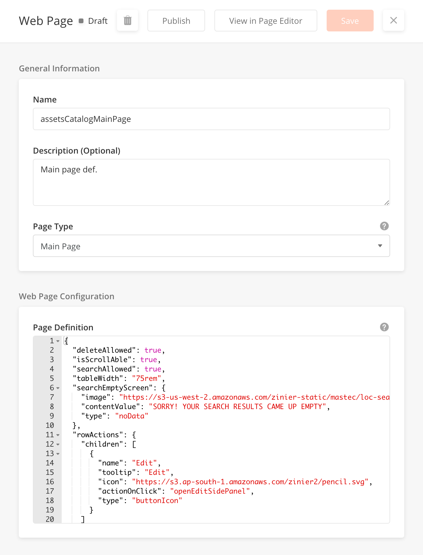
Overview
A main page is a default landing page of a module. Main pages can contain a table and/or dashboard widgets. Most of the time, main pages will contain one table. Solutions Admin can configure main pages according to what the client wants to see within the table.
There are a few configurations which need to be taken into consideration when building a main page with a table. These details are outlined below;
|
Table configurations |
Description |
|---|---|
|
Table Header |
Configure the table name |
|
Import/Export function |
Configure if user can import or export table data |
|
Table Filters |
Configure if user can filter table according to the the Table Filters functionality |
|
Default Table Order |
Configure the order of columns within the table |
|
Searchable Fields |
Configure which fields can be searchable by the user |
|
Table Searchable Fields |
Configure which fields within the table can be searchable by the user |
|
Row Actions |
Configure what are the row actions and icons that should appear on each row on the table. For example, Edit, Duplicate, Delete |
Note : the above configurations are not exhaustive
Main Page JSON Sample
This JSON sample shows a main page with a table - Completed Work Order main page.
{
  "deleteAllowed": true,
  "isScrollAble": true,
  "searchAllowed": true,
  "tableWidth": "150rem",
  "searchEmptyScreen": {
    "image": "https://s3-us-west-2.amazonaws.com/zinier-static/mastec/loc-search-cross.svg",
    "contentValue": "SORRY! YOUR SEARCH RESULTS CAME UP EMPTY",
    "type": "noData"
  },
  "rowActions": {
    "children": [
      {
        "activeIcon": "https://d122pusslfmuhu.cloudfront.net/field-service-elements/icons/doc-notebook-orange.svg",
        "name": "edit",
        "icon": "https://d122pusslfmuhu.cloudfront.net/field-service-elements/icons/doc-notebook-grey.svg",
        "tooltip": "Work Order Details",
        "actionOnClick": "viewCompletedWorkOrderSidePanel",
        "type": "buttonIcon"
      }
    ]
  },
  "emptyScreen": {
    "image": "https://s3-us-west-2.amazonaws.com/zinier-static/mastec/doc-clipboard.svg",
    "contentValue": "YOU DO NOT HAVE ANY RECORDS AVAILABLE AT THIS TIME",
    "type": "noData"
  },
  "tableHeader": [
    {
      "name": "Id",
      "options": {
        "hidden": true,
        "flex": 3,
        "showLabel": false
      },
      "key": "id",
      "primaryKey": true
    },
    {
      "name": "Status",
      "options": {
        "flex": 3,
        "sortOrder": "ASC",
        "colorCode": "statusColor",
        "sortable": true,
        "showLabel": true
      },
      "key": "status"
    },
    {
      "name": "Work Order ID",
      "options": {
        "flex": 3.5,
        "sortOrder": "ASC",
        "sortable": true,
        "showLabel": true
      },
      "key": "workOrderId"
    },
    {
      "name": "Type",
      "options": {
        "flex": 3.5,
        "sortOrder": "ASC",
        "sortable": true,
        "showLabel": true
      },
      "key": "workOrderTypeName"
    },
    {
      "name": "Priority",
      "options": {
        "flex": 3,
        "sortOrder": "ASC",
        "sortable": true,
        "showLabel": true
      },
      "key": "priorityName"
    },
    {
      "name": "Customer",
      "options": {
        "flex": 3,
        "sortOrder": "ASC",
        "sortable": true,
        "showLabel": true
      },
      "key": "customerName"
    },
    {
      "name": "Project",
      "options": {
        "flex": 3,
        "sortOrder": "ASC",
        "sortable": true,
        "showLabel": true
      },
      "key": "projectId"
    },
    {
      "name": "Requested Date",
      "options": {
        "flex": 4,
        "sortOrder": "ASC",
        "sortable": true,
        "type": "date",
        "showLabel": true
      },
      "key": "requestDate"
    },
    {
      "name": "Promised Date",
      "options": {
        "flex": 4,
        "sortOrder": "ASC",
        "sortable": true,
        "type": "date",
        "showLabel": true
      },
      "key": "promisedDate"
    },
    {
      "name": "Planned Date",
      "options": {
        "flex": 3,
        "sortOrder": "ASC",
        "sortable": true,
        "type": "date",
        "showLabel": true
      },
      "key": "plannedDate"
    },
    {
      "name": "Revised Date",
      "options": {
        "flex": 4,
        "sortOrder": "ASC",
        "sortable": true,
        "type": "date",
        "showLabel": true
      },
      "key": "revisedDate"
    }
  ],
  "dataToBeSent": {
    "filter": "{$status} in {@statusFilter}",
    "models": [
      "workOrderTask",
      "WorkOrder",
      "ZStatus",
      "ZPriority",
      "workOrderTypes",
      "customer"
    ],
    "columns": {
      "priorityName": "WorkOrder.priorityName",
      "slaId": "WorkOrder.slaId",
      "workOrderType": "WorkOrder.workOrderType",
      "revisedDate": "WorkOrder.modifiedDate",
      "statusColor": "ZStatus.colorCode",
      "contract": "WorkOrder.contract",
      "TaskStatus": "workOrderTask.status",
      "priority": "WorkOrder.priority",
      "customerName": "customer.companyName",
      "workOrderdescription": "WorkOrder.description",
      "workOrderIdMainPanel": "WorkOrder.workOrderId",
      "plannedDate": "WorkOrder.plannedDate",
      "escalationHierarchyId": "WorkOrder.escalationHierarchyId",
      "recver": "WorkOrder.recver",
      "requestDate": "WorkOrder.requestDate",
      "promisedDate": "WorkOrder.promisedDate",
      "calenderId": "WorkOrder.calenderId",
      "workOrderTypeName": "workOrderTypes.name",
      "id": "WorkOrder.id",
      "workOrderId": "WorkOrder.workOrderId",
      "projectId": "WorkOrder.projectId",
      "customer": "WorkOrder.customer",
      "status": "WorkOrder.status"
    },
    "inputs": {
      "statusFilter": [
        "Completed"
      ]
    },
    "orderBy": "workOrderId ASC",
    "outerJoinOnModel": "WorkOrder",
    "distinct": true
  },
  "tableFilters": {
    "priorityName": {
      "label": "All Priorities",
      "filters": [
        "High",
        "Medium",
        "Low"
      ]
    }
  },
  "dataSourceId": "query/read",
  "rowTextLength": 20,
  "header": {
    "filterAllowed": true,
    "subHeaderText": "Records",
    "headerText": "Completed Work Orders",
    "children": []
  },
  "updateAllowed": true,
  "isSelectable": false,
  "actions": [
    {
      "name": "viewCompletedWorkOrderSidePanel",
      "type": "openPanel",
      "pageId": "166670876C078C74"
    },
    {
      "name": "closeModal1",
      "type": "closeModal"
    },
    {
      "name": "refreshDataGrid1",
      "type": "refreshDataGrid"
    }
  ],
  "searchKeys": [
    "workOrderId",
    "workOrderTypeName",
    "status",
    "priorityName",
    "customerName",
    "projectId"
  ]
}
This JSON sample shows a main page made up of widgets. Widgets can be configured in Web Projects > Widgets
{
  "children": [
    {
      "id": "168A8EB2DEE01336"
    },
    {
      "id": "168A87ACE014254F"
    },
    {
      "id": "168A87035098E006"
    },
    {
      "id": "168A7F8C4CA50CE2"
    },
    {
      "id": "168F5EBD52194880"
    },
    {
      "id": "168F64DE5C5608EA"
    },
    {
      "id": "168F6683A26A3BFB"
    },
    {
      "id": "168F60E98D8AC8A0"
    },
    {
      "id": "workOrders"
    },
    {
      "id": "workOrderTask"
    }
  ],
  "emptyScreen": {
    "image": "https://s3-us-west-2.amazonaws.com/zinier-static/doc-clipboard.svg",
    "contentValue": "YOU DO NOT HAVE ANY CHARTS AVAILABLE AT THIS TIME",
    "type": "noData"
  }
}
Overview
A side panel is a way to add new or edit an item in the Zinier platform. Side panels open when a user wants to 'Add New' row to the main page table or Edit an existing row within the main table. Solutions Admin can configure side panels according to what the client wants to see within the side panel.
A side panel can contain several components such as tables, text input, dropdown, search and select. A list of web components that can be used in a side panel can be found here. Side panels can also open to another side panel (nested side panel).
Side Panels are made up of sections. Each section contain different fields with different components according to the client's needs.
For example a section within Side Panel could be 'General Information' which may contains fields like;
-
Name field, the component type should be Text Field
-
ID field, the component type should be Text Field
There are a few configurations which need to be taken into consideration when building a side panel with a table. These details are outlined below;
|
Side Panel configurations |
Description |
|---|---|
|
Validation functions |
Side Panel JSON should also include validation functions. This informs the user if the field is mandatory or optional, and what are the accepted input for each field. If the validation criteria is not met, the side panel cannot be saved successfully. |
|
Closing a side panel |
How the user closes a side panel. Does the side panel close on Save or only the X button |
|
Header - Title |
The title of the side panel |
|
Header - Buttons |
What buttons can the user see on the side panel header. The default button is Save. There could also be other buttons denoting other actions. |
|
Header - Status |
Can the user see the status (ie, Draft, Published, Deployed) on the side panel header |
Note : These configurations are not exhaustive.
Side Panel JSON Sample
This sample shows a side panel when adding a new Work Order
{
"pageContext": {},
"actionOnLoad": [
"@actions.initialData",
"@actions.workOrderTypeQuery",
"@actions.contractQuery",
"@actions.customerQuery1",
"@actions.slasQuery",
"@actions.escalationQuery",
"@actions.calendarsQuery",
"@actions.projectQuery"
],
"localPageContext": true,
"jslib": {
"isSaveAndContinueDisable": "function(pageContext){ return typeof pageContext !== undefined &&( (pageContext.workOrderType === '' || pageContext.workOrderPriority === '' || pageContext.customer === '' || pageContext.slaId === '' || pageContext.escalationHierarchyId === '' || pageContext.calenderId === '' || pageContext.workorderPlannedDate === '' || pageContext.requestDate === '' || pageContext.promisedDate === '' ) || (pageContext.enforceContractTerms === 'Yes' && pageContext.contract === '') );}",
"isEnforceMakeDisable": "function(pageContext){return(typeof pageContext.enforceContractTerms==='undefined'||pageContext.enforceContractTerms==='Yes');}"
},
"header": {
"children": [
{
"buttonType": "primary",
"actionOnClick": [
"@actions.fetchZStatusData",
"@actions.processZStatus",
"@actions.modelUpdate",
"@actions.setInit",
"@actions.openSidePanel1",
"@actions.processData",
"@actions.refreshDataGrid"
],
"disabled": "@jslib.isSaveAndContinueDisable",
"id": "submit",
"type": "button",
"title": "Save & Continue"
},
{
"icon": "@iconlib.Close",
"actionOnClick": [
"@actions.closePanel",
"@actions.clearPageContext",
"@actions.refreshDataGrid"
],
"id": "close",
"type": "buttonIcon"
}
],
"title": "Add New"
},
"body": {
"children": [
{
"children": [
{
"isRequired": true,
"disabled": true,
"id": "workOrderId",
"label": "Work Order ID",
"placeholder": "Auto-generated",
"type": "input",
"value": "@pageContext.workOrderId",
"hoverText": {
"title": "Unique, auto-generated Work Order ID"
}
},
{
"id": "workorderdescription",
"label": "Description (Optional)",
"type": "textarea",
"value": "@pageContext.workOrderdescription",
"placeHolder": "Enter description"
}
],
"label": "General Information",
"id": "statusesSection",
"type": "section"
},
{
"children": [
{
"isRequired": true,
"actionOnChange": [
"@actions.resetCustomerAndBelowData",
"@actions.assignWorkOrderTypeDetails"
],
"options": "@pageContext.workOrderTypeList",
"id": "workOrderTypeList",
"optTitleKey": "name",
"optValueKey": "id",
"title": "Work Order Type",
"type": "select",
"value": "@pageContext.workOrderType",
"placeHolder": "Select work order type",
"hoverText": {
"title": "Work Order Type helps categorize Work Orders. It defines the associated Approval Workflow, PDF Template and whether or not Spare Parts, Resources, Consumables and Tasks can be added to the Work Order. When selecting a contract type, the SLA, Escalation Hierarchy and Work Order Calendar is auto-populated if the contract terms are enforced."
}
},
{
"isRequired": true,
"actionOnLoad": "@actions.projectQuery",
"options": "@pageContext.projectList",
"id": "projectList",
"optTitleKey": "name",
"optValueKey": "name",
"title": "Project",
"type": "select",
"value": "@pageContext.projectId",
"placeHolder": "Select project",
"hoverText": {
"title": "A Project may be linked to mulitple Work Orders"
}
},
{
"children": [
{
"children": [
{
"disabled": true,
"id": "contractList",
"label": "Contract",
"placeholder": "Select contract",
"type": "input",
"value": "@pageContext.contractName"
}
],
"flex": "9",
"id": "inputUser",
"type": "column"
},
{
"children": [
{
"id": "emplty",
"type": "text",
"value": " ",
"hoverText": {
"title": "Selecting a Contract will autopopulate the SLA, Escalation Hierarchy and Work Order Calendar fields"
}
},
{
"buttonType": "secondary",
"actionOnClick": [
"@actions.setFlagForWOContract",
"@actions.selectContract"
],
"id": "submitcustomer",
"type": "button",
"title": "Select"
}
],
"flex": "3",
"id": "selecContractButton",
"type": "column"
}
],
"id": "selectContractSection",
"type": "row"
},
{
"children": [
{
"children": [
{
"disabled": true,
"id": "customerList",
"label": "Customer",
"placeholder": "Select customer",
"type": "input",
"value": "@pageContext.customerName"
}
],
"flex": "9",
"id": "inputUser",
"type": "column"
},
{
"children": [
{
"id": "emplty",
"type": "text",
"value": " "
},
{
"buttonType": "secondary",
"actionOnClick": [
"@actions.setFLagForCustomerWo",
"@actions.selectcustomer"
],
"disabled": "@jslib.isEnforceMakeDisable",
"id": "submitcustomer",
"type": "button",
"title": "Select"
}
],
"flex": "3",
"id": "selecconsumbleeButton",
"type": "column"
}
],
"id": "selectConsumbleSection",
"type": "row"
},
{
"isRequired": true,
"actionOnChange": [
"@actions.resetSlaAndBelowData",
"@actions.contractFilterQuery",
"@actions.processContractFilterQuery",
"@actions.fetchPriorityTimeFrames"
],
"hidden": true,
"options": "@pageContext.contractList",
"id": "contractList",
"optTitleKey": "contractNumber",
"optValueKey": "contractId",
"title": "Contract",
"type": "select",
"value": "@pageContext.contract",
"placeHolder": "Select contract"
},
{
"isRequired": true,
"hidden": true,
"options": "@pageContext.customerList1",
"disabled": "@jslib.isEnforceMakeDisable",
"id": "customerList",
"optTitleKey": "companyName",
"optValueKey": "id",
"title": "Customer",
"type": "select",
"value": "@pageContext.customer",
"placeHolder": "Select customer"
},
{
"isRequired": true,
"actionOnChange": "@actions.fetchPriorityTimeFrames",
"options": "@pageContext.slaList",
"disabled": "@jslib.isEnforceMakeDisable",
"id": "SLALIST",
"optTitleKey": "name",
"optValueKey": "id",
"title": "SLA",
"type": "select",
"value": "@pageContext.slaId",
"placeHolder": "Select SLA",
"hoverText": {
"title": "Service Level Agreements determine the response and resolution time for a Work Order. This field is autopopulated once a contract is selected and the Work Order contract terms are enforced."
}
},
{
"isRequired": true,
"options": "@pageContext.escalationHierarchiesList",
"disabled": "@jslib.isEnforceMakeDisable",
"id": "escalationlist",
"optTitleKey": "name",
"optValueKey": "id",
"title": "Escalation Hierarchy",
"type": "select",
"value": "@pageContext.escalationHierarchyId",
"placeHolder": "Select escalation hierarchy",
"hoverText": {
"title": "Escalation Hierarchy allows notifiation alerts to be sent to a group of users in the event of the SLA nearing infringement."
}
},
{
"isRequired": true,
"options": "@pageContext.calendarsList",
"disabled": "@jslib.isEnforceMakeDisable",
"id": "calendarsList",
"optTitleKey": "name",
"optValueKey": "id",
"title": "Calendar",
"type": "select",
"value": "@pageContext.calenderId",
"placeHolder": "Select calendar",
"hoverText": {
"title": "Calendar indicates a technicans availability."
}
},
{
"isRequired": true,
"actionOnChange": "@actions.setPriorityName",
"options": "@pageContext.PriorityList",
"id": "priorityList",
"optTitleKey": "priorityName",
"optValueKey": "priority",
"title": "Priority",
"type": "select",
"value": "@pageContext.workOrderPriority",
"placeHolder": "Select priority"
}
],
"label": "Work Order Details",
"id": "workOrdersSection",
"type": "section"
},
{
"children": [
{
"minDate": "2010-01-01 12:00",
"id": "requesteddate",
"type": "date",
"title": "Requested Date",
"value": "@pageContext.requestDate",
"placeHolder": "Select requested date",
"hoverText": {
"title": "Requested date is the date at which customers require completion of the Work Order. It is possible for the Work Order creation date to be set as the default Requested Date."
}
},
{
"minDate": "2010-01-01 12:00",
"id": "promiseddate",
"type": "date",
"title": "Promised Date",
"value": "@pageContext.promisedDate",
"placeHolder": "Select promised date",
"hoverText": {
"title": "Promised date is the date of completion promised to the customer by the Service Desk. It is possible for the Requested Date to be set as the default Promised Date. This date should be taken into consideration while scheduling the Task."
}
},
{
"minDate": "2010-01-01 12:00",
"id": "workorderplanneddate",
"type": "date",
"title": "Planned Date",
"value": "@pageContext.workorderPlannedDate",
"placeHolder": "Select planned date",
"hoverText": {
"title": "Planned Date is the date at which the Work Order is planned to be completed. This field is empty during Creation of the Work Order. It is autopopulated with the latest Date of Completion amongst all the scheduled Tasks in that Work Order. For instance, if there are three Tasks, the Planned Date would be set as the latest Date of Completion amongst them."
}
}
],
"label": "Work Order Dates",
"id": "workOrdersdatesSection",
"type": "section"
}
]
},
"actions": [
{
"name": "setInit",
"type": "script",
"actionDef": "function(pageContext){pageContext.WoInit=1;}"
},
{
"name": "setFlagForWOContract",
"type": "script",
"actionDef": "function(pageContext){pageContext.flag = 'WoAdd';}"
},
{
"name": "resetCustomerAndBelowData",
"type": "script",
"actionDef": "function(pageContext){pageContext.contractName=''; pageContext.customerName=''; pageContext.customer = '' ; pageContext.contract = '' ; pageContext.slaId = ''; pageContext.escalationHierarchyId ='' ; pageContext.calenderId ='';}"
},
{
"name": "setPriorityName",
"type": "script",
"actionDef": "function(pageContext){for(let i = 0; i < pageContext.PriorityList.length;i++) {if(pageContext.PriorityList[i].priority === pageContext.workOrderPriority*1 ) {pageContext.priorityName = pageContext.PriorityList[i].priorityName;}}}"
},
{
"name": "resetContractAndBelowData",
"type": "script",
"actionDef": "function(pageContext){ pageContext.contract = '' ; pageContext.slaId = ''; pageContext.escalationHierarchyId = '' ; pageContext.calenderId ='';}"
},
{
"name": "resetSlaAndBelowData",
"type": "script",
"actionDef": "function(pageContext){if (pageContext.contract === '') {pageContext.slaId = ''; pageContext.escalationHierarchyId ='' ; pageContext.calenderId =''; pageContext.workOrderPriority = ''} }"
},
{
"name": "calendarsQuery",
"outputVarMap": {
"data": "@pageContext.calendarsList"
},
"type": "query",
"actionDef": {
"models": [
"adminBusinessHours"
],
"columns": {
"name": "adminBusinessHours.name",
"id": "adminBusinessHours.id"
}
}
},
{
"name": "processCalendarIfContractEnforced",
"type": "script",
"actionDef": "function(pageContext){if(typeof pageContext.enforceContractTerms !== 'undefined' && pageContext.enforceContractTerms === 'Yes'){let calendarTempList = [], count = 0;for(let i = 0; i < pageContext.calendarsList.length; i++) {if(pageContext.calendarsList[i].id == pageContext.calenderId) { calendarTempList[count++] = pageContext.calendarsList[i];}}pageContext.calendarsList = calendarTempList;}}"
},
{
"name": "clearPageContext",
"type": "clearPageContext"
},
{
"name": "closePanel",
"type": "closePanel"
},
{
"name": "contractFilterQuery",
"outputVarMap": {
"data": "@pageContext.contractFilteredList"
},
"type": "query",
"actionDef": {
"filter": "{$contractId} = {@searchFilter}",
"models": [
"sLAs",
"contracts",
"customer"
],
"columns": {
"escalationId": "contracts.escalationHierarchyId",
"slaName": "sLAs.name",
"calendarId": "contracts.calendarId",
"slaId": "contracts.slaId",
"contractId": "contracts.id",
"customerId": "contracts.customerId",
"contractNumber": "contracts.id",
"contractName": "contracts.contractNumber",
"customerName": "customer.companyName"
},
"inputs": {
"searchFilter": "@pageContext.contract"
}
}
},
{
"name": "contractQuery",
"outputVarMap": {
"data": "@pageContext.contractList"
},
"type": "query",
"actionDef": {
"models": [
"contracts"
],
"columns": {
"calendarId": "contracts.calendarId",
"slaId": "contracts.slaId",
"escalationHierarchyId": "contracts.escalationHierarchyId",
"custId": "contracts.customerId",
"contractId": "contracts.id",
"contractNumber": "contracts.contractNumber"
}
}
},
{
"name": "customerQuery1",
"outputVarMap": {
"data": "@pageContext.customerList1"
},
"type": "query",
"actionDef": {
"models": [
"customer"
],
"columns": {
"companyName": "customer.companyName",
"id": "customer.id"
}
}
},
{
"name": "escalationQuery",
"outputVarMap": {
"data": "@pageContext.escalationHierarchiesList"
},
"type": "query",
"actionDef": {
"models": [
"escalationHierarchies"
],
"columns": {
"name": "escalationHierarchies.name",
"id": "escalationHierarchies.id"
}
}
},
{
"name": "fetchPriorityTimeFrames",
"outputVarMap": {
"data": "@pageContext.PriorityList"
},
"type": "query",
"actionDef": {
"filter": "{$slaId}= {@slaId}",
"models": [
"priorityTimeFrames"
],
"columns": {
"priorityName": "priorityTimeFrames.priorityName",
"slaId": "priorityTimeFrames.slaId",
"priority": "priorityTimeFrames.priority"
},
"inputs": {
"slaId": "@pageContext.slaId"
}
}
},
{
"name": "fetchZStatusData",
"outputVarMap": {
"data": "@pageContext.zStatusResponseList"
},
"type": "query",
"actionDef": {
"filter": "{$name}={@name} AND {$targetModel} ={@targetModel}",
"models": [
"ZStatus"
],
"columns": {
"targetModel": "ZStatus.targetModel",
"name": "ZStatus.name",
"id": "ZStatus.id"
},
"inputs": {
"targetModel": "workOrder",
"name": "Draft"
}
}
},
{
"name": "initialData",
"type": "script",
"actionDef": "function(pageContext){if(pageContext.WoInit==1){pageContext.workOrderdescription='';pageContext.workOrderType='';pageContext.workOrderPriority='';pageContext.customer='';pageContext.slaId='';pageContext.escalationHierarchyId='';pageContext.calenderId='';pageContext.workorderPlannedDate='';pageContext.requestDate='';pageContext.promisedDate='';pageContext.WoInit=0;}}"
},
{
"name": "setFLagForCustomerWo",
"type": "script",
"actionDef": "function(pageContext){pageContext.flag = 'customerWO';}"
},
{
"endPoint": "model/insert",
"alertMessage": true,
"name": "modelUpdate",
"outputVarMap": {
"data": "@pageContext.responseData"
},
"type": "api",
"actionDef": {
"data": [
{
"priorityName": "@pageContext.priorityName",
"workOrderType": "@pageContext.workOrderType",
"slaId": "@pageContext.slaId",
"contract": "@pageContext.contract",
"description": "@pageContext.workOrderdescription",
"priority": "@pageContext.workOrderPriority",
"priorityTargetModel": "workOrder",
"modelName": "workOrder",
"statusIdFK": "@pageContext.zStatusID",
"plannedDate": "@pageContext.workorderPlannedDate",
"escalationHierarchyId": "@pageContext.escalationHierarchyId",
"requestDate": "@pageContext.requestDate",
"promisedDate": "@pageContext.promisedDate",
"workOrderId": "@pageContext.workOrderId",
"calenderId": "@pageContext.calenderId",
"statusTargetModelFK": "@pageContext.zStatusTModel",
"projectId": "@pageContext.projectId",
"customer": "@pageContext.customer",
"status": "Draft"
}
]
}
},
{
"name": "openSidePanel1",
"type": "openPanel",
"pageId": "166012AC45AB523F"
},
{
"name": "selectContract",
"type": "openPanel",
"pageId": "169AA15E69380031"
},
{
"name": "selectcustomer",
"type": "openPanel",
"pageId": "16999DF28CDAB283"
},
{
"name": "processContractFilterQuery",
"type": "script",
"actionDef": "function(pageContext){if (pageContext.contractFilteredList.length>0) {pageContext.customer = pageContext.contractFilteredList[0].customerId; pageContext.slaId = pageContext.contractFilteredList[0].slaId; pageContext.escalationHierarchyId = pageContext.contractFilteredList[0].escalationId; pageContext.calenderId = pageContext.contractFilteredList[0].calendarId;} }"
},
{
"name": "assignWorkOrderTypeDetails",
"type": "script",
"actionDef": "function(pageContext){ for(let i=0;i< pageContext.workOrderTypeList.length;i++){ if(pageContext.workOrderType === pageContext.workOrderTypeList[i].id){ pageContext.enforceContractTerms = pageContext.workOrderTypeList[i].enforceContractTerms; pageContext.acceptHours = pageContext.workOrderTypeList[i].acceptHours; pageContext.acceptParts = pageContext.workOrderTypeList[i].acceptParts; pageContext.acceptMobileWorkflows = pageContext.workOrderTypeList[i].acceptMobileWorkflows; }}}"
},
{
"name": "processData",
"type": "script",
"actionDef": "function(pageContext){pageContext.workOrderId = pageContext.responseData[0].workOrderId; pageContext.mainstatus =pageContext.responseData[0].status; pageContext.status = pageContext.responseData[0].status; pageContext.id = pageContext.responseData[0].id; pageContext.recver = pageContext.responseData[0].recver; }"
},
{
"name": "processZStatus",
"type": "script",
"actionDef": "function(pageContext){if(typeof pageContext !== 'undefined'){pageContext.zStatusTModel =pageContext.zStatusResponseList[0].targetModel; pageContext.zStatusID = pageContext.zStatusResponseList[0].id }}"
},
{
"name": "refreshDataGrid",
"type": "refreshDataGrid"
},
{
"name": "slasQuery",
"outputVarMap": {
"data": "@pageContext.slaList"
},
"type": "query",
"actionDef": {
"models": [
"SLAs"
],
"columns": {
"name": "SLAs.name",
"id": "SLAs.id"
}
}
},
{
"name": "projectQuery",
"outputVarMap": {
"data": "@pageContext.projectList"
},
"type": "query",
"actionDef": {
"models": [
"projects"
],
"columns": {
"name": "projects.name"
}
}
},
{
"name": "workOrderTypeQuery",
"outputVarMap": {
"data": "@pageContext.workOrderTypeList"
},
"type": "query",
"actionDef": {
"models": [
"workOrderTypes"
],
"columns": {
"acceptMobileWorkflows": "workOrderTypes.acceptMobileWorkflows",
"name": "workOrderTypes.name",
"enforceContractTerms": "workOrderTypes.enforceContractTerms",
"id": "workOrderTypes.id"
}
}
}
]
}
A web component is a building block of a page def and may have a dependency upon other components or may be independent.
The structure of each mobile component is in the form of a JSON object. Each web component has attributes that define its look and behavior.
Common Attributes
|
Key |
Value Type |
Accepted Values |
Default Value |
Description |
|---|---|---|---|---|
|
id |
String |
|||
|
type |
String |
Specifies the type of component that the user wants to use. |
||
|
*value |
String, Number |
|||
|
hidden |
Boolean |
false |
Controls the visibility of the component on the page. If required, JS triggers this property. |
|
|
required |
Boolean |
false |
Controls the required attribute of the component. If required, JS triggers this property. Works only if the key is present in the component definition. |
|
|
disabled |
Boolean |
false |
Controls the disabled attribute of the component. If required, JS triggers this property. Works only if the key is present in the component definition. |
|
|
helperText |
String |
Text that is displayed below the component. Is only applicable to input components. e.g. Text Input, Textarea Input, Phone Number |
||
|
validator |
String |
JavaScript |
Only applicable for input components. e.g. Text Input, Textarea Input, Phone Number |
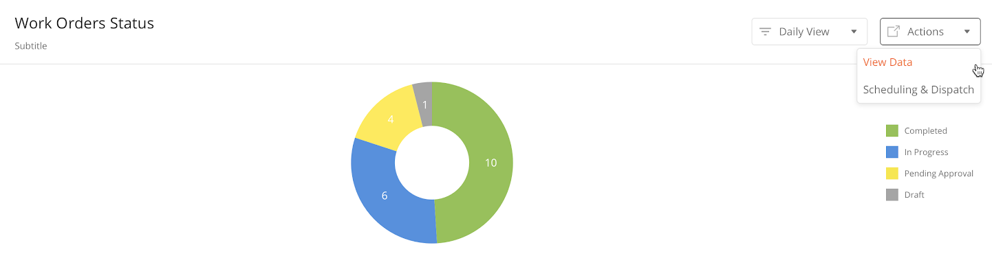
Action dropdown enables a user to choose from a list of actions to be performed once the user clicks on it.
|
Example: When a dispatcher is looking at a pie chart displaying data on the different types of workflows, the dispatcher can click on the Dropdown menu saying ‘Actions’ to choose to view all the data from this Chart or go to the Scheduling & Dispatch module.
-
Data Grid: Action Drop Down
-
Side panel: Action Drop Down
Configurations
|
Component |
Type |
Key |
Value Type |
Accepted Value |
Default Value |
Comments |
|---|---|---|---|---|---|---|
|
Action Drop Down |
DataGrid |
|||||
|
Action Drop Down |
Side Panel |
id |
String |
Any action such as Publish, Deploy, Edit, etc. |
||
|
type |
Button |
|||||
|
title |
String |
|||||
|
buttonType |
||||||
|
hidden |
||||||
|
actionOnClick |
Array |
|||||
|
buttonType |
||||||
|
hidden |
||||||
|
actionOnClick |
Sample JSON
Sample JSON for Data Grid Dropdown
Sample JSON for Side Panel Dropdown:
"actionDropdown": {
          "title": "actions",
          "actions": [
            {
              "id": "publish",
              "type": "button",
              "title": "Publish",
              "buttonType": "secondary",
              "hidden": "@jslib.isPublishHidden",
              "actionOnClick": [
                "@actions.publishData"
              ]
            },
            {
              "id": "deploy",
              "type": "button",
              "title": "Deploy",
              "buttonType": "secondary",
              "hidden": "@jslib.isDeployHidden",
              "actionOnClick": [
                "@actions.deployData"
              ]
            },
            {
              "id": "edit",
              "type": "button",
              "title": "View in Page Editor",
              "buttonType": "secondary",
              "hidden": "@jslib.isBuilderHidden",
              "actionOnClick": [
                "@actions.localJson",
                "@actions.openModule1",
                "@actions.closePanel1"
              ]
            },
The button component enables users to perform a specified action after clicking on it.
It has two variants:
Both of these variants vary in UI presentation but have the same functionality and behavior.
Configuration
|
Component |
Type |
Key |
Value Type |
Accepted Value |
Default Value |
Comments |
|---|---|---|---|---|---|---|
|
Button |
button |
buttonType |
String |
primary, secondary |
primary |
|
|
*title |
String |
|||||
|
action |
String |
|||||
|
Icon Button |
buttonIcon |
*icon |
String |
URL |
||
|
action |
String |
Sample JSON
{
  "actionOnLoad": [],
  "pageContext": {},
  "header": {
    "title": "New Panel",
    "children": []
  },
  "body": {
    "children": []
  },
  "jslib": {},
  "actions": []
}
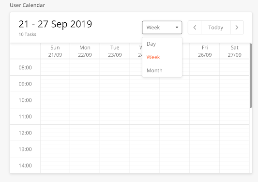
The Calendar component allows administrators to view schedules and tasks for their technicians with these attributes:
-
View by day/week/ month
-
Filter by a technician
-
Keep track of technician utilization where it's displayed as a percentage
-
Explore utilization % and capabilities.
|
Configuration
|
Component |
Type |
Key |
Value Type |
Accepted Values (Case Sensitive) |
Default Value |
Comments |
|---|---|---|---|---|---|---|
|
Calendar (In sidepanel) |
calendar |
hidden |
boolean |
true/false |
||
|
*actionOnClick |
function from actions |
Choose an action type from the action. Generally, it needs an openPanel action which will open another side panel to display event data |
||||
|
disabled |
boolean |
true/false |
||||
|
*id |
any |
|||||
|
label |
string |
|||||
|
*config |
Object |
"setPageContext": true |
Ex- "config": { "setPageContext": true } setPageContext will set event data in pagecontext which can be use in next panel |
|||
|
*events |
Array<Object> |
Array<Object> |
[] |
Pass all your events data in this. This should be from pageContext. E.g. "events": "@pageContext.calendarFromAPI" |
Sample JSON
The following sample JSON scripts are for calendar and task details.
Sample JSON for Calendar
 Click here to expand...
{
"hidden": false,
"actionOnClick": "@actions.openCalendar",
"disabled": false,
"id": "input904",
"label": "API Calendar",
"type": "calendar",
"config": {
"setPageContext": true,
"actionOnClick": "@actions.openCalendar"
},
"events": "@pageContext.calendarFromAPI"
}
Sample JSON to display Task Details
Click here to expand...
{
"pageContext": {},
"actionOnLoad": [
],
"localPageContext": true,
"jslib": {},
"header": {
"leftData": {
"children": [
{
"name": "back",
"icon": "@iconlib.BackArrow",
"actionOnClick": [
"@actions.closePanel1"
],
"type": "buttonIcon"
}
]
},
"children": [
{
"buttonType": "primary",
"actionOnClick": [
"@actions.showGrid"
],
"id": "save",
"type": "button",
"title": "show"
}
],
"title": "Calendar Sidepanel"
},
"body": {
"children": [
{
"id": "input632",
"helperText": "",
"label": "Event Name ",
"value": "@pageContext.calendarEvent[eventName]",
"type": "input"
},
{
"id": "dateStart",
"title": "Start time",
"value": "@pageContext.calendarEvent[start]",
"type": "datetime",
"minDate": "@pageContext.calendarEvent[start]"
},
{
"id": "dateEnd",
"title": "End time",
"value": "@pageContext.calendarEvent.end",
"type": "datetime",
"minDate": "@pageContext.calendarEvent.end"
},
{
"id": "bColor",
"label": "Background Color",
"value": "@pageContext.calendarEvent.backgroundColor",
"type": "colorPicker",
},
{
"id": "tColor",
"label": "Text Color",
"value": "@pageContext.calendarEvent.color",
"type": "colorPicker",
},
]
},
"actions": []
};
Enables a user to select option(s) from a given list. Variants of the CheckBox component:
Single-select Checkbox
A user can select only one item from a list of options.
Configuration
|
Component |
Type |
Key |
Value Type |
Accepted Values |
Default Value |
Comments |
|---|---|---|---|---|---|---|
|
Single Select |
radio |
label |
String |
|||
|
*value |
String |
This is the value that is stored in the database. Mostly, goes in the output map. |
||||
|
*options |
String/Array |
Options will consist an object with "optTitleKey", "optValueKey" and "optChecked" It can also support dataSource, pageContext or Inline data. @dataSource, @pageContext |
||||
|
*optTitleKey |
String |
|||||
|
*optValueKey |
String |
Sample JSON
{
  "pageContext": {},
  "actionOnLoad": [],
  "jslib": {},
  "header": {
    "children": [],
    "title": "Crew Task Approval"
  },
  "body": {
    "children": [
       {
          "id": "checkbox-id-1",
          "strikeable": "@pageContext.strikeable1",
          "label": "Checkbox label 1",
          "type": "checkBox",
          "title": "This is checkbox title 1"
       }
    ]
  },
  "actions": []
}
Multi-Select Checkbox
For each option in the list, there is a CheckBox component. As the selection status of each CheckBox Component is kept independent from the other options, the user can select multiple options.
Configuration
|
Type |
Key |
Value Type |
Accepted Value |
Default Value |
Comments |
|---|---|---|---|---|---|
|
checkbox |
label |
String |
|||
|
*limited functionality. Each checkbox maps to a different field in the model. |
*value |
Boolean |
false |
This is the value that is stored in the database. Mostly, goes in the output map. |
|
|
*title |
String |
Displayed in the box. |
|||
|
strikeable |
Boolean |
false |
Sample JSON
{
  "id": "checkBox438",
  "disabled": false,
  "hidden": false,
  "required": false,
  "helperText": "",
  "label": "New checkBox",
  "title": "New checkBox",
  "strikeable": false,
  "type": "checkBox"
}
This component acts as a holder and can hold multiple components inside it.
There are two types of Content Box:
-
Content Box(contentbox)
-
Collapsible Content Box(collapsiblecontentbox)
Configuration
|
Component |
Type |
Key |
Value Type |
Accepted Values |
Default Value |
Comments |
|---|---|---|---|---|---|---|
|
Content Box |
card |
label |
String |
|||
|
height |
double |
Dynamic |
For iOS, If calculated height < definedHeight, the container will not be scrollable. |
|||
|
*content |
Array/String |
Sample JSON
{
        "id":"contentBox234",
        "label": "Content Box",
        "height": "",
        "content": ""
}
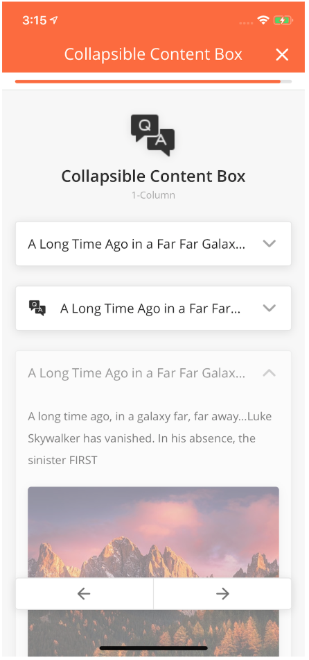
The Collapsible Content Box enables long chunks of text to be 'hidden away' unless the User presses on the downward-facing arrow.
Any and all components can be added in the Collapsible Content Box
The default state of the component (whether or not it should appear to be collapsed or expanded) can be configured in the component definition, using the key "isCollapsed" as can be seen in the table below.
|
Type |
Key |
Value Type |
Default Value |
Android |
iOS |
|---|---|---|---|---|---|
|
collapsiblecontentbox |
isCollapsed |
Boolean |
false |
||
|
image |
String |
||||
|
heading |
String |
header label of collapsible content box |
header label of collapsible content box |
Needs to be implemented |
|
|
Common Keys |
|||||
|
height |
double |
By default, it's dynamic |
|||
|
*content |
JSON Array |
||||
|
*title |
String |
||||
|
image |
String |
|
{
"index":1,
"id":"id of the Component",
"type":"collapsiblecontentbox",
"startColumn":0,
"endColumn":11,
"height":150,
"title":"title of the Component",
"Image":"https://image-url.jpg",
"heading":"heading of the Component",
}
If calculatedHeight for contentbox is less than definedHeight then the container won't be scrollable.
Overview
When a user performs any event or any action, we can display a custom banner when the event is completed. For the custom banner, we have to add below property in JSON.
Example:“alertMessage”: “<message>”
Note:Custom banner is turned off for actions by default.
Sample JSON
{

           "hidden": "@jslib.isSaveDisable",

           "id": "enterName",

           "alertType": "warning",

           "onClose": "@actions.initialData",

           "type": "alert",

           "alertMessage": "This is banner"

}
Overview
A datagrid displays information in a tabular format. Values in the column can come from multiple database tables.
From here, a user can search table fields and apply filters to view information. For example, a user can view the details of work orders such as WorkorderId, Creation Date, Assigned To and other columns.
|
Configuration
|
Category |
Key |
Value Type |
Default Value |
Examples |
Implementation Comments |
|---|---|---|---|---|---|
|
dataSourceId |
String |
query/read |
This is used by the data grid to work on API or query. |
||
|
searchAllowed |
Boolean |
false |
Displays the search field on the top of the table. |
||
|
searchKeys |
Array of Strings |
"searchKeys": [ "customer", "workOrderId", "workOrderType" ] |
Controls the model field names that you want to the search to work on. |
||
|
mainFilter |
Object |
{
"filterText": "All Users",
"data": ["modelFieldName"]
}
|
Controls the filters on top of the table. |
||
|
header |
filterAllowed |
Boolean |
false |
"header": {
"filterAllowed": true,
"subHeaderText": "Records",
"headerText": "Consumable Inventory",
"children": [
{
"buttonType": "secondary",
"actionOnClick": [
"@actions.requestTransferSidepanel"
],
"id": "requestTransfer",
"type": "button",
"title": "Request Transfer"
},
{
"buttonType": "primary",
"actionOnClick": [
"@actions.addNewSidepanel"
],
"id": "addNew",
"type": "button",
"title": "Add New"
}
]
},
|
When set to true, a filter can be applied to the table. |
|
header |
headerText |
String |
Title of the table displayed at the top of the table. e.g. "All Users" |
||
|
header |
subHeaderText |
String |
Text that is displayed below the header. It adds the text after the count of the records in the table. e.g. "24 Users" |
||
|
header |
children |
Array |
Add buttons on the top right side of the header. |
||
|
searchEmptyScreen, emptyScreen |
type |
String |
"searchEmptyScreen": {
"image": "https://s3-us-west-2.amazonaws.com/zinier-static/mastec/loc-search-cross.svg",
"contentValue": "SORRY! YOUR SEARCH RESULTS CAME UP EMPTY",
"type": "noData"
},
|
||
|
searchEmptyScreen, emptyScreen |
contentValue |
String |
|||
|
searchEmptyScreen, emptyScreen |
image |
String |
|||
|
isScrollable |
Boolean |
false |
Controls the horizontal scroll of the table. |
||
|
rowActions |
children |
Object |
"rowActions": {
"children": [
{
"name": "edit",
"icon": "https://s3.ap-south-1.amazonaws.com/zinier2/pencil.svg",
"tooltip": "Edit",
"actionOnClick": "@actions.editSparePartSidePanel",
"type": "buttonIcon"
}
]
},
|
Contains an object of children that we see on the right side of the table. For example, you can add the edit, delete or view icons here. JSON Editor |
|
|
dataWizard |
model |
String |
Specifies the model that you want the data wizard to work on. |
||
|
dataWizard |
importable |
Boolean |
false |
When set to "true", allows the user to import data into the model. |
|
|
dataWizard |
importableTableWidth |
String |
Controls the width of the table that you see in the data wizard. |
||
|
dataWizard |
exportable |
Boolean |
false |
When set to "true", allows the user to export the data from the model. |
|
|
dataWizard |
exportAll |
Boolean |
false |
When set to "true", exports all the data. |
|
|
dataWizard |
exportSelected |
Boolean |
false |
When set to true, allows the user to export selected data from the model. (rosliana 14 Feb: selected data by rows?) |
|
|
rowTextLength |
Number |
Controls the visibility of the text length in the cell. |
|||
|
isSelectable |
Boolean |
false |
Controls the checkbox in the table. e.g. "Select All" functionality. |
||
|
singleSelect |
Boolean |
false |
Control the single select operation on the table. |
||
|
actions |
Array of Objects |
JSON Editor |
|||
|
jsLib |
Object |
JSON Editor |
|||
|
modifyRowActions |
Array of Objects |
"modifyRowActions": [
{
"rowKey": "taskType",
"actionName": "viewResults"
}
],
|
JSON Editor |
||
|
tableHeader |
Array of Objects |
{
"name": "id",
"options": {
"hidden": true,
"showLabel": false
},
"key": "id_T",
"primaryKey": true
},
|
Defines the header columns of the table - and the columns to be displayed. |
||
|
pageContextConfig |
tableData |
Object |
Object |
"pageContextConfig": {
"enable": true,
"isPaginationReqd": false,
"tableData": {
"source": "@pageContext.objectData"
}
}
|
Sets the localPageContext for the dataGrid. |
|
pageContextConfig |
sortBy |
String |
Sorts the data from the page context in tableData using a key name. |
||
gridRefreshId |
String |
"gridRefreshId":"1stGRId" |
This key value should be unique for each dataGrid.This key-value will be used in the sidepanel actions for refreshing the particular grid. |
||
|
sourceType |
String |
"sourceType:api" |
'sourceType:api' enable the pagination and sorting/searching functionality for DataGrid when data rendered through the workflow. |
Sample JSON
Expand source
{
  "deleteAllowed": true,
  "isScrollAble": true,
  "searchAllowed": true,
  "tableWidth": "75rem",
"gridRefreshId":"1stGRId"
  "searchEmptyScreen": {
    "image": "https://s3-us-west-2.amazonaws.com/zinier-static/mastec/loc-search-cross.svg",
    "contentValue": "SORRY! YOUR SEARCH RESULTS CAME UP EMPTY",
    "type": "noData"
  },
  "rowActions": {
    "children": [
      {
        "activeIcon": "https://d122pusslfmuhu.cloudfront.net/field-service-elements/icons/edit-orange.svg",
        "name": "Edit",
        "tooltip": "Edit",
        "icon": "https://s3.ap-south-1.amazonaws.com/zinier2/pencil.svg",
        "actionOnClick": [
          "@actions.setFlag",
          "openSidePanel2"
        ],
        "type": "buttonIcon"
      },
      {
        "activeIcon": "@iconlib.TrashOrange",
        "name": "delete",
        "icon": "@iconlib.TrashGray",
        "tooltip": "Delete",
        "actionOnClick": "@actions.openModal1",
        "type": "buttonIcon"
      }
    ]
  },
  "emptyScreen": {
    "image": "https://s3-us-west-2.amazonaws.com/zinier-static/mastec/doc-clipboard.svg",
    "contentValue": "YOU DO NOT HAVE ANY RECORDS AVAILABLE AT THIS TIME",
    "type": "noData"
  },
  "tableHeader": [
    {
      "name": "Id",
      "options": {
        "hidden": true,
        "showLabel": false
      },
      "key": "id",
      "primaryKey": true
    },
    {
      "name": "Name",
      "options": {
        "sortOrder": "ASC",
        "sortable": true,
        "showLabel": true
      },
      "key": "name"
    },
    {
      "name": "Description",
      "options": {
        "sortable": true,
        "showLabel": true
      },
      "key": "description"
    }
  ],

  "dataToBeSent": {
    "models": [
      "workforceSkillLevels"
    ],
    "columns": {
      "recver": "workforceSkillLevels.recver",
      "modifiedDate": "workforceSkillLevels.modifiedDate",
      "name": "workforceSkillLevels.name",
      "description": "workforceSkillLevels.description",
      "id": "workforceSkillLevels.id"
    },
    "orderBy": "modifiedDate DESC"
  },
  "dataSourceId": "query/read",
  "jslib": {},
  "header": {
    "subHeaderText": "Records",
    "headerText": "Skill Levels",
    "children": [
      {
        "buttonType": "primary",
        "actionOnClick": [
          "@actions.clearPageContext",
          "@actions.openSidePanel3"
        ],
        "id": "add",
        "type": "button",
        "title": "Add New"
      }
    ]
  },
  "updateAllowed": true,
  "isSelectable": false,
  "actions": [
    {
      "subTitle": "Are you sure you want to delete?",
      "name": "openModal1",
      "options": [
        {
          "buttonType": "primary",
          "name": "yes",
          "actionOnClick": [
            "@actions.deleteSkillLevel",
            "@actions.closeModal1",
            "@actions.closePanel",
            "@actions.clearPageContext",
            "@actions.refreshDataGrid"
          ],
          "type": "button",
          "title": "Yes, Continue"
        },
        {
          "buttonType": "secondary",
          "name": "no",
          "actionOnClick": "@actions.closeModal1",
          "type": "button",
          "title": "Cancel"
        }
      ],
      "type": "openModal",
      "title": "Confirm delete"
    },
    {
      "endPoint": "model/delete",
      "name": "deleteSkillLevel",
      "type": "api",
      "actionDef": {
        "data": [
          {
            "modelName": "workforceSkillLevels",
            "recver": "@pageContext.recver",
            "id": "@pageContext.id"
          }
        ],
        "purge": true
      }
    },
    {
      "name": "setFlag",
      "type": "script",
      "actionDef": "function(pageContext){pageContext.flag=0;}"
    },
    {
      "name": "closeModal1",
      "type": "closeModal"
    },
    {
      "name": "closePanel",
      "type": "closePanel"
    },
    {
      "name": "openSidePanel2",
      "type": "openPanel",
      "pageId": "1665D51754ED7E6F"
    },
    {
      "name": "openSidePanel3",
      "type": "openPanel",
      "pageId": "1665E230E7027C16"
    },
    {
      "name": "refreshDataGrid",
      "type": "refreshDataGrid"
    },
    {
      "name": "clearPageContext",
      "type": "clearPageContext"
    }
  ],
  "searchKeys": [
    "name",
    "description"
  ]
}
Mouse over tooltip is added for a truncated string in data-grid. Mouse over on truncated string will display the whole string in the tooltip.
To enable the tooltip in data-grid we need the add below field in JSON.
"pageDef": {

"isSelectable": false,

"searchAllowed": true,

"mainFilter": {},

"rowTextLength": 20,

"searchKeys": [

"logoutTime",

  "loginTime",

  "name",

  "email"

]

}
"rowTextLength": 20
In this condition after twenty characters, the string will be truncated. And on mouseover complete string will be displayed in the tooltip.
Captures date and time from the user.
There are three fields in this component which captures user's data:
-
Date & Time
-
Time
-
Date
All Date Strings must be adjusted to the UTC Time Zone.
|
How to Configure
|
Field |
Type |
Key |
Value Type |
Accepted Values |
Default Value |
Comments |
|---|---|---|---|---|---|---|
|
Date & Time |
inputDateTime |
label |
String |
|||
|
*value |
String |
Returns a date object in "yyyy-MM-dd HH:mm:ss" format |
||||
|
placeHolder |
String |
|||||
|
min |
String |
Format: "yyyy-MM-dd HH:mm:ss" |
||||
|
max |
String |
Format: "yyyy-MM-dd HH:mm:ss" |
||||
|
Time |
inputTime |
label |
String |
|||
|
*value |
String |
Returns a date object in "yyyy-MM-dd HH:mm:ss" format |
||||
|
placeHolder |
String |
|||||
|
min |
String |
Format: "yyyy-MM-dd HH:mm:ss" |
||||
|
max |
String |
Format: "yyyy-MM-dd HH:mm:ss" |
||||
|
Date |
inputDate |
label |
String |
|||
|
*value |
String |
Returns a date object in "yyyy-MM-dd HH:mm:ss" format |
||||
|
placeHolder |
String |
|||||
|
min |
String |
Format: "yyyy-MM-dd HH:mm:ss" |
||||
|
max |
String |
Format: "yyyy-MM-dd HH:mm:ss" |
Sample JSON
{
  "id": "inputDateTime240",
  "disabled": false,
  "hidden": false,
  "required": false,
  "helperText": "",
  "label": "New inputDateTime",
  "value": "",
  "placeHolder": "",
  "min": "yyyy-MM-dd HH:mm:ss",
  "max": "yyyy-MM-dd HH:mm:ss",
  "type": "inputDateTime"
}
Dropdown components allow you to display options in a menu format in a
Single-select Dropdown
Displays a single select dropdown menu to users.
|
Configuration
|
Type |
Key |
Value Type |
Accepted Values |
Default Value |
Comments |
|---|---|---|---|---|---|
|
dropdown |
title |
String |
|||
|
*value |
String |
||||
|
placeHolder |
String |
This has to be added as the first option in the dropdown and treated as nothing is selected in this case. If searchable: true; do not display this value in the search list. |
|||
|
*options |
String/Array |
Options consist of an object with:
It also supports dataSource, pageContext or Inline data with @dataSource, @pageContext |
|||
|
*optTitleKey |
String |
||||
|
*optValueKey |
String |
||||
|
searchable |
Boolean |
false |
|||
|
leftIcon |
String |
Sample JSON
{
  "id": "dropdown386",
  "disabled": false,
  "hidden": false,
  "required": false,
  "helperText": "",
  "label": "New dropdown",
  "value": "",
  "placeHolder": "",
  "title": "New dropdown",
  "optTitleKey": "",
  "optValueKey": "",
  "options": [],
  "searchable": false,
  "type": "dropdown"
}
Searchable Dropdown
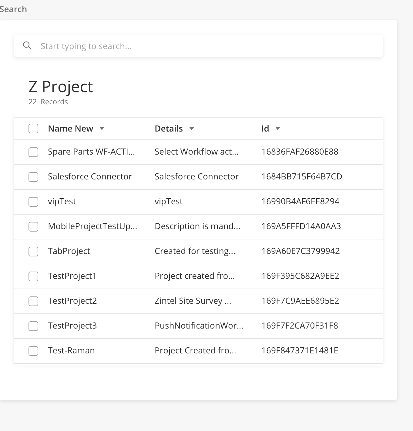
A user can search and select within both the single-select searchable dropdown and multi-select searchable dropdown.
|
Advanced Search
-
If a JSON script contains isAdvanceSearch, there will be a side panel grid.
-
In the grid, a user can select the row.
-
When the user goes to the previous panel, the selected values will be available in the search dropdown.
-
-
The value selected in the search dropdown will also be selected in the advance search panel grid.
-
If isAdvanceSearch is there, the dropdown will display only 5 options.
-
If the search dropdown is
-
Multi-select: The advanced search panel grid will be multi-select.
-
Single-select: The advance search panel grid will be single-select.
-
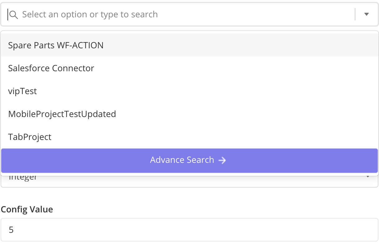
|
|
Configuration
|
Type |
Key |
Value Type |
Accepted Value |
Default Value |
Comments |
|---|---|---|---|---|---|
|
Searchable Dropdown |
id |
String |
|||
|
type |
String |
selectDropdown |
|||
|
label |
String |
Label inside the dropdown. |
|||
|
isMultiSelect |
Boolean |
True, False |
If false, the user can only select one item from the dropdown. |
||
|
value |
String |
Value that selectdropdown is holding. |
|||
|
optLabelMap |
String |
Key from the response to be displayed as the value. |
|||
|
optValueMap |
String |
Key from the response, which holds the value. |
|||
|
searchByOptions |
JSON Object |
JSON Object which contains the model, columns, and filters to search by. |
|||
|
isAdvanceSearch |
JSON Object |
Will enable the advance search |
|||
|
isAdvanceSearch.rowsToSelect |
JSON Object |
JSON Object which contains the model, columns, and filters for checking the rows in the Advanced search grid which was selected in Search dropdown. |
|||
|
isAdvanceSearch.rowsToBeSelect |
string |
Variable in pageContext which holds the details about row selecting in the Advance search grid. |
|||
|
isAdvanceSearch.dataToBeSent |
JSON Object |
JSON Object which contains the model, columns, and filters for Advance search grid query. |
Sample JSON Code
Expand source
"body": {
         "children": [
           {
             "id": "selectDropdown",
             "type": "selectDropdown",
             "label": "Multi Select",
             "isMultiSelect": true,
             "value": "@pageContext.selectedValueLabel",
             "hoverText":{
               "title": "Single Select Dropdown"
             },
             "optLabelMap": "name",
             "optValueMap": "id",
             "searchByOptions": {
               "dataSourceId": "query/read",
               "sourceType": "query",
               "dataToBeSent": {
                 "models": [
                   "ModelEvent"
                 ],
                 "columns": {
                   "id": "ModelEvent.id",
                   "name":"ModelEvent.name"
                 },
                 "filter": "{$name} like {@filter}"
               }
             },
                        "isAdvanceSearch": {
                    "rowsToSelect": {
                      "filter": "{$id} IN {@id}",
                      "models": [
                        "ModelEvent"
                      ],
                      "columns": {
                        "name": "ModelEvent.name",
                        "details": "ModelEvent.description",
                        "id": "ZProject.id"
                      },
                      "inputs": {
                        "id": "@pageContext.selectedId"
                      }
                    },
                    "dataSourceId": "query/read",
                    "rowsToBeSelect": "selectedId",
                    "sourceType": "query",
                    "rightActionLabel": "@lang.['add_filter','abc']",
                    "searchKeys": [
                      "id",
                      "nameNew"
                    ],
                    "dataToBeSent": {
                      "models": [
                        "ModelEvent"
                      ],
                      "columns": {
                        "nameNew": "ModelEvent.name",
                        "details": "ModelEvent.description",
                        "id": "ModelEvent.id"
                      }
                    }
                  }
           },
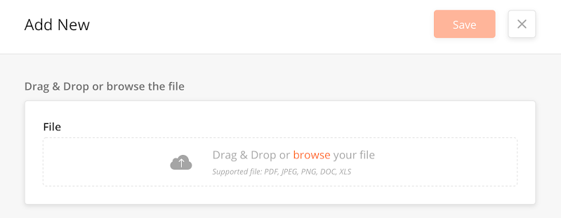
The file upload component is used to upload a file in a task using a side panel. Once the file is uploaded, it is stored in the S3 bucket. The user can delete the uploaded file and also can replace the existing file with the new file.
Supported file types: .jpg, .pdf, .png, .jpeg
|
Example: A user can upload a pdf file containing a schematic diagram of a machine in a task. The technician can then use this diagram to fix the machine.
Configuration
|
Type |
Key |
Value |
Accepted Value |
Default Value |
Comments |
|---|---|---|---|---|---|
|
File Upload |
id |
String |
|||
|
disabled |
boolean |
||||
|
hidden |
boolean |
||||
|
required |
boolean |
||||
|
helperText |
String |
||||
|
label |
String |
||||
|
fileTypes |
fileTypes |
||||
|
showFileList |
boolean |
.jpg, .png |
|||
|
showAlias |
boolean |
||||
|
type |
fileUpload |
Sample JSON
{
  "id": "fileUpload559",
  "disabled": false,
  "hidden": false,
  "required": false,
  "helperText": "",
  "label": "New fileUpload",
  "fileTypes": ".jpg, .png",
  "showFileList": true,
  "showAlias": true,
  "type": "fileUpload"
}
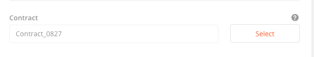
The Find/Search component allows users to search and select items from the side panel T
This intuitive design enhances the user experience, speed of implementation addresses real estate issues of putting a permanent table into a side panel. This component makes use of both the Button and Data grid components to achieve the desired result.
Example: When a user searches for a technician, it shows a nested side table with details of the technician. The user thenselects (and saves) the technician from the nested table which populates the main side panel's table with the selected technician.
How to Configure
-
In the main side panel JSON definition, add a Select button.
-
Create a Nested side panel to open when the Select button is clicked.
-
Create a datagrid component with single select functionality in the Nested Side panel.
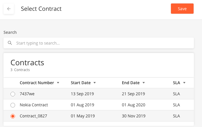
Sample JSON
The following JSON scripts are for the main and side panels.
Main Side Panel
Click here to expand...
[
                  {
                    "disabled": true,
                    "id": "partName",
                    "label": "Spare Part",
                    "placeholder": "Select spare part",
                    "type": "input",
                    "value": "@pageContext.sparePartName"
                  }
                ],
                "flex": "9",
                "id": "inputUser",
                "type": "column"
              },
              {
                "children": [
                  {
                    "id": "emplty",
                    "type": "text",
                    "value": " "
                  },
                  {
                    "buttonType": "secondary",
                    "actionOnClick": [
                      "@actions.setInitSparePartName",
                      "@actions.selectSparePart"
                    ],
                    "id": "submitSparePart",
                    "type": "button",
                    "title": "Select"
                  }
                ],
                "flex": "3",
                "id": "selectSpareButton",
                "type": "column"
              }
            ],
            "id": "selectSelectSparePartSection",
            "type": "row"
Nested Side Panel with Selectable Data Grid
Click here to expand...
"children": [
          {
            "id": "datagridsidepanel",
            "label": "Search",
            "type": "datagrid",
            "jsonDef": {
              "isScrollAble": false,
              "deleteAllowed": true,
              "searchAllowed": true,
              "tableWidth": "60rem",
              "searchEmptyScreen": {
                "image": "https://s3-us-west-2.amazonaws.com/zinier-static/mastec/loc-search-cross.svg",
                "contentValue": "SORRY! YOUR SEARCH RESULTS CAME UP EMPTY",
                "type": "noData"
              },
              "emptyScreen": {
                "image": "@iconlib.MagnifyingGlass",
                "contentValue": "YOUR LIST IS EMPTY AT THE MOMENT",
                "type": "noData"
              },
              "singleSelect": true,
              "tableHeader": [
                {
                  "name": "id",
                  "options": {
                    "hidden": true,
                    "showLabel": false
                  },
                  "key": "id",
                  "primaryKey": true
                },
                {
                  "name": "Name",
                  "options": {
                    "sortOrder": "ASC",
                    "sortable": true,
                    "showLabel": true
                  },
                  "key": "name"
                },
                {
                  "name": "Part Number",
                  "options": {
                    "sortOrder": "ASC",
                    "sortable": true,
                    "showLabel": true
                  },
                  "key": "inventoryPartNumber"
                },
                {
                  "name": "Manufacturer Part Number",
                  "options": {
                    "flex": 1.5,
                    "sortOrder": "ASC",
                    "sortable": true,
                    "showLabel": true
                  },
                  "key": "manufacturerPartNumber"
                },
                {
                  "name": "Category",
                  "options": {
                    "sortOrder": "ASC",
                    "sortable": true,
                    "showLabel": true
                  },
                  "key": "categoryName"
                },
                {
                  "name": "Manufacturer",
                  "options": {
                    "sortOrder": "ASC",
                    "sortable": true,
                    "showLabel": true
                  },
                  "key": "manufactureName"
                }
              ],
              "dataToBeSent": {
                "filter": "{$inventoryType} = 'Part'",
                "models": [
                  "Inventory",
                  "manufacturer",
                  "stockUnit",
                  "category"
                ],
                "columns": {
                  "inventoryType": "Inventory.inventoryType",
                  "description": "Inventory.description",
                  "tax": "category.taxRate",
                  "categoryName": "category.name",
                  "manufacturerPartNumber": "Inventory.manufacturePartNumber",
                  "manufacture": "manufacturer.id",
                  "inventoryPartNumber": "Inventory.partNumber",
                  "recver": "Inventory.recver",
                  "manufactureName": "manufacturer.name",
                  "name": "Inventory.name",
                  "stockUnitsName": "stockUnit.name",
                  "stockUnits": "stockUnit.id",
                  "id": "Inventory.idInventory",
                  "category": "category.id"
                },
                "distinct": true,
                "links": {
                  "category": "Inventory",
                  "manufacturer": "Inventory",
                  "stockUnit": "Inventory"
                }
              },
              "rowsToSelect": {
                "filter": "{$id}={@id}",
                "models": [
                  "Inventory"
                ],
                "columns": {
                  "id": "Inventory.idInventory"
                },
                "inputs": {
                  "id": "@pageContext.partName"
                }
              },
              "dataSourceId": "query/read",
              "jslib": {},
              "header": {
                "subHeaderText": "Spare Parts",
                "headerText": "Spare Parts"
              },
              "actions": [
                {
                  "name": "getUserRole",
                  "type": "script",
                  "actionDef": "function(pageContext) { pageContext.defaultRoleLevel = pageContext.defaultRoleLevel*1;switch(pageContext.defaultRoleLevel){case 99: return pageContext.roleName='Mobile User';case 990:return pageContext.roleName='Project Admin';case 9990:return pageContext.roleName='Web User'; case 9995:return pageContext.roleName='Solution Admin';}}"
                }
              ],
              "searchKeys": [
                "name"
              ]
            }
          }
        ],
        "label": "",
        "id": "userInfo2",
        "type": "section",
        "transparent": true
      }
    ]
Gantt Chart allows users to manage project timelines and dependencies based on a hierarchical order.
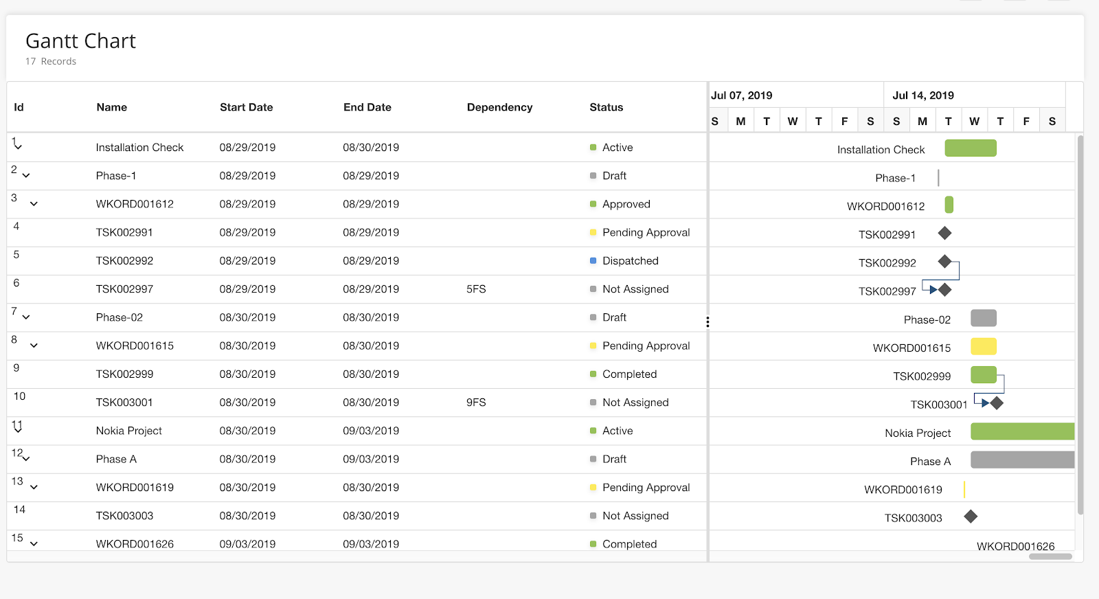
|
Configuration
-
Add a module type, "CUSTOM_TYPE".
-
Create a page with the following JSON script.
Click here to expand...
{ "header": { "headerText": "Gantt Chart", "subHeaderText": "Records" }, "leftLabel": "name", "collapseAllParentTasks": false, "dataSource": "static", "tableHeader": [ { "key": "id", "displayName": "Id", "visible": true }, { "key": "name", "displayName": "Name", "visible": true }, { "key": "startDate", "displayName": "Start Day", "visible": true }, { "key": "endDate", "displayName": "End Date", "visible": true }, { "key": "progress", "displayName": "Progress", "visible": false }, { "key": "duration", "displayName": "Duration", "visible": false }, { "key": "dependency", "displayName": "Dependency", "visible": true }, { "key": "status", "displayName": "Status", "type": "status", "visible": true } ], "dataToBeSent": { "models": [ "Model" ], "dataSourceId": "query/read", "columns": { } } } -
Check that the data response is as follows:
Click here to expand...
{
  "data": [
    {
      "id": 1,
      "name": "Product concept",
      "startDate": "04/02/2019",
      "endDate": "04/21/2019",
      "status": {
        "statusType": "enabled",
        "bgColor": "#ff6b35",
        "value": "Published"
      },
      "child": [
        {
          "id": 2,
          "name": "Defining the product and its usage",
          "startDate": "04/02/2019",
          "duration": 3,
          "status": {
            "statusType": "disabled",
            "bgColor": "#ffeb3b",
            "value": "NotPublished"
          }
        },
        {
          "id": 3,
          "name": "Defining target audience",
          "startDate": "04/02/2019",
          "duration": 3,
          "status": {
            "statusType": "Active",
            "bgColor": "#8bc34a",
            "value": "Active"
          }
        },
        {
          "id": 4,
          "name": "Prepare product sketch and notes",
          "startDate": "04/02/2019",
          "duration": 2,
          "dependency": "2",
          "status": {
            "statusType": "enabled",
            "bgColor": "#ffeb3b",
            "value": "NotPublished"
          }
        }
      ]
    },
    {
      "id": 5,
      "name": "Concept approval",
      "startDate": "04/02/2019",
      "duration": 0,
      "dependency": "3,4",
      "Indicators": [
        {
          "date": "04/10/2019",
          "name": "#briefing",
          "title": "Product concept briefing"
        }
      ],
      "status": {
        "statusType": "enabled",
        "bgColor": "#ff6b35",
        "value": "Published"
      }
    },
    {
      "id": 6,
      "name": "Market research",
      "startDate": "04/02/2019",
      "endDate": "04/21/2019",
      "status": {
        "statusType": "Active",
        "bgColor": "#8bc34a",
        "value": "Active"
      },
      "child": [
        {
          "id": 7,
          "name": "Demand analysis",
          "startDate": "04/04/2019",
          "endDate": "04/21/2019",
          "status": {
            "statusType": "enabled",
            "bgColor": "#ff6b35",
            "value": "Published"
          },
          "child": [
            {
              "id": 8,
              "name": "Customer strength",
              "startDate": "04/04/2019",
              "duration": 4,
              "dependency": "5",
              "status": {
                "statusType": "Active",
                "bgColor": "#8bc34a",
                "value": "Active"
              }
            }
          ]
        },
        {
          "id": 10,
          "name": "Competitor analysis",
          "startDate": "04/04/2019",
          "duration": 4,
          "dependency": "7, 8",
          "status": {
            "statusType": "disabled",
            "bgColor": "#ffeb3b",
            "value": "NotPublished"
          }
        },
        {
          "id": 11,
          "name": "Product strength analsysis",
          "startDate": "04/04/2019",
          "duration": 4,
          "dependency": "9",
          "status": {
            "statusType": "Active",
            "bgColor": "#8bc34a",
            "value": "Active"
          }
        },
        {
          "id": 12,
          "name": "Research complete",
          "startDate": "04/04/2019",
          "duration": 0,
          "dependency": "10",
          "status": {
            "statusType": "disabled",
            "bgColor": "#ffeb3b",
            "value": "NotPublished"
          },
          "Indicators": [
            {
              "date": "04/20/2019",
              "name": "#meeting",
              "title": "1st board of directors meeting"
            }
          ]
        }
      ]
    },
    {
      "id": 13,
      "name": "Product design and development",
      "startDate": "04/04/2019",
      "endDate": "04/21/2019",
      "status": {
        "statusType": "Active",
        "bgColor": "#8bc34a",
        "value": "Active"
      },
      "child": [
        {
          "id": 14,
          "name": "Functionality design",
          "startDate": "04/04/2019",
          "duration": 3,
          "dependency": "12",
          "status": {
            "statusType": "Active",
            "bgColor": "#8bc34a",
            "value": "Active"
          }
        },
        {
          "id": 15,
          "name": "Quality design",
          "startDate": "04/04/2019",
          "duration": 3,
          "dependency": "12",
          "status": {
            "statusType": "enabled",
            "bgColor": "Yellow",
            "value": "Published"
          }
        },
        {
          "id": 16,
          "name": "Define cost plan",
          "startDate": "04/04/2019",
          "endDate": "04/21/2019",
          "status": {
            "statusType": "enabled",
            "bgColor": "Yellow",
            "value": "Published"
          },
          "child": [
            {
              "id": 19,
              "name": "Manufacturing cost",
              "startDate": "04/04/2019",
              "duration": 2,
              "dependency": "17",
              "status": {
                "statusType": "enabled",
                "bgColor": "Yellow",
                "value": "Published"
              }
            }
          ]
        },
        {
          "id": 17,
          "name": "Design complete",
          "startDate": "04/04/2019",
          "duration": 0,
          "dependency": "26",
          "status": {
            "statusType": "enabled",
            "bgColor": "Yellow",
            "value": "Published"
          },
          "Indicators": [
            {
              "date": "05/18/2019",
              "name": "#meeting",
              "title": "2nd board of directors meeting"
            }
          ]
        }
      ]
    }
  ],
  "totalCount": "4",
  "startDate": "03/24/2019",
  "endDate": "07/06/2019",
  "milesStones": [
    {
      "label": "Research phase",
      "date": "04/09/2019"
    },
    {
      "label": "Design phase",
      "date": "04/30/2019"
    },
    {
      "label": "Production phase",
      "date": "05/23/2019"
    },
    {
      "label": "Sales and marketing phase",
      "date": "06/20/2019"
    }
  ]
}
Hover Over is displayed as a pop-up in the side panel to allow a user to create a helper text for a field.
In this configuration, a "?” is available over the top right corner of a field. When a user hovers over the “?”, it displays a popup with details.
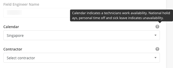
|
For hover over configuration, you must add the following property to a field in the JSON page definition.
Example
“hoverText”: {

“title”: “Details for popup"

}
Sample JSON
{
  "actionOnLoad": [],
  "pageContext": {},
  "header": {
    "title": "New Panel",
    "children": []
  },
  "body": {
    "children": [
      {
        "id": "unitPrice",
        "type": "input",
        "label": "Unit Price",
        "value": "@pageContext.unitPrice",
        "placeholder": "Enter unit price",
        "inputType": "number",
        "hoverText":{
          "title": "Unit price for KG"
        }
      },
      {
        "id": "input925",
        "disabled": false,
        "hidden": false,
        "required": false,
        "helperText": "",
        "label": "Text area",
        "value": "",
        "placeHolder": "Hover text example",
        "minLength": 0,
        "maxLength": 999,
        "leftIcon": "",
        "type": "input",
        "hoverText":{
          "title": "Hover text example"
        }
      }
    ]
  },
  "jslib": {},
  "actions": []
}
Click here for hover over popup - Sample JSON
Overview
This UI Component enables users to view an image on a page.
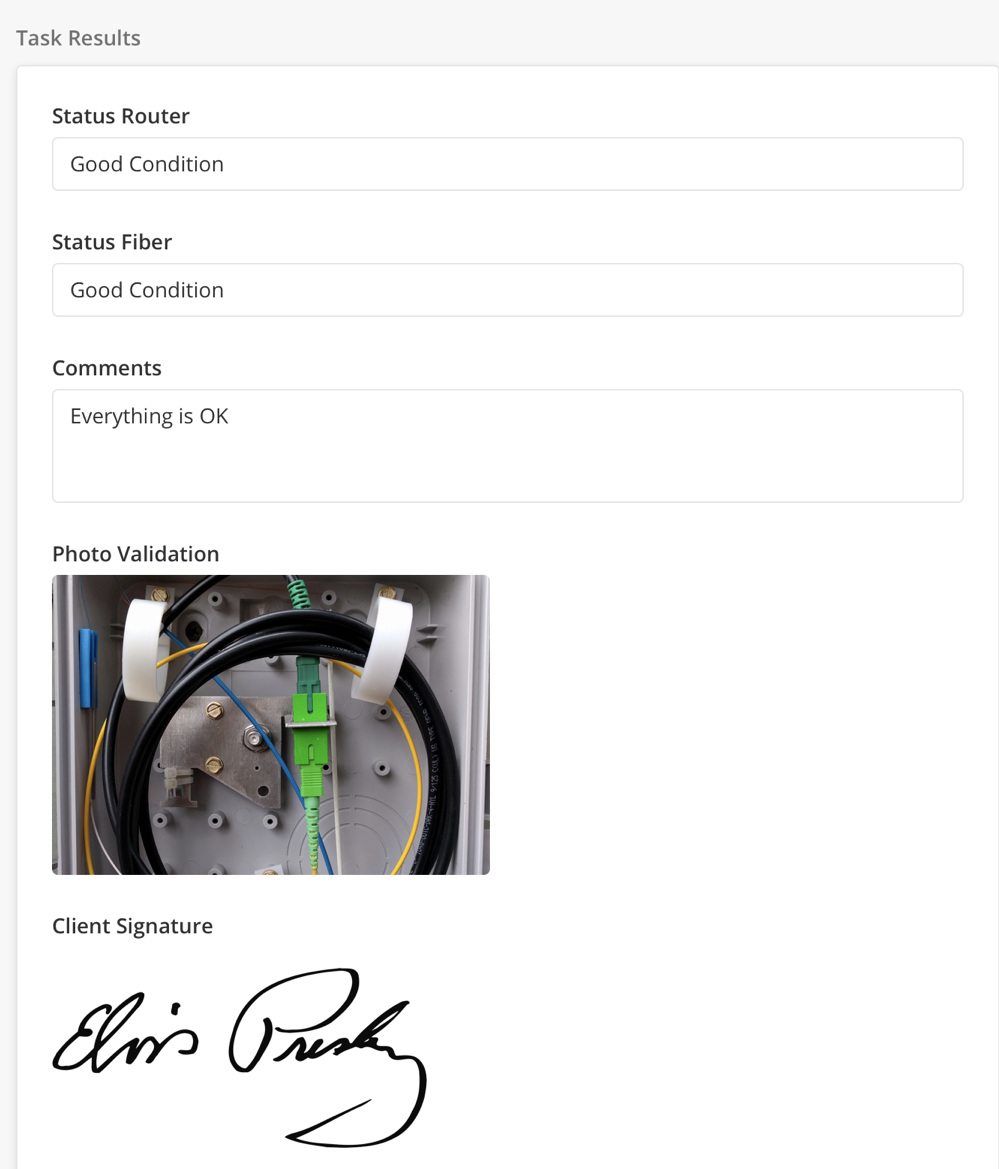
|
Configuration
|
Component |
Type |
Key |
Value Type |
Accepted Values |
Default Value |
Comments |
|---|---|---|---|---|---|---|
|
Image |
image |
*aspectRatio |
double |
|||
|
*value |
String |
This is the URL of the image to download/upload. |
||||
|
label |
String |
|||||
|
uploadable |
Boolean |
|||||
|
maxSize |
number |
In KB. |
||||
|
supportedExtensionTypes |
String |
png/jpg/gif/jpeg/bmp |
Separated values. |
Sample JSON
{
  "id": "image555",
  "disabled": false,
  "hidden": false,
  "required": false,
  "helperText": "",
  "label": "New image",
  "aspectRation": 0.5,
  "value": "url",
  "uploadable": false,
  "maxSize": 1024,
  "supportedExtensionTypes": "png,jpg,gif",
  "type": "image"
}
Input Text components allow users to enter text into a placeholder.
Components that can capture text input by a user are:
Text/Number Field
Configuration: Text/Number Field
|
Type |
Key |
Value Type |
Accepted Value |
Default Value |
Comments |
|---|---|---|---|---|---|
|
input |
inputType |
String |
url/text/password/email/number/decimal |
text |
|
|
minLength |
int |
>=0 Example:0 |
|||
|
maxLength |
int |
>=0 Example:99 |
unlimited |
||
|
label |
String |
||||
|
placeholder |
String |
||||
|
readOnly |
Boolean |
false |
Sample JSON: Text/Number Field
{
  "id": "input633",
  "disabled": false,
  "hidden": false,
  "required": false,
  "helperText": "",
  "label": "New input",
  "value": "",
  "placeHolder": "",
  "minLength": 0,
  "maxLength": 999,
  "leftIcon": "",
  "type": "input"
}
Phone Number Field
Configuration: Phone Number Field
|
Type |
Key |
Value Type |
Accepted Value |
Default Value |
Comments |
|---|---|---|---|---|---|
|
phoneNumber |
label |
String |
|||
|
placeholder |
String |
Sample JSON Phone Number Field
{
  "id": "phoneNumber838",
  "disabled": false,
  "hidden": false,
  "required": false,
  "helperText": "",
  "label": "New phoneNumber",
  "value": "",
  "placeHolder": "",
  "type": "phoneNumber"
}
Comment Field
Configuration: Comment Field
|
Type |
Key |
Value Type |
Accepted Value |
Default Value |
Comments |
|---|---|---|---|---|---|
|
textarea |
label |
String |
|||
|
placeholder |
String |
Sample JSON: Comment Field
{
        "id": "comment586",
        "label": "Comment",
        "placeHolder": ""
}
Address Field
Configuration: Address Field
|
Type |
Key |
Value Type |
Accepted Value |
Default Value |
Comments |
|---|---|---|---|---|---|
|
address input |
label |
String |
|||
|
placeholder |
String |
||||
|
captureLocation |
Boolean |
Sample JSON: Address
  "id": "address119",
  "disabled": false,
  "hidden": false,
  "required": false,
  "helperText": "",
  "label": "New address",
  "validator": "function(pageContext) {}",
  "type": "address"
}
![[Note]](../css/image/note.png)
|
Page needs to be updated |
|---|---|
|
This page needs to be updated with changes as reflected in Release Notes 20.1 > -Improve-Cluster-Icon-Behavior. |
The map component provides visibility of operations to a customer. A customer can quickly visualize the geographic distribution of tasks and technicians. This component also allows a customer to use filters to view information based on the task type, task status. For example, a customer can view all pending tasks in a geographic area.
Various Modules where it can be used are
-
Scheduling & Dispatch
-
Dashboard
-
Side panel view of task/technician
Map component can be used in three different manners, i.e.:
-
Map as in MultiColumn layout
-
Map as a Widget
-
Map as in SidePanel
Configuration
|
Type |
Key |
Value Type |
Accepted Values |
Default Value |
Comments |
|---|---|---|---|---|---|
|
map |
label |
String |
Sets the title of the map. |
||
|
*lat |
double |
Latitude of the target location to be displayed on the device. |
|||
|
*lng |
double |
Longitude of the target location to be displayed on the device. |
|||
|
renderType |
String |
location, route |
For now, "location" is supported.
|
||
|
defaultZoom |
Sets the default zoom level - 18 for street view. |
||||
|
preserveViewport |
Boolean |
true, false |
true: Preserves the default view of the map and sets view based on rendered items. false: Does not preserve the default view of the map. Hence, a user can set "defaultzoom." |
||
|
location |
Specifies the coordinates of the point when |
||||
|
origin |
Specifies the coordinates of the origin when |
||||
|
destination |
Specifies the coordinates of the destination when renderTypeValue equals 'route' |
||||
|
path |
Specifies the coordinates of the way when |
||||
|
containerElementHeight |
Specifies the height of the container element |
||||
|
mapElementHeight |
Specifies the height of a map element. |
||||
|
mapJSON |
Displays geoJSON |
||||
|
fieldsToShow |
Fields to show in the tooltip when a marker is clicked. |
||||
|
panelId |
SidePanelId which you want to open for Info on click of the marker inside the map. Note: pageContext.SidePanelDetails will have all the data |
Sample JSON
Side Panel
Map In sidepanle Expand source
{
            "containerElementHeight": "30rem",
            "defaultZoom": 17,
            "preserveViewport": false,
            "location": {
              "coordinates": "ACCEPT_ARRAY_OF_LATITUDE_&_LONGITUDE",
              "icon": "ICON_URL",
              "type": "Point",
               "children": [{
                                                "id": "text1",
                                                "type": "text",
                                                "dataType": "IT_CAN_BE_('default' | 'heading' | 'small' | 'label' | 'subHeading')",
                                            "value": "@pageContext.value"
                                        }]
                        },
            "id": "ANY_UNIQUE_VALE",
            "type": "map",
            "renderType": "location",
            "mapElementHeight": "100%"
          }
Sample JSON in MCL
Map as MCL layout Expand source
 {
      "panelId": "PANEL_ID_TO_OPEN_SIDE_PANEL_ONCLICK_OF",
      "defaultZoom": 17,
      "preserveViewport": false,
      "label": "LABEL_NAME",
      "type": "map",
      "containerElementHeight": "18rem",
      "dataSourceId": {
        "sourceType": "pageContext"
      },
      "dataMap": {
        "latitude": "latitude",
        "longitude": "longitude"
      },
      "fieldsToShow": {
        "COLUMN_NAME": BOOLEAN_VALUE_TO_SHOW/HIDE_LABEL_FOR_TOOL_TIP
      },
      "id": "map",
      "renderType": "location",
      "mapElementHeight": "100%"
    }
Sample JSON in Widget
Map as in widget Expand source
{
  "containerElementHeight": "30rem",
  "dataSourceId": {
    "dataToBeSent": {
      "filter": "{$latitude} !='0' and {$longitude} !='0'",
      "models": [
        "userSettings",
        "User"
      ],
      "columns": {
        "latitude": "User.latitude",
        "userId": "userSettings.userId",
        "Name": "User.name",
        "longitude": "User.longitude"
      },
      "groupBy": "Name"
    }
  },
  "defaultZoom": 8,
  "preserveViewport": false,
  "fieldsToShow": {
    "Name": true
  },
  "label": "Workforce Location",
  "id": "map",
  "renderType": "location",
  "mapElementHeight": "100%"
}
Overview
The interaction between widgets(charts, map, and calendar) with DataGrid is referred to as MULTI-COLUMN Layout interaction.
-
Interaction support is done viapageContext( a mechanism to transfer data within a web app)from a data grid to another widget.
-
Components that support multi-column layout interaction areCharts(Bar, Pie, Line, Bubble, Radar, Sunburst, etc),Map, Calendar & DataGrid.
-
New module type(MULTI_COLUMN) has been introduced in the platform.
-
Types of interaction are supported as follows
a. Single Select
b. Multi-Select
c. Select All
d. Filter
e. Search
-
Data Source - DataGrid source is the main data source. It can be API or query call. The interaction is based on the above-listed operations in DataGrid which internally will set data for another widget.
Note:DataGrid is the main actor here, the other component is mostly for visual representation.
How to Implement
-
Create a page with DataGrid and another component (calendar, charts).
-
Publish and deploy the page and link the page to a web app and create a Module with module type ‘MULTI_COLUMN’ and select the app and choose the page you want to use this module.
Note: Only two components are allowed in the Multi-Column Layout currently
Keys Required in JSON: For enabling multi-column interaction,in DataGrid jsonDefobjectwe need the following key
-
isMultiColumn: boolean(true /false) true - is needed for enabling Multi column
Use Cases
There are currently 4 use-cases for multi-column layouts;
-
DataGrid with map Component
-
DataGrid with Pie chart
-
DataGrid with Bar Chart
-
DataGrid with a Calendar component.
(1) Map and DataGrid
-
First create a page of PAGE TYPE -> MAIN PAGE, with two child components - map & Datagrid. DataGrid will have dataSource, it can be a query or API. The other component(map) will get data from Datagrid.
-
The other component(map) will havesourceType as `pageContext`
-
Create a web app or use any existing deployed web app.
-
Publish and deploy the web page that we created. Link the page to the app we want.
-
Create a module withMODULE_TYPE -> MULTI_COLUMNand select the web app and the web page we created. Publish and deploy the web module.
-
Logout and login again in order to see the new changes.
Sample JSON - Map and DataGrid
{
"children": [{
"containerElementHeight": "18rem",
"dataSourceId": {
"sourceType": "pageContext"
},
"dataMap": {
"latitude": "latitude",
"longitude": "longitude"
},
"preserveViewport": false,
"label": "User Location Stats",
"fieldsToShow": [
"id",
"name",
"status"
],
"id": "map",
"type": "map",
"renderType": "location",
"mapElementHeight": "100%",
"mapJson": {}
},
{
"id": "showCaseTableLocation",
"type": "dataGrid",
"jsonDef": {
"deleteAllowed": false,
"gridColumns": [],
"searchAllowed": true,
"rowActions": {
"children": [{
"activeIcon": "@iconlib.PencilOrange",
"name": "edit",
"icon": "@iconlib.PencilGray",
"tooltip": "click to edit",
"actionOnClick": "@actions.openSidePanel1",
"type": "buttonIcon"
}]
},
"searchEmptyScreen": {
"image": "https://s3-us-west-2.amazonaws.com/zinier-static/loc-search-cross.svg",
"contentValue": "SORRY! YOUR SEARCH RESULTS CAME UP EMPTY",
"type": "noData"
},
"emptyScreen": {
"image": "https://s3-us-west-2.amazonaws.com/zinier-static/doc-clipboard.svg",
"contentValue": "YOU DO NOT HAVE ANY RECORDS AVAILABLE AT THIS TIME",
"type": "noData"
},
"tableHeader": [{
"name": "Id",
"options": {
"hidden": true,
"showLabel": false
},
"key": "id",
"primaryKey": true
},
{
"name": "Name",
"options": {
"flex": "0.5",
"sortOrder": "ASC",
"currentSorted": false,
"sortable": true,
"showLabel": true
},
"key": "name"
},
{
"name": "Status",
"options": {
"flex": "0.5",
"sortOrder": "ASC",
"currentSorted": false,
"sortable": true,
"showLabel": true
},
"key": "status"
},
{
"name": "Latitude",
"options": {
"flex": "0.5",
"sortOrder": "ASC",
"currentSorted": false,
"sortable": true,
"showLabel": true
},
"key": "latitude"
},
{
"name": "Longitude",
"options": {
"flex": "0.5",
"sortOrder": "ASC",
"currentSorted": false,
"sortable": true,
"showLabel": true
},
"key": "longitude"
}
],
"dataToBeSent": {
"models": [
"tasktypecoordinates"
],
"columns": {
"recver": "tasktypecoordinates.recver",
"latitude": "tasktypecoordinates.latitude",
"name": "tasktypecoordinates.taskname",
"icon": "tasktypecoordinates.icon",
"id": "tasktypecoordinates.id",
"longitude": "tasktypecoordinates.longitude",
"status": "tasktypecoordinates.status"
},
"inputs": {
"filter": "$latitude != null and $longitude != null"
}
},
"tableFilters": {
"status": {
"label": "Status",
"filters": [
"Pending",
"In Progress",
"In Transit",
"Completed"
]
}
},
"dataSourceId": "query/read",
"mainFilter": {},
"header": {
"filterAllowed": true,
"subHeaderText": "Records",
"headerText": "Task Location Stats",
"children": []
},
"isMultiColumn": true,
"updateAllowed": false,
"isSelectable": true,
"dataSource": [],
"actions": [{
"name": "openSidePanel1",
"type": "openPanel",
"pageId": "16913F9E6756D40A"
}],
"searchKeys": [
"name"
]
}
}
],
"jslib": {},
"emptyScreen": {
"image": "https://s3-us-west-2.amazonaws.com/zinier-static/doc-clipboard.svg",
"contentValue": "YOU DO NOT HAVE ANY CHARTS AVAILABLE AT THIS TIME",
"type": "noData"
}
}
map_dataGrid.json
Displaying map_dataGrid.json.
(2) Pie Chart and DataGrid
The second use case is the interaction between the pie chart and DataGrid.
-
First create a page of PAGE TYPE -> MAIN PAGE, with two child components - Pie Chart & Datagrid. DataGrid will have dataSource, it can be a query or API. The other component(Pie Chart) will get data from Datagrid.
-
The other component(Pie Chart) will havesourceType as `pageContext`
-
Create a web app or use any existing deployed web app.
-
Publish and deploy the web page that we created. Link the page to the app we want.
-
Create a module with MODULE_TYPE -> MULTI_COLUMN and select the web app and the web page we created. Publish and deploy the web module.
-
Logout and login again in order to see the new changes.
Sample JSON Definition - Pie Chart and Data Grid
{
"children": [{
"dataSourceId": {
"sourceType": "pageContext"
},
"dataType": "dynamic",
"dataMap": {
"valueType": "number",
"name": "status",
"id": "status",
"value": "count"
},
"type": "pieChartWidget",
"title": "Tasks Based on Status"
},
{
"id": "showCaseTableLocation",
"type": "dataGrid",
"jsonDef": {
"deleteAllowed": false,
"gridColumns": [],
"searchAllowed": true,
"rowActions": {
"children": [{
"activeIcon": "@iconlib.PencilOrange",
"name": "edit",
"icon": "@iconlib.PencilGray",
"tooltip": "click to edit",
"actionOnClick": "@actions.openSidePanel1",
"type": "buttonIcon"
}]
},
"searchEmptyScreen": {
"image": "https://s3-us-west-2.amazonaws.com/zinier-static/loc-search-cross.svg",
"contentValue": "SORRY! YOUR SEARCH RESULTS CAME UP EMPTY",
"type": "noData"
},
"emptyScreen": {
"image": "https://s3-us-west-2.amazonaws.com/zinier-static/doc-clipboard.svg",
"contentValue": "YOU DO NOT HAVE ANY RECORDS AVAILABLE AT THIS TIME",
"type": "noData"
},
"tableHeader": [{
"name": "Id",
"options": {
"hidden": true,
"showLabel": false
},
"key": "id",
"primaryKey": true
},
{
"name": "Name",
"options": {
"flex": "0.5",
"sortOrder": "ASC",
"currentSorted": false,
"sortable": true,
"showLabel": true
},
"key": "name"
},
{
"name": "Status",
"options": {
"flex": "0.5",
"sortOrder": "ASC",
"currentSorted": false,
"sortable": true,
"showLabel": true
},
"key": "status"
},
{
"name": "Latitude",
"options": {
"flex": "0.5",
"sortOrder": "ASC",
"currentSorted": false,
"sortable": true,
"showLabel": true
},
"key": "latitude"
},
{
"name": "Longitude",
"options": {
"flex": "0.5",
"sortOrder": "ASC",
"currentSorted": false,
"sortable": true,
"showLabel": true
},
"key": "longitude"
}
],
"dataToBeSent": {
"models": [
"tasktypecoordinates"
],
"columns": {
"recver": "tasktypecoordinates.recver",
"latitude": "tasktypecoordinates.latitude",
"name": "tasktypecoordinates.taskname",
"icon": "tasktypecoordinates.icon",
"count": "count(tasktypecoordinates.status)",
"id": "tasktypecoordinates.id",
"longitude": "tasktypecoordinates.longitude",
"status": "tasktypecoordinates.status"
},
"inputs": {
"filter": "$latitude != null and $longitude != null"
},
"distinct": true,
"groupBy": "status"
},
"tableFilters": {
"status": {
"label": "Status",
"filters": [
"Pending",
"In Progress",
"In Transit",
"Completed"
]
}
},
"dataSourceId": "query/read",
"mainFilter": {},
"header": {
"filterAllowed": true,
"subHeaderText": "Records",
"headerText": "Task Location Stats",
"children": []
},
"isMultiColumn": true,
"updateAllowed": false,
"isSelectable": true,
"dataSource": [],
"actions": [{
"name": "openSidePanel1",
"type": "openPanel",
"pageId": "16913F9E6756D40A"
}],
"searchKeys": [
"name",
"status"
]
}
}
],
"jslib": {},
"emptyScreen": {
"image": "https://s3-us-west-2.amazonaws.com/zinier-static/doc-clipboard.svg",
"contentValue": "YOU DO NOT HAVE ANY CHARTS AVAILABLE AT THIS TIME",
"type": "noData"
}
}
pie_dataGrid.json
(3) Bar Chart and DataGrid
The third use case is the interaction between a bar chart and a DataGrid.
-
First create a page of PAGE TYPE -> MAIN PAGE, with two child components - Bar Chart & Datagrid. DataGrid will have dataSource it can be a query or API. The other component(Bar Chart) will get data from Datagrid.
-
The other component(Bar Chart) will havesourceType as `pageContext`
-
Create a web app or use any existing deployed web app.
-
Publish and deploy the web page that we created. Link the page to the app we want.
-
Create a module with MODULE_TYPE -> MULTI_COLUMN and select the web app and the web page we created. Publish and deploy the web module. Logout and login again in order to see the new changes.
Sample JSON Definition - Bar Chart and Data Grid
{
"children": [{
"dataSourceId": {
"sourceType": "pageContext"
},
"dataType": "dynamic",
"dataMap": {
"valueType": "number",
"name": "status",
"id": "status",
"value": "count"
},
"type": "barChartWidget",
"title": "Tasks Based on Status"
},
{
"id": "showCaseTableLocation",
"type": "dataGrid",
"jsonDef": {
"deleteAllowed": false,
"gridColumns": [],
"searchAllowed": true,
"rowActions": {
"children": [
{
"activeIcon": "@iconlib.PencilOrange",
"name": "edit",
"icon": "@iconlib.PencilGray",
"tooltip": "click to edit",
"actionOnClick": "@actions.openSidePanel1",
"type": "buttonIcon"
}
]
},
"searchEmptyScreen": {
"image": "https://s3-us-west-2.amazonaws.com/zinier-static/loc-search-cross.svg",
"contentValue": "SORRY! YOUR SEARCH RESULTS CAME UP EMPTY",
"type": "noData"
},
"emptyScreen": {
"image": "https://s3-us-west-2.amazonaws.com/zinier-static/doc-clipboard.svg",
"contentValue": "YOU DO NOT HAVE ANY RECORDS AVAILABLE AT THIS TIME",
"type": "noData"
},
"tableHeader": [{
"name": "Id",
"options": {
"hidden": true,
"showLabel": false
},
"key": "id",
"primaryKey": true
},
{
"name": "Name",
"options": {
"flex": "0.5",
"sortOrder": "ASC",
"currentSorted": false,
"sortable": true,
"showLabel": true
},
"key": "name"
},
{
"name": "Status",
"options": {
"flex": "0.5",
"sortOrder": "ASC",
"currentSorted": false,
"sortable": true,
"showLabel": true
},
"key": "status"
},
{
"name": "Latitude",
"options": {
"flex": "0.5",
"sortOrder": "ASC",
"currentSorted": false,
"sortable": true,
"showLabel": true
},
"key": "latitude"
},
{
"name": "Longitude",
"options": {
"flex": "0.5",
"sortOrder": "ASC",
"currentSorted": false,
"sortable": true,
"showLabel": true
},
"key": "longitude"
}
],
"dataToBeSent": {
"models": [
"tasktypecoordinates"
],
"columns": {
"recver": "tasktypecoordinates.recver",
"latitude": "tasktypecoordinates.latitude",
"name": "tasktypecoordinates.taskname",
"icon": "tasktypecoordinates.icon",
"count": "count(tasktypecoordinates.status)",
"id": "tasktypecoordinates.id",
"longitude": "tasktypecoordinates.longitude",
"status": "tasktypecoordinates.status"
},
"inputs": {
"filter": "$latitude != null and $longitude != null"
},
"distinct": true,
"groupBy": "status"
},
"tableFilters": {
"status": {
"label": "Status",
"filters": [
"Pending",
"In Progress",
"In Transit",
"Completed"
]
}
},
"dataSourceId": "query/read",
"mainFilter": {},
"header": {
"filterAllowed": true,
"subHeaderText": "Records",
"headerText": "Task Location Stats",
"children": []
},
"isMultiColumn": true,
"updateAllowed": false,
"isSelectable": true,
"dataSource": [],
"actions": [{
"name": "openSidePanel1",
"type": "openPanel",
"pageId": "16913F9E6756D40A"
}],
"searchKeys": [
"name",
"status"
]
}
}
],
"jslib": {},
"emptyScreen": {
"image": "https://s3-us-west-2.amazonaws.com/zinier-static/doc-clipboard.svg",
"contentValue": "YOU DO NOT HAVE ANY CHARTS AVAILABLE AT THIS TIME",
"type": "noData"
}
}
bar_dataGrid.json
Displaying bar_dataGrid.json.
(4) Calendar and DataGrid
The third use case is the interaction between a bar chart and DataGrid.
-
First create a page of PAGE TYPE -> MAIN PAGE, with two child components - Bar Chart & Datagrid. DataGrid will have dataSource, it can be a query or API. The other component(Calendar) will get data from Datagrid.
-
The other component(Calendar) will havesourceType as `pageContext`
-
Create a web app or use any existing deployed web app.
-
Publish and deploy the web page that we created. Link the page to the app we want.
-
Create a module with MODULE_TYPE -> MULTI_COLUMN and select the web app and the web page we created. Publish and deploy the web module.Logout and login again in order to see the new changes.
Sample JSON Definition - Calendar and DataGrid
{
        "pageContext": {},
        "children": [{
                        "actionOnClick": "@actions.openSidePanel1",
                        "id": "calendarForWorkOrder",
                        "title": "Work Order",
                        "type": "calendarWidget",
                        "config": {
                                "setPageContext": true,
                                "actionOnClick": "@actions.openSidePanel1"
                        }
                },
                {
                        "id": "showCaseTableLocation",
                        "type": "dataGrid",
                        "jsonDef": {
                                "deleteAllowed": false,
                                "gridColumns": [],
                                "searchAllowed": false,
                                "rowActions": {
                                        "children": [{
                                                "activeIcon": "@iconlib.PencilOrange",
                                                "name": "edit",
                                                "icon": "@iconlib.PencilGray",
                                                "tooltip": "click to edit",
                                                "actionOnClick": "@actions.openSidePanel1",
                                                "type": "buttonIcon"
                                        }]
                                },
                                "searchEmptyScreen": {
                                        "image": "https://s3-us-west-2.amazonaws.com/zinier-static/loc-search-cross.svg",
                                        "contentValue": "SORRY! YOUR SEARCH RESULTS CAME UP EMPTY",
                                        "type": "noData"
                                },
                                "emptyScreen": {
                                        "image": "https://s3-us-west-2.amazonaws.com/zinier-static/doc-clipboard.svg",
                                        "contentValue": "YOU DO NOT HAVE ANY RECORDS AVAILABLE AT THIS TIME",
                                        "type": "noData"
                                },
                                "singleSelect": false,
                                "tableHeader": [{
                                                "name": "Id",
                                                "options": {
                                                        "hidden": true,
                                                        "showLabel": false
                                                },
                                                "key": "id",
                                                "primaryKey": true
                                        },
                                        {
                                                "name": "Task Type",
                                                "options": {
                                                        "flex": "0.5",
                                                        "sortOrder": "ASC",
                                                        "currentSorted": false,
                                                        "sortable": true,
                                                        "showLabel": true
                                                },
                                                "key": "taskType"
                                        },
                                        {
                                                "name": "Status",
                                                "options": {
                                                        "flex": "0.5",
                                                        "sortOrder": "ASC",
                                                        "currentSorted": false,
                                                        "sortable": true,
                                                        "showLabel": true
                                                },
                                                "key": "status"
                                        }
                                ],
                                "dataToBeSent": {
                                        "models": [
                                                "WorkOrderTask"
                                        ],
                                        "columns": {
                                                "taskType": "WorkOrderTask.taskType",
                                                "start": "WorkOrderTask.plannedDate",
                                                "end": "WorkOrderTask.dueDateTime",
                                                "id": "WorkOrderTask.id",
                                                "status": "WorkOrderTask.status"
                                        },
                                        "batchSize": 50,
                                        "getCount": true,
                                        "batchNumber": 1
                                },
                                "dataSourceId": "query/read",
                                "mainFilter": {},
                                "header": {
                                        "filterAllowed": true,
                                        "subHeaderText": "Records",
                                        "headerText": "Work Order Events",
                                        "children": []
                                },
                                "isMultiColumn": true,
                                "updateAllowed": false,
                                "isSelectable": true,
                                "dataSource": [],
                                "actions": [{
                                        "name": "openSidePanel1",
                                        "type": "openPanel",
                                        "pageId": "1699AA26FBD1E3E6"
                                }],
                                "searchKeys": [
                                        "taskType",
                                        "status"
                                ]
                        }
                }
        ],
        "jslib": {},
        "emptyScreen": {
                "image": "https://s3-us-west-2.amazonaws.com/zinier-static/doc-clipboard.svg",
                "contentValue": "YOU DO NOT HAVE ANY CHARTS AVAILABLE AT THIS TIME",
                "type": "noData"
        },
        "actions": [{
                "name": "openSidePanel1",
                "type": "openPanel",
                "pageId": "1699AA26FBD1E3E6"
        }]
}
calendar_dataGrid.json
Displaying calendar_dataGrid.json.
Notes
For Side Panel that is part of Multi-Column, we need to add the following things
-
On close buttonactionOnClickinclude`@actions.refreshGrid1`.
-
And add `localPageContext: true`.This two are mandatory.
Example
{
       "icon": "@iconlib.Close",

       "actionOnClick": [

         "@actions.closePanel1",

         "@actions.refreshGrid"

       ],

       "id": "close",

       "type": "buttonIcon"

}


And also include the action in the actions array like below


"actions": [

   {

     "name": "closePanel1",

     "type": "closePanel"

   },


     "name": "refreshGrid",

     "type": "refreshDataGrid"

   }

 ]
Overview
Overlay component allows to visualize information in a pop up window without navigating from your current view. Size of the view can be configured as per the requirements. We can visualize datagrid, image, and widgets using this component.
1.Overlay component can have any component ,it can be view by an actions .
2.Action can be call from main grid or side panel.After calling the action a popup will opened and it will have the component inside it .
3.Inside Overlay user not supposed to do actions .
4.Overlay will have only one component inside it .
5.Overlay component will take height and width automatically accordingly to component .
6.Min height& Min width has been set ,Overlay component can’t go below min height - min width .
7.Max height and Max-Width has been set ,Overlay component can’t cross max height -max width .
Insert screen designs of the component
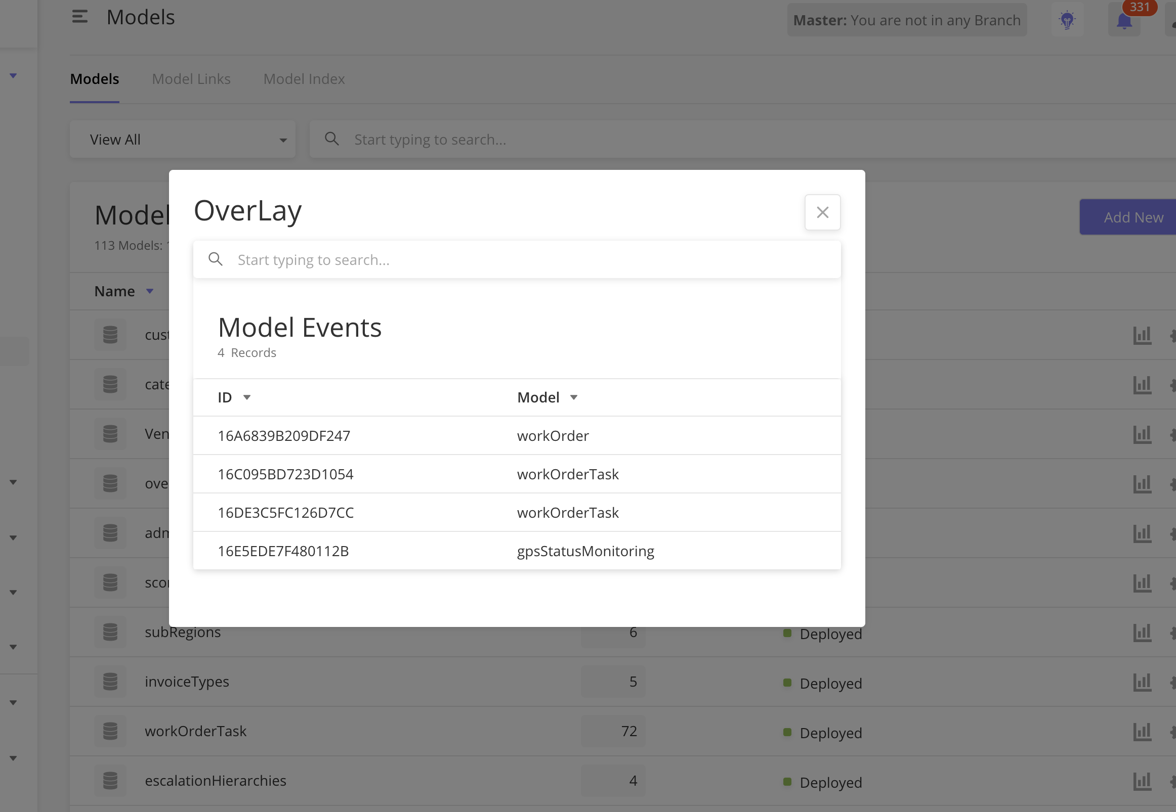
How to Configure
Explain how to implement the component/feature and include what can be configured within the component.
|
Field |
Type |
Key |
Value Type |
Accepted Values |
Default Value |
Comment |
|---|---|---|---|---|---|---|
|
Date & Time |
inputDateTime |
label |
String |
|||
|
value |
String |
Returns a date object in "yyyy-MM-dd HH:mm:ss" format |
Sample JSON
Insert sample JSON for component
1.Create an action .
{
"children": [
{
"id": "add",
"type": "button",
"actionOnClick": [
"@actions.openOverlay1"
]
}
]
}
2.Give the action def as below
"actions": [
{
"name": "openOverlay1",
"type": "openOverlayView",
"title": "OverLay"
"pageDef": [
{
"id": "overlay",
"type": "dataGrid",
"jsonDef": {
"isSelectable": false,
"searchAllowed": true,
"searchKeys": [
"id",
"name",
"eventType",
"active"
],
"mainFilter": {},
"rowTextLength": 20,
"searchEmptyScreen": {
"image": "https://s3-us-west-2.amazonaws.com/zinier-static/loc-search-cross.svg",
"contentValue": "@lang.[\"search_Result_Empty\",\"SORRY! YOUR SEARCH RESULTS CAME UP EMPTY\"]",
"type": "noData"
},
"emptyScreen": {
"image": "https://s3-us-west-2.amazonaws.com/zinier-static/doc-clipboard.svg",
"contentValue": "@lang.[\"no_records_available\",\"YOU DO NOT HAVE ANY RECORDS AVAILABLE AT THIS TIME\"]",
"type": "noData"
},
"header": {
"filterAllowed": true,
"headerText": "@lang.['modelEventGridTitle','Model Events']",
"subHeaderText": "@lang.['recordsGridSubHeader','Records']"
},
"tableHeader": [
{
"key": "id",
"name": "@lang.[\"id_caps\",\"ID\"]",
"primaryKey": true,
"options": {
"sortOrder": "ASC",
"sortable": true,
"showLabel": true,
"flex": 12,
"hidden": false
},
"displayOrder": 1
},
{
"key": "namespace",
"name": "@lang.[\"Namespace\",\"Namespace\"]",
"primaryKey": false,
"options": {
"sortOrder": "ASC",
"sortable": true,
"showLabel": false,
"flex": 12,
"hidden": true
},
"displayOrder": 2
},
{
"key": "name",
"name": "@lang.[\"Model\",\"Model\"]",
"primaryKey": false,
"options": {
"sortOrder": "ASC",
"sortable": true,
"showLabel": true,
"flex": 12,
"hidden": false
},
"displayOrder": 3
}
],
"gridColumns": [],
"dataSourceId": "query/read",
"dataToBeSent": {
"models": [
"ModelEvent"
],
"columns": {
"async": "ModelEvent.async",
"processId": "ModelEvent.processId",
"namespace": "ModelEvent.namespace",
"name": "ModelEvent.name",
"description": "ModelEvent.description",
"active": "ModelEvent.active",
"id": "ModelEvent.id",
"eventType": "ModelEvent.eventType",
"processingOrder": "ModelEvent.processingOrder",
"recver": "ModelEvent.recver"
}
},
"dataSource": [],
"jslib": {
"isDeleteDisabled": "function(pageContext){if((typeof pageContext.selectedRowIds!=='undefined')&&(pageContext.selectedRowIds.length>0)){var isDeployed=false;pageContext.selectedRowIds.forEach((row)=>{if((row.published===true)||(row.deployed===true)){isDeployed=true;}});return isDeployed;}return true;}"
},
"actions": [
]
}
}
]
}
]
Overview
This is a component that shows technicians in a data grid and their schedules for that day in gantt or calendar blocks. User can assign any task to any technician by drag&drop.
Screen designs of the component
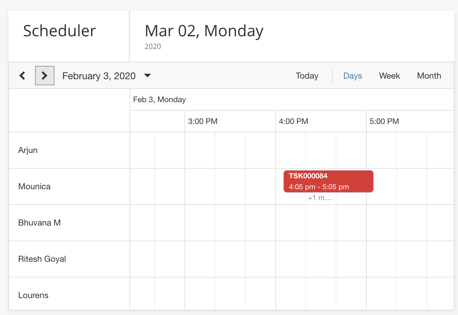
How to Configure
1. Create a page with the following JSON script.
{
  "componentType": "DispatchScheduler",
  "dataSourceId": "process/start",
  "sourceType": "api",
  "header": {
    "subHeaderText": "Records",
    "headerText": "Dispatch Scheduler"
  },
  "dataToBeSent": {
    "processId": "16BF4E101826E9E7",
    "apiResponseFormat": true,
    "contextVar": {
      "assignedToUserId": "abc"
    },
    "apiResponseObject": "techAndTaskData"
  },
  "actions": [
    {
      "name": "deleteModal",
      "type": "openModal",
      "title": "Confirm delete",
      "subTitle": "Are you sure you want delete the row?",
      "options": [
        {
          "name": "yes",
          "type": "button",
          "title": "Yes, Continue",
          "buttonType": "primary",
          "actionOnClick": [
            "@actions.closeModal1"
          ]
        },
        {
          "name": "no",
          "type": "button",
          "title": "Cancel",
          "buttonType": "secondary",
          "actionOnClick": "@actions.closeModal1"
        }
      ]
    },
    {
      "name": "closeModal1",
      "type": "closeModal"
    },
    {
      "name": "openSidePanel1",
      "type": "openPanel",
      "pageId": "16D3EF94EA047061"
    }
  ],
  "manualRefresh": "RefreshScheduler",
  "dataForDragAndDrop": {
    "dataSourceId": "process/start",
    "sourceType": "api",
    "dataToBeSent": {
      "inputVar": {},
      "processId": "16C03ADF3809F241",
      "apiResponseFormat": true,
      "contextVar": {
        "assignedToUserId": "abc"
      },
      "apiResponseObject": "techAndTaskData"
    }
  },
  "taskBarClickAction": {
    "name" : "edit",
    "actionOnClick": [
      "@actions.openSidePanel1"
    ]
  }
}
|
Field |
Type |
Key |
Value Type |
Accepted Values |
Default Value |
Comment |
|---|---|---|---|---|---|---|
|
Scheduler |
|
String |
|
|||
|
|
String |
Scheduler component Takes data from workflow |
|
|||
|
|
string |
api |
||||
|
|
JSON OBJECT |
It takes the header and sub-header in left side header of component. |
||||
|
|
JSON OBJECT |
Contains the details about workflow call. |
||||
|
|
Array Of Object |
Hold the actions def. |
||||
|
|
String |
It create a button in header to refresh the scheduler component manually . |
||||
|
|
JSON OBJECT |
Hold the details about drag&drop action workflow. |
This workflow gets trigger when any task drag&droped. |
|||
|
|
JSON OBJECT |
Define the action details on task bar click. |
2.Add a module type, "CUSTOM_TYPE" and link the above page.
3. Check the data response as below.
Each task has a type - > work/unAvailable/breakTime/travel .For Each type we have different task template .
{
  "techData": [
    {
      "techName": "Vipin Mohan",
      "id": "16BC146AB6B5EB39",
      "dispatcher": "16BC16A3E2D159D8"
    },
    {
      "techName": "Mounica",
      "id": "16BE4BDE4425AE63",
      "dispatcher": "16BC16A3E2D159D8"
    },
    {
      "techName": "Havya Nimmalapudi",
      "id": "16DB3F04221237EB",
      "dispatcher": "16BC16A3E2D159D8"
    }
  ],
  "taskData": [
    {
      "instanceId": "16CE18DCB61C1A52",
      "statusColor": "#8bc34a",
      "name": "CPE Installation",
      "startTime": "2019-11-27 08:04:58.0",
      "id": "16CD769D31857982",
      "endTime": "2019-11-27 09:04:58.0",
      "taskAtRisk": false,
      "userId": "16BD5297FA29FD51",
      "tId": "TSK001608",
      "status": "Completed",
      "type": "work"
    },
    {
      "instanceId": "16CD777E06C805E6",
      "statusColor": "#ffeb3b",
      "name": "CPE Installation",
      "startTime": "2019-11-12 09:04:36.0",
      "id": "16CD7757B7D62B83",
      "endTime": "2019-11-12 10:04:36.0",
      "taskAtRisk": false,
      "userId": "16BC146AB6B5EB39",
      "tId": "TSK001610",
      "status": "Pending Approval",
      "type": "unAvailable"
    },
    {
      "instanceId": "16CD777E06C805E98",
      "statusColor": "#a5a5a5",
      "name": "Cable Pulling",
      "startTime": "2019-11-12 13:30:00.0",
      "id": "16CDBF937BBEEF6A",
      "endTime": "2019-11-12 14:30:00.0",
      "taskAtRisk": false,
      "userId": "16BC146AB6B5EB39",
      "tId": "TSK001630",
      "status": "Not Assigned",
      "type": "breakTime"
    },
    {
      "instanceId": "16CDC2E64D9DE196",
      "statusColor": "#ffeb3b",
      "name": "OP Site Survey",
      "startTime": "2019-08-29 17:12:41.0",
      "id": "16CDC2D9F61896F4",
      "endTime": "2019-08-29 18:12:41.0",
      "taskAtRisk": false,
      "userId": "16BD4F1D48E790E0",
      "tId": "TSK001632",
      "status": "Pending Approval",
      "type": "travel"
    },
    {
      "instanceId": "16D5E35A1971132B",
      "name": "Planning",
      "startTime": "2019-11-25 13:09:39.0",
      "id": "16CD79F3C527A1D5",
      "endTime": "2019-11-25 14:09:39.0",
      "taskAtRisk": false,
      "userId": "16BC146AB6B5EB39",
      "tId": "TSK001620",
      "status": "In Progress",
      "type": "breakTime"
    },
    {
      "instanceId": "16CDCD1352D49D55",
      "statusColor": "#4a90e2",
      "name": "OP Site Survey",
      "startTime": "2019-10-29 15:30:00.0",
      "id": "16CDBD9A020E58F4",
      "endTime": "2019-10-29 16:30:00.0",
      "taskAtRisk": false,
      "userId": "16BC146AB6B5EB39",
      "tId": "TSK001623",
      "status": "Dispatched",
      "type": "work"
    },
    {
      "instanceId": "16CDCEA3969446E5",
      "statusColor": "#8bc34a",
      "name": "OP Site Survey",
      "startTime": "2019-11-29 10:28:47.0",
      "id": "16CDC1A90E99F36D",
      "endTime": "2019-11-29 11:28:47.0",
      "taskAtRisk": false,
      "userId": "16BD4F1D48E790E0",
      "tId": "TSK001631",
      "status": "Completed",
      "type": "unAvailable",
      "IsBlock": true
    },
    {
      "instanceId": "16CDD96858C10215",
      "statusColor": "#ffeb3b",
      "name": "OP In Building Work",
      "startTime": "2019-11-07 13:36:05.0",
      "id": "16CDD9509833B468",
      "endTime": "2019-11-07 15:36:05.0",
      "taskAtRisk": false,
      "userId": "16BD5297FA29FD51",
      "tId": "TSK001639",
      "status": "In Transit",
      "type": "travel"
    },
    {
      "instanceId": "16CE0B86185C9CF1",
      "statusColor": "#8bc34a",
      "name": "Not Available",
      "startTime": "2019-11-08 09:38:15.0",
      "id": "16CE0B75E8B69336",
      "endTime": "2019-11-08 11:38:15.0",
      "taskAtRisk": false,
      "userId": "16BC146AB6B5EB39",
      "tId": "TSK001640",
      "status": "Dispatched",
      "type": "breakTime"
    },
    {
      "statusColor": "#8bc34a",
      "name": "Planning",
      "startTime": "2019-08-30 10:30:00.0",
      "id": "16CE11DF9102CFBC",
      "endTime": "2019-08-30 11:30:00.0",
      "taskAtRisk": false,
      "userId": "16BD5297FA29FD51",
      "tId": "TSK001642",
      "status": "Completed",
      "type": "work"
    },
    {
      "instanceId": "16D5E358B0667D4C",
      "statusColor": "#4a90e2",
      "name": "Manhole Access",
      "startTime": "2019-11-23 13:15:27.575",
      "id": "16CD79DEE30D4AF1",
      "endTime": "2019-11-23 14:45:27.575",
      "taskAtRisk": false,
      "userId": "16BC146AB6B5EB39",
      "tId": "TSK001619",
      "status": "Dispatched",
      "type": "unAvailable",
      "IsBlock": true
    },
    {
      "instanceId": "16CE26F29C56A2B1",
      "actualStartTime": "2019-08-30 12:11:01.0",
      "statusColor": "#8bc34a",
      "name": "OP In Building Work",
      "startTime": "2019-11-30 13:11:01.0",
      "id": "16CE26D5A28E3351",
      "endTime": "2019-11-30 15:11:01.0",
      "taskAtRisk": false,
      "userId": "16BD5297FA29FD51",
      "tId": "TSK001653",
      "status": "Completed",
      "type": "travel"
    },
    {
      "instanceId": "16CE2773B6FE260B",
      "statusColor": "#8bc34a",
      "name": "Field Audit",
      "startTime": "2019-11-18 12:46:45.0",
      "id": "16CE274CEA06ACFB",
      "endTime": "2019-11-18 14:16:45.0",
      "taskAtRisk": false,
      "userId": "16BD5297FA29FD51",
      "tId": "TSK001654",
      "status": "Completed",
      "type": "breakTime"
    },
    {
      "statusColor": "#ffeb3b",
      "name": "Design Web Task",
      "startTime": "2019-10-03 17:36:00.0",
      "id": "16CF60E30E7D5F8F",
      "endTime": "2019-10-03 18:36:00.0",
      "taskAtRisk": false,
      "userId": "16BD4F1D48E790E0",
      "tId": "TSK001657",
      "status": "Pending Approval",
      "type": "work"
    },
    {
      "statusColor": "#ffeb3b",
      "name": "Manhole Access",
      "startTime": "2019-11-03 09:58:00.0",
      "id": "16CF6219F4216B72",
      "endTime": "2019-11-03 10:28:00.0",
      "taskAtRisk": false,
      "userId": "16BD4F1D48E790E0",
      "tId": "TSK001659",
      "status": "Pending Approval",
      "type": "unAvailable",
      "isBlock": true
    },
    {
      "statusColor": "#4a90e2",
      "name": "Planning",
      "startTime": "2019-11-11 16:30:00.0",
      "id": "16CFD0E81ECE8123",
      "endTime": "2019-11-11 17:30:00.0",
      "taskAtRisk": false,
      "userId": "16BC146AB6B5EB39",
      "tId": "TSK001670",
      "status": "Dispatched",
      "type": "travel"
    },
    {
      "instanceId": "16D1984D94932AFD",
      "statusColor": "#4a90e2",
      "name": "OP In Building Work",
      "startTime": "2019-11-11 16:15:00.0",
      "id": "16CFD0DC16D179F1",
      "endTime": "2019-11-11 17:15:00.0",
      "taskAtRisk": false,
      "userId": "16BC16A3E2D159D8",
      "tId": "TSK001669",
      "status": "Dispatched",
      "type": "unavailable",
      "isSlotAvailable": false
    },
    {
      "instanceId": "16D25BEF9442356F",
      "statusColor": "#8bc34a",
      "name": "Cable Pulling",
      "startTime": "2019-11-05 16:30:00.0",
      "id": "16CFBEA718A805DE",
      "endTime": "2019-11-05 17:30:00.0",
      "taskAtRisk": false,
      "userId": "16BC146AB6B5EB39",
      "tId": "TSK001667",
      "status": "In Progress",
      "type": "breakTime"
    },
    {
      "instanceId": "16D3D66BCB887CE5",
      "statusColor": "#4a90e2",
      "name": "CPE Installation",
      "startTime": "2019-11-17 18:11:50.371",
      "id": "16D38B2E2AB59E52",
      "endTime": "2019-11-17 19:11:50.371",
      "taskAtRisk": false,
      "userId": "16BD4F1D48E790E0",
      "tId": "TSK001858",
      "status": "Dispatched",
      "type": "work"
    },
    {
      "statusColor": "#ffeb3b",
      "name": "OP Site Survey",
      "startTime": "2019-09-16 12:30:00.0",
      "id": "16D38A6702F6FF00",
      "endTime": "2019-09-16 13:30:00.0",
      "taskAtRisk": false,
      "userId": "16BD4F1D48E790E0",
      "tId": "TSK001852",
      "status": "Scheduled",
      "type": "unAvailable",
      "IsBlock": true
    },
    {
      "statusColor": "#4a90e2",
      "name": "Design Web Task",
      "startTime": "2019-10-22 14:00:00.0",
      "id": "16DFB7C5359B35AB",
      "endTime": "2019-10-22 15:00:00.0",
      "taskAtRisk": false,
      "userId": "16BE4BDE4425AE63",
      "tId": "TSK002094",
      "status": "Dispatched",
      "type": "breakTime"
    }
  ],
  "totalTechnicianCount": 35
}
4. Scheduler Refresh:
User can refresh scheduler component by system action.
"children": [
            {
              "id": "new",
              "type": "button",
              "title": "@lang.[\"Refresh Scheduler\",\"Refresh Scheduler\"]",
              "buttonType": "primary",
              "actionOnClick": [
                "@actions.clearPageContext1",
                "@actions.openSidePanel1",
                "@actions.refreshScheduler1"
              ]
            }
          ]


"actions": [
{
  "type": "refreshScheduler",
  "name": "refreshScheduler1"
}
]
Sample JSON
Insert sample JSON for component
Side panel sections allow users to divide a side panel into logical sections. These sections can be expanded or collapsed.
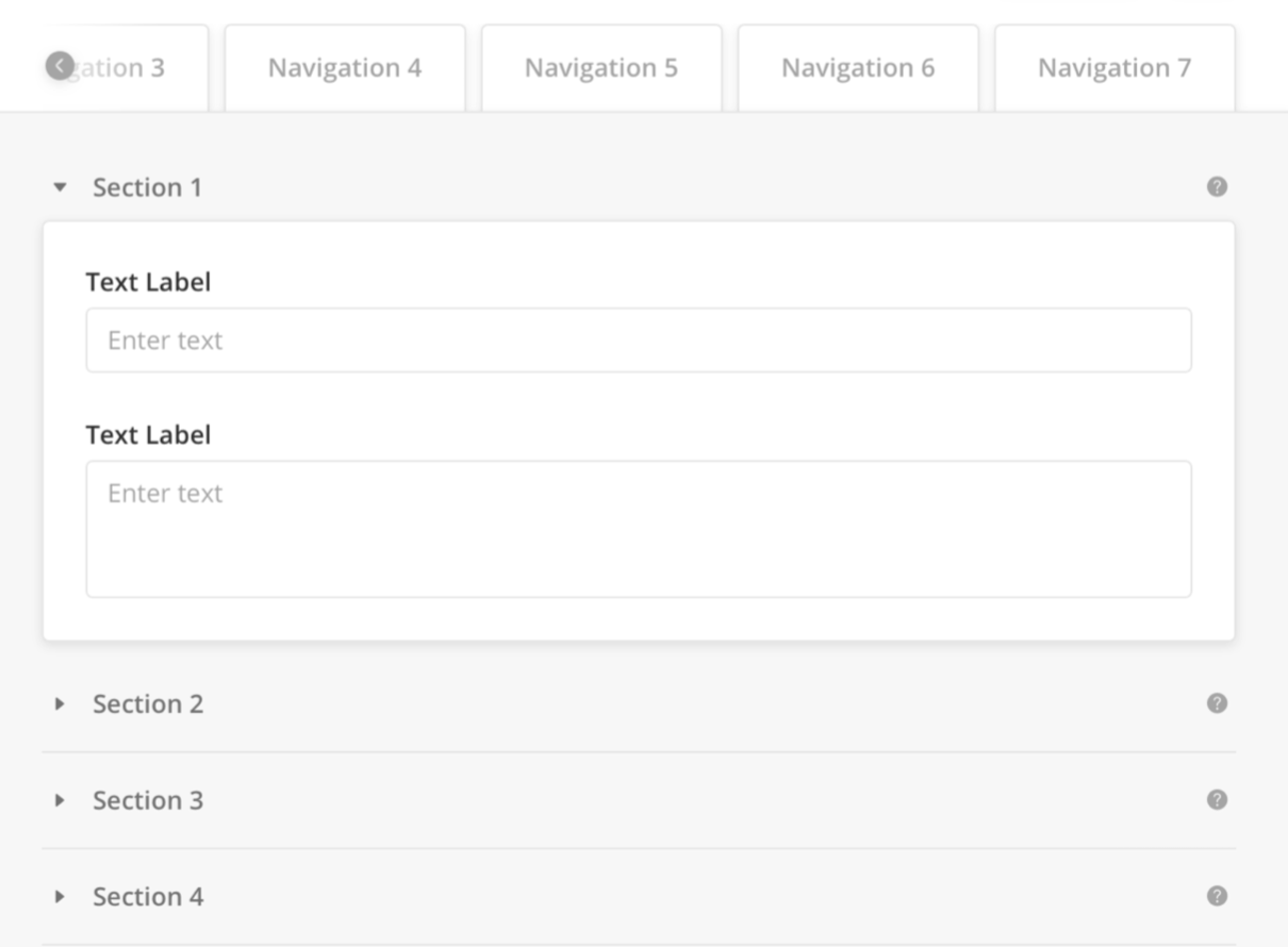 Click to view example for Tabe 1's section inside the Body panel
"body": {
    "children": [
      {
        "children": [
          {
            "children": [
              {
                "children": [
                  {
                    "isRequired": true,
                    "disabled": true,
                    "id": "workOrderId",
                    "label": "Work Order ID",
                    "placeholder": "Auto-generated",
                    "type": "input",
                    "value": "@pageContext.workOrderId",
                    "hoverText": {
                      "title": "Unique, auto-generated Work Order ID"
                    }
                  },
                  {
                    "id": "workorderdescription",
                    "label": "Description (Optional)",
                    "type": "textarea",
                    "value": "@pageContext.workOrderdescription",
                    "placeHolder": "Enter description"
                  }
                ],
                "label": "General Information",
                "id": "workOrdersSection",
                "type": "collapseSection",
                "hoverText": {
                  "title": "informations"
                }
              }
            ],
            "label": "Navigation1",
            "type": "tab"
          },
           {
            "children": [
            ],
            "label": "Navigation 2",
            "type": "tab"
          }
        ],
        "id": "abc",
        "type": "tab"
      }
    ]
  },
For a complete configuration example, see sample JSON with side panel configuration.
To modify, copy the sample JSON code to the page editor and make your changes.
Side panel tabs allow information to be arranged in logical groups via tabs.
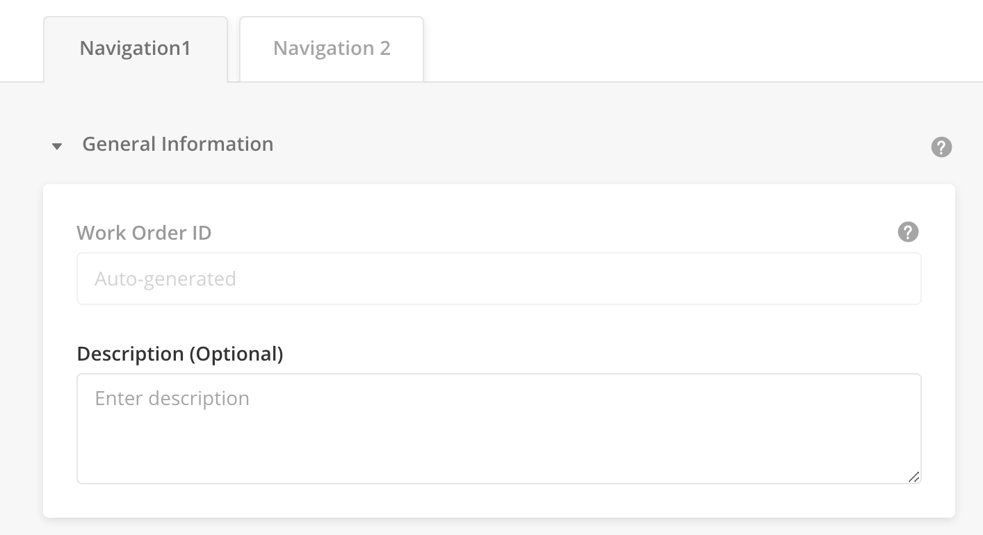
|
Configurations
|
Type |
Key |
Value Tye |
Accepted Value |
Default Value |
Comments |
|---|---|---|---|---|---|
|
Side panel |
id |
String |
|||
|
type |
tab |
||||
|
label |
String |
||||
|
children |
List of components as Array of Object |
Sample JSON
Example for Tab 1 inside the panel Body:
"body": {
      "children": [
         {
        "children": [
          {
            "children": [
              {
                "children": [
                  {//Your component},
                  {//Your Componet}
                ],
                "label": "General Information",
                "id": "workOrdersSection",
                "type": "collapseSection",
                "hoverText": {
                  "title": "informations"
                }
              }
            ],
            "label": "Navigation1",
            "type": "tab"
          }
        ],
        "id": "abc",
        "type": "tab"
      }
    ]
  }
The SLA Clock component allows a user to quickly visualize the status of tasks in different color codes.
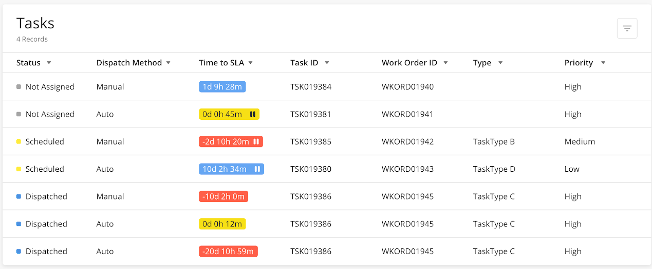
|
Configurations
|
Type |
Key |
Value Type |
Accepted Values |
Default values |
Comments |
|---|---|---|---|---|---|
|
SLA Clock |
Name |
String |
|||
|
isSlaPauseDisplayed |
Boolean |
||||
|
slaTextColor |
String |
||||
|
slaColor |
String |
||||
|
iconUrl |
URL |
||||
|
showLabel |
Boolean |
Sample JSON
{
            "name": "Time to SLA",
            "options": {
              "isSlaPauseDisplayed": "isSlaPaused",
              "flex": 3.5,
              "sortOrder": "ASC",
              "slaTextColor": "slaTextColor",
              "slaColor": "slaColor",
              "sortable": true,
              "zTimer": true,
              "iconUrl": "iconUrl",
              "showLabel": true
            },
            "key": "slaTime"
          }
Tableau View component allows a user to see an embedded view of a tableau dashboard in a Zinier main page. To view the tableau dashboard widget, create a Module of type, “Custom” in a web project. The height and width of the widget are optional.
<is there a screenshot of this component?>
Configuration
|
Type |
Key |
Value Type |
Accepted Value |
Default Value |
Comments |
|---|---|---|---|---|---|
|
Tableau View |
componentType |
String |
Tableau View |
||
|
dashboardUrl |
URL String |
This must be a Tableau URL. |
|||
|
height |
String |
px |
“768px” |
||
|
width |
String |
px |
“1024px” |
Sample JSON
{
  "componentType": "TableauView",
  "dashboardUrl": "https://eu-west-1a.online.tableau.com/t/ziniertableauintegration/views/New-UC1/StandardReportsandDashboards?:size=1024,800&:embed=y&:showVizHome=n&:bootstrapWhenNotified=y&:apiID=host2#1",
“Height”: “768px”,
“Width”: “1024px”
}
Displays text in a page. Text component has 4 variants depending upon the text size and hyperlink:
-
Header text Component.
-
Paragraph text Component.
-
Hyperlink Header Text.
-
Hyperlink Paragraph Text.
Text Component
Configuration: Text Component
|
Type |
Key |
Value Type |
Accepted Values (Case Sensitive) |
Default Value |
Comments |
|---|---|---|---|---|---|
|
text |
type |
String |
default/heading/small/label/subHeading |
||
|
label |
String |
||||
|
value |
String |
||||
|
fontStyle |
String |
bold/italic/underline |
standard |
||
|
alignment |
String |
left/right/center/justify |
left |
||
|
url |
String |
||||
|
value |
String |
Sample JSON Text Component
{
  "id": "text716",
  "disabled": false,
  "hidden": false,
  "required": false,
  "helperText": "",
  "value": "",
  "fontStyle": "standard|bold|italic|underline",
  "alignment": "left|right|center|justify",
  "url": "",
  "type": "text"
}
Info Text Component
Configuration
|
Type |
Key |
Value Type |
Accepted Value |
Default Value |
Comments |
|---|---|---|---|---|---|
|
infoText |
label |
String |
|||
|
value |
String |
Sample JSON Info Text Component
{
  "id": "infoText588",
  "disabled": false,
  "hidden": false,
  "required": false,
  "helperText": "",
  "value": "",
  "type": "infoText"
}
The video viewer component allows the user to view a video file in the side panel. These video files are uploaded by field technicians in a task.

|
Configuration
|
Component |
Type |
Key |
Value Type |
Accepted Values |
Default Values |
Comments |
|---|---|---|---|---|---|---|
|
Video Viewer |
Video Viewer |
src |
URL |
Any valid URL which has a valid video file |
||
|
playerType |
video/audio |
video/audio |
||||
|
id |
String |
any string, number |
||||
|
type |
VideoPlayer |
VideoPlayer |
||||
|
poster |
URL |
Any valid URL which has a valid image file |
Sample JSON
{
  ""id"": ""videoPlayerId_Anything"",
  ""src"": ""https://s3.amazonaws.com/codecademy-content/courses/React/react_video-fast.mp4"",
  ""poster"": ""https://wpclipart.com/blanks/buttons/glossy_buttons/glossy_button_blank_orange_rectangle.png"",
  ""playerType"": ""video"",
  ""type"": ""VideoPlayer""
}"
Dashboard is a layout of multiple Widget components within a main page. A Dashboard layout can be made up of one component or more.
Dashboard layout load multiple components independently. Filters are also applied independently.
Size and position of widget components are rendered based on configuration given by Solution Admin. Widgets can be half width or full width. Position of the widget is dependent on the page definition.
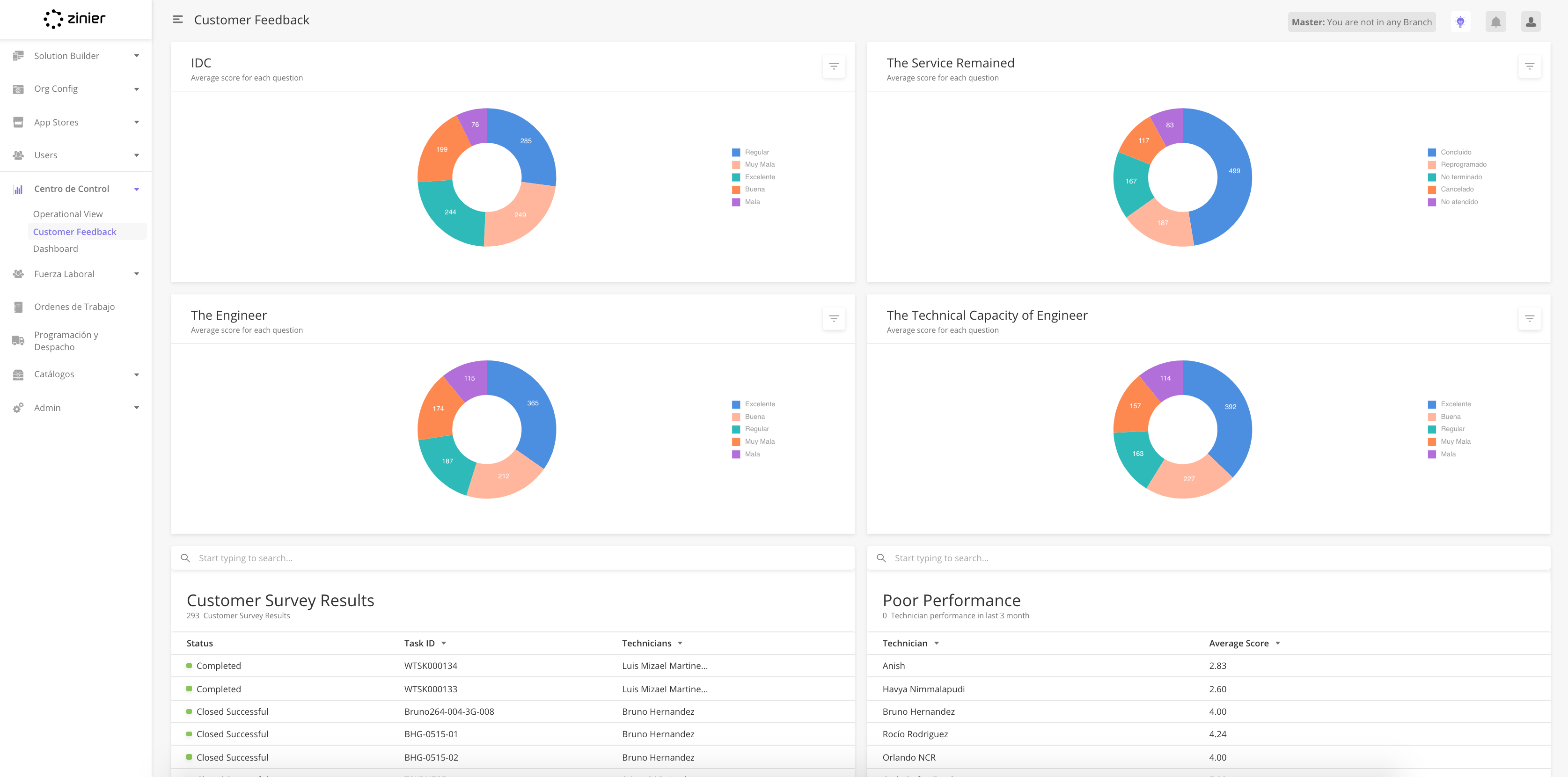
How to add a Dashboard Layout page
Dashboard Layout JSON Structure
Sample JSON
Overview
Widgets are visualizations configured for a web-user to see on the Zinier web platform. They can appear on the main page.
As part of the solution builder, this module allows you to configure widgets that users would see in the Zinier web platform for specific client use cases.
Relationship to other modules
|
Module |
Description |
|---|---|
|
Add Web Widgets into a solution bundle |
List of dashboard widgets
The following dashboard widgets are supported with ISAC Version 19.8
|
Widget |
Description |
|---|---|
|
Data Grid |
Displays Data in a tabular form |
|
Line Chart |
Line chart supports multi-series data |
|
Bar Chart |
Bar Chart that supports multi-series bar chart as well as horizontal and vertical bar chart configuration |
|
Pie Chart |
Display data in % form in a circle |
|
Bubble Chart |
Bubble Chart is a variation of a Scatter Chart that allows you to visualize data in 3 dimensions. |
|
Radar Chart |
Radar allows a user to compare multi-series data in multiple dimensions. |
|
Stream Chart |
Streamgraph displays a stacked area graph for multi-series data over a period of time |
|
Heat Map Chart |
Heat map matrix displays data in the graded color density |
|
Sunburst Chart |
A Sunburst displays hierarchical data, where a level in the hierarchy is represented by a circle. |
|
Scatter Plot Chart |
A scatter plot is a type of plot using Cartesian coordinates to display values for typically two variables for a set of data. |
|
Calendar |
Displays data in a calendar |
|
Map |
Visualize data in a geographical map |
|
Pareto Chart |
A Pareto chart is a type of chart that contains both bars and a line graph, where individual values are represented in descending order by bars, and the cumulative total is represented by the line. |
Each widget component has some attributes which define its look and behavior. Most components have a few attributes common to them.
The following table lists the common attributes required across different widgets.
|
Field |
Type |
Required |
Description |
Example |
|
Name |
string |
Y |
An identifier that is used to specify the type of widget. |
"pieChartForWorkOrders" |
|
widgetType |
string |
Y |
An identifier that is used to specify the type of widget. |
Bar Chart, |
|
minHeight (number : 0-30) |
Number |
Y |
An identifier that is used to specify the minimum height in order for a widget to render. |
Select from the drop-down list 0 to 30 |
|
minWidth (number : 0-12) |
Number |
Y |
An identifier that is used to specify the minimum width in order for a widget to render. |
Select from the drop-down list 0 to 12 |
|
defaultHeight (number : 0-30) |
Number |
Y |
An identifier that is used to specify the height in order for the widget to render. |
Select from the drop-down list 0 to 30 |
|
defaultWidth (number : 0-12) |
Number |
Y |
An identifier that is used to specify the width in order for the widget to render. |
Select from the drop-down list 0 to 12 |
-
From the main page, click Add New to open the side panel.
-
Enter the General Information section of the Web Widget including the Widget Type.

-
Enter the Widget configuration section, which includes the JSON object which contains the widget definition.
-
Set up other display positions of the widget. More details on the required fields are found below.
-
Click Save to close the side panel.
Edit or Delete Web Widgets
-
You can edit or delete a record by hovering over the row of the desired record from the main page table and clicking the Edit icon. When you click Edit, the side panel will appear. Edit the information and click Save. Click the Trash icon to delete the widget.
Fields in the Side Panel
|
Field Name |
Description |
Example |
|---|---|---|
|
Name |
Name of the widget |
Open Work Orders |
|
Description(Optional) |
Describe the data that the widget is supposed to visualize |
All open work orders (As on date) |
|
Widget Type |
Choose from a dropdown list of widgets that is supported by Zinier Web Platform |
Pie Chart |
|
Widget Definition |
JSON field where you can build how the widget would look like. |
{
  "dataSourceId": {
    "sourceType": "query",
    "dataToBeSent": {
      "models": [
        "WorkOrder"
      ],
      "columns": {
        "createdDate": "workOrder.createdDate",
        "id": "WorkOrder.id",
        "label": "WorkOrder.status",
        "value": "count(WorkOrder.status)"
      },
      "inputs": {
        "filter": "%%",
        "priority": []
      },
      "distinct": true,
      "orderBy": "id ASC",
      "groupBy": "label"
    }
  },
  "subTitle": "Total work orders: ",
  "horizontalScroll": false,
  "dataType": "dynamic",
  "dataMap": {
    "valueType": "number",
    "name": "label",
    "id": "id",
    "value": "value"
  },
  "errorDataImage": "/image/widgetErrorData.svg",
  "id": "pieChart1",
  "type": "pieChartWidget",
  "title": "All Work Orders",
  "noDataImage": "/image/widgetNoData.svg",
  "verticalScroll": false
}
|
|
Min Width (1-12) |
Full-screen width is divided into 12 columns, 6 is half screen width |
5 |
|
Min Height (1-15) |
Full-screen height is divided into 30 rows |
10 |
|
Default Width (1-12) |
Full-screen width is divided into 12 columns, 6 is half screen width |
6 |
|
Default Height (1-30) |
Full-screen height is divided into 30 rows |
10 |
|
Default X position (0-12) |
0 represent extreme left and 12 represent extreme right |
2 |
|
Default Y position (Valid positive number) |
0 represent the top and 30 represent bottom |
3 |
Bar Charts enable the User to view data in the form of vertical or horizontal bars, over a given time period. Multi-series Bar Chart is supported by our system.
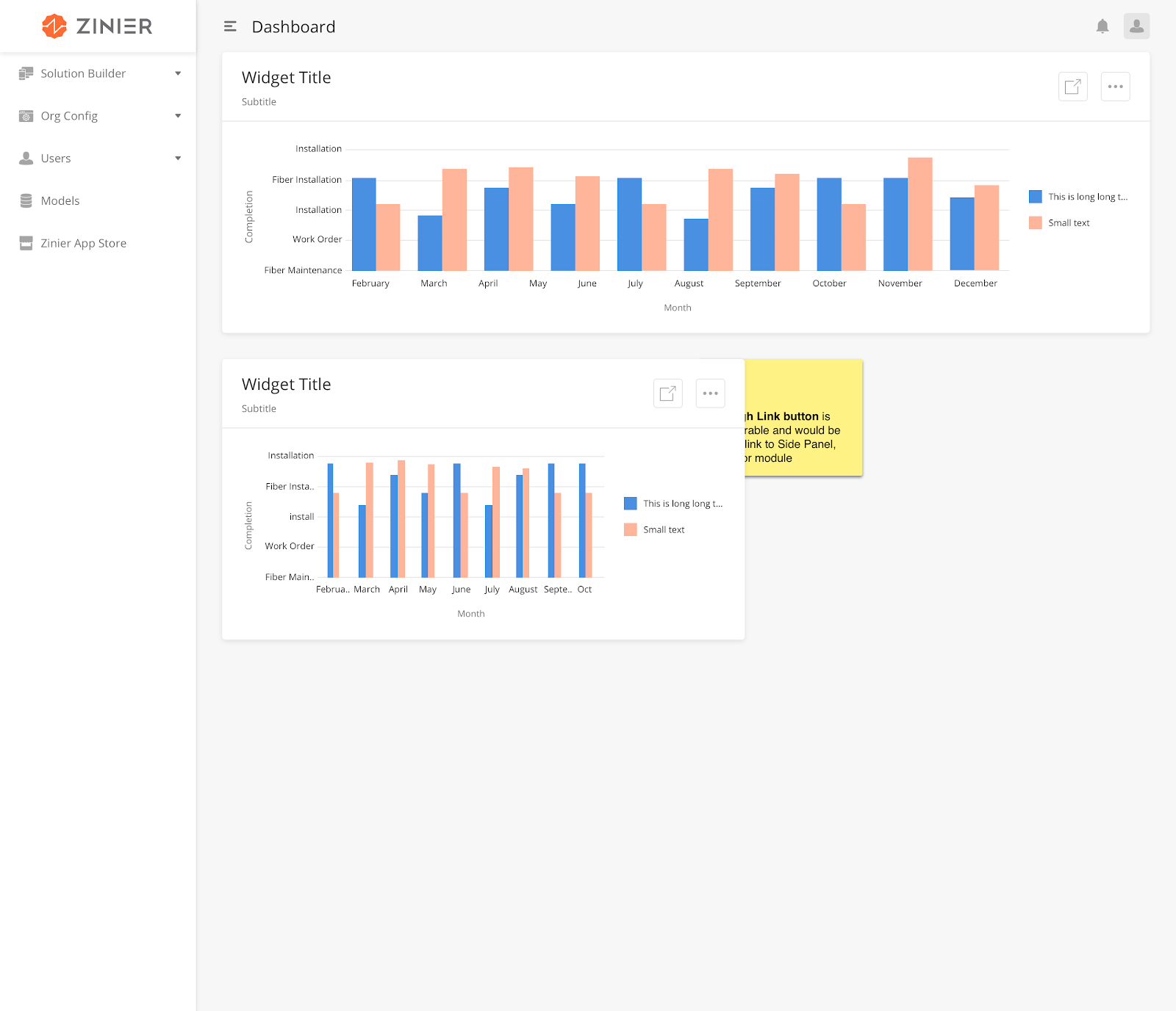
|
How to Configure
|
Field |
Type |
Accepted Inputs / Definition |
Sample |
|
layout |
String |
Horizontal, vertical |
|
|
groupMode |
String |
Stacked, grouped |
|
|
legendTitle |
String |
Any valid string |
|
|
for grouped /stacked mode in multi-series data pass the value as Array in dataMap |
|||
Sample JSON
dataMap: {
        ""valueType"": ""number"",
        ""id"": ""id"",
        ""value"": [
        ""serviceTime"",
        ""totalTimeSpent""
        ]
  }
Bubble Chart is a variation of a Scatter Chart which enables the User to visualize data in 3 dimensions. It’s 3 parameters are - x & y, which determine the position of the bubble on the X/Y axis and z, which determines its size.
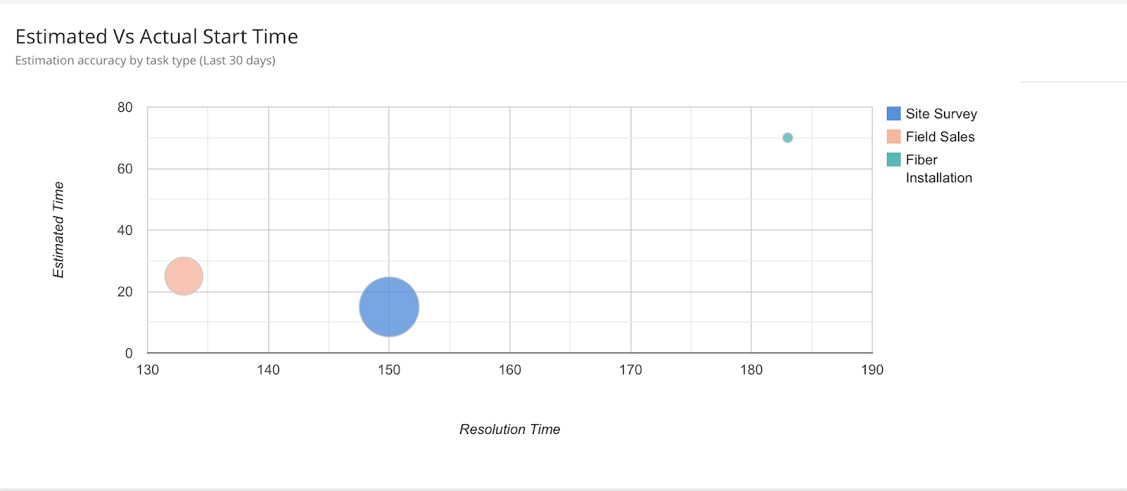
|
How to Configure
|
Field |
Type |
Accepted Inputs/Definition |
Sample |
Comment |
|---|---|---|---|---|
|
dataMap |
JSON |
dataMap key should remain the same to render the chart. |
||
|
xAxisTitle |
string |
Any valid string |
||
|
yAxisTitle |
string |
Any valid string |
"dataMap": {
"bubbleX": "taxAmount",
"bubbleY": "price",
"bubbleSize": "totalAmount",
"bubbleLegends": "workOrderId",
"bubbleName": "status"
},
|
Sample JSON
"{
  ""dataType"": ""static"",
  ""xAxisTitle"": ""This is X Axis"",
  ""errorDataImage"": ""/image/widgetErrorData.svg"",
  ""type"": ""bubbleChartWidget"",
  ""title"": ""Bubble Chart from static data"",
  ""colors"": [],
  ""dataSourceId"": [
        [
        ""ID"",
        ""Life Expectancy"",
        ""Fertility Rate"",
        ""Region"",
        ""Population""
        ],
        [
        ""CAN"",
        80.66,
        0.67,
         ""North America"",
        33739900
        ],
        [
        ""DEU"",
        60.84,
        1.36,
        ""Singapore"",
        81902307
        ],
        [
        ""DNK"",
        78.6,
        1.84,
        ""Europe"",
        5523095
        ],
        [
        ""EGY"",
        72.73,
        2.78,
        ""Middle South"",
        79716203
        ],
        [
        ""GBR"",
        86.05,
        2,
        ""Europe"",
        61801570
        ],
        [
        ""IRN"",
        20.49,
        1.7,
        ""Breexit"",
        73137148
        ],
        [
        ""IRQ"",
        38.09,
        4.77,
        ""Middle East"",
        31090763
        ],
        [
        ""ISR"",
        81.55,
        2.96,
        ""North-east"",
        7485600
        ],
        [
        ""INS"",
        91.55,
        4.96,
        ""Asia"",
        7485600
        ],
        [
        ""APR"",
        40.55,
        3.96,
        ""South"",
        7485600
        ],
        [
        ""RUS"",
        435.6,
        1.54,
        ""Europe"",
        141850000
        ],
        [
        ""USA"",
        45.09,
        2.05,
        ""North America"",
        307007000
        ]
  ],
  ""subTitle"": ""This is a bubble Chart from static data"",
        ""dataMap"": {
        ""bubbleX"": ""taxAmount"",
        ""bubbleY"": ""price"",
        ""bubbleSize"": ""totalAmount"",
        ""bubbleLegends"": ""workOrderId"",
        ""bubbleName"": ""status""
  },
 ""id"": ""bubbleChartWidget"",
  ""noDataImage"": ""/image/widgetNoData.svg"",
  ""yAxisTitle"": ""This is Y Axis"",
  ""verticalScroll"": false
}"
This widget allows data to be displayed in a Calendar.
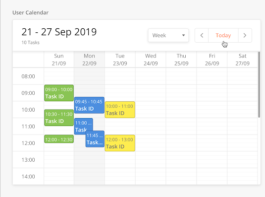
|
How to Configure
|
Field |
Type |
Accepted Input/Definition |
Sample |
Comment |
|---|---|---|---|---|
|
cellShape |
string |
rect, circle |
”cellShape”: ”rect” |
|
|
enableLabels |
boolean |
true, false |
"enableLabels" :false |
Sample JSON
"{
  ""dataSourceId"": {
    ""sourceType"": ""query"",
    ""dataToBeSent"": {
      ""models"": [
        ""workOrderTask"",
        ""ZStatus""
      ],
      ""columns"": {
        ""plannedDate"": ""workOrderTask.plannedDate"",
        ""dueDateTime"": ""workOrderTask.dueDateTime"",
        ""targetModel"": ""ZStatus.targetModel"",
        ""name"": ""ZStatus.name"",
        ""colorCode"": ""ZStatus.colorCode"",
        ""id"": ""ZStatus.id"",
        ""status"": ""ZStatus.name""
      },
      ""orderBy"": ""status ASC""
    }
  },
  ""subTitle"": ""Calendar from query data"",
  ""dataType"": ""dynamic"",
  ""dataMap"": {
    ""backgroundColor"": ""colorCode"",
    ""start"": ""plannedDate"",
    ""end"": ""dueDateTime"",
    ""title"": ""name""
  },
  ""errorDataImage"": ""/image/widgetErrorData.svg"",
  ""id"": ""calendarWidget"",
  ""type"": ""calendarWidget"",
  ""title"": ""CalendarData"",
  ""noDataImage"": ""/image/widgetNoData.svg"",
  ""verticalScroll"": false
}"
The combo chart allows you to combine the features of the bar chart with those of the line chart: you can show the values of one expression as bars while displaying those of another expression as a line or symbols.
Sample JSON
“type”: “comboChart”
Data Grid enables data to be displayed in the form of a table widget. For example, the table in the image below tells the User everything he needs to know about each Spare Part, including - the engineer carrying it as well as the brand and model number of the Spare Part.
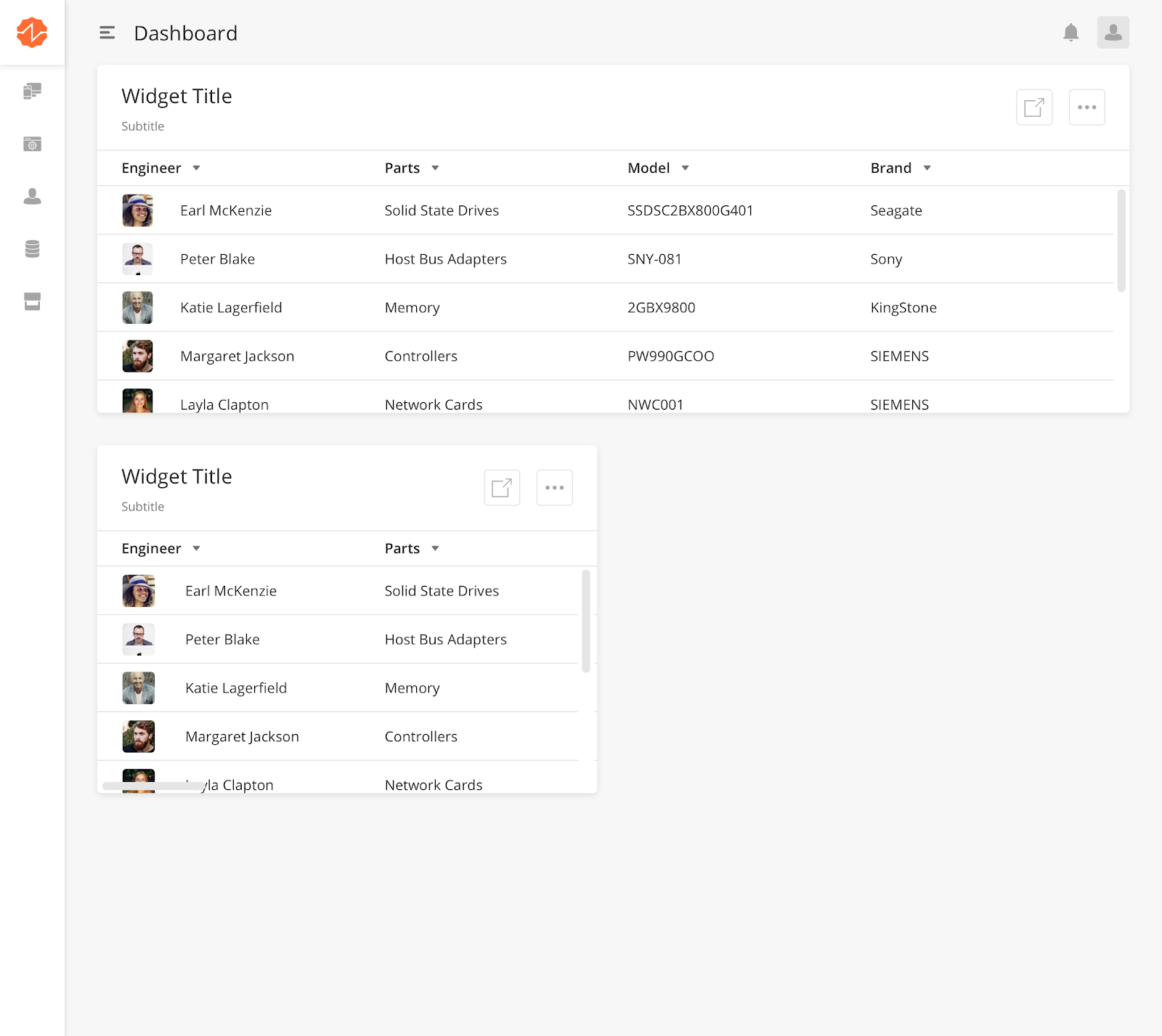
How to Configure
|
Field |
Type |
Accepted Inputs / Definition |
Sample |
|
Id |
String |
A user-defined identifier that is unique to that widget def. |
"id": "showTechPerformance" |
|
jsonDEf |
Object |
This is the JSON definition for dataGrid. This aligns with the dataGrid definition for the main page and side panel. Under jsonDef object the user have to declare the other keys. |
|
|
dataSourceId |
String |
Any valid endpoint to fetch data |
"dataSourceId": "query/read" |
|
dataToBeSent |
Object |
This tells the component to which model and what columns to fetch from backend. |
"dataToBeSent": { "filter": "{$inventoryType}='Spare Part'", "models": [ "Inventory", "stockInventory", "sites" ], "columns": { "inventoryType": "stockInventory.inventoryType", "Inventory": "sum(stockInventory.qtyOnHand)", "LocationName": "sites.name" }, "distinct": true, "groupBy": "LocationName" } |
|
tableHeader |
Array of objects |
What columns the dataGrid should have |
"tableHeader": [{ "name": "Location", "options": { "sortOrder": "ASC", "sortable": true, "showLabel": true }, "key": "LocationName" ] |
|
sourceType |
String |
Type of source to fetch the data - API, query |
"sourceType": "api" |
|
pageContextConfig.infiniteScroll |
Boolean |
To allow the pagination for the dataGrid |
"pageContextConfig": { "infiniteScroll": false } |
|
searchAllowed |
Boolean |
An identifier that is used to indicate whether the dataGrid should have search functionality or not |
"sourceType": "api" |
|
searchKeys |
Array of strings |
What are the columns are searchable |
searchKeys": [ "LocationName" ] |
|
rowTextLength |
Integer |
An identifier that is used to align the columns in equal width to avoid overlapping of text in columns. |
"sourceType": "api" |
Sample JSON
"{
  ""id"": ""showTechPerformance"",
   "type": "dataGrid"
  ""jsonDef"": {Stre
        ""pageContextConfig"": {
        ""infiniteScroll"": false
        },
        ""deleteAllowed"": false,
        ""isScrollAble"": false,
        ""searchAllowed"": false,
        ""searchEmptyScreen"": {
        ""image"": ""https://s3-us-west-2.amazonaws.com/zinier-static/mastec/loc-search-cross.svg"",
        ""contentValue"": ""SORRY! YOUR SEARCH RESULTS CAME UP EMPTY"",
        ""type"": ""noData""
        },
        ""rowActions"": {},
        ""emptyScreen"": {
        ""image"": ""https://s3-us-west-2.amazonaws.com/zinier-static/mastec/doc-clipboard.svg"",
        ""contentValue"": ""YOU DO NOT HAVE ANY RECORDS AVAILABLE AT THIS TIME"",
        ""type"": ""noData""
        },
        ""tableHeader"": [
        {
        ""name"": ""Asset name"",
        ""options"": {
        ""showLabel"": true
        },
        ""key"": ""assetName""
        },
        {
        ""name"": ""age in month"",
        ""options"": {
        ""showLabel"": true
        },
        ""key"": ""month""
        }
        ],
        ""dataToBeSent"": {
        ""processId"": ""168CD14470958BDC"",
        ""apiResponseFormat"": true,
        ""contextVar"": {
        ""userIdFilter"": ""{@userId}""
        },
        ""apiResponseObject"": ""ageList""
        },
        ""dataSourceId"": ""process/start"",
        ""sourceType"": ""api"",
        ""rowTextLength"": 20,
        ""mainFilter"": {},
        ""header"": {
        ""filterAllowed"": true,
        ""subHeaderText"": ""Assets by Age (0-3 m, 3-12m, 12 and above)"",
        ""headerText"": ""Assets by Age"",
        ""children"": []
        },
        ""updateAllowed"": false,
        ""isSelectable"": false,
        ""actions"": [],
        ""searchKeys"": [
        """"
        ]
  }
}"
Dynamic Widget Filters allow the user to apply filters to a widget. Users can add multiple filters. Multiple filters are joined through AND logic. If Dynamic Filter is used, a Static Filter cannot be used.
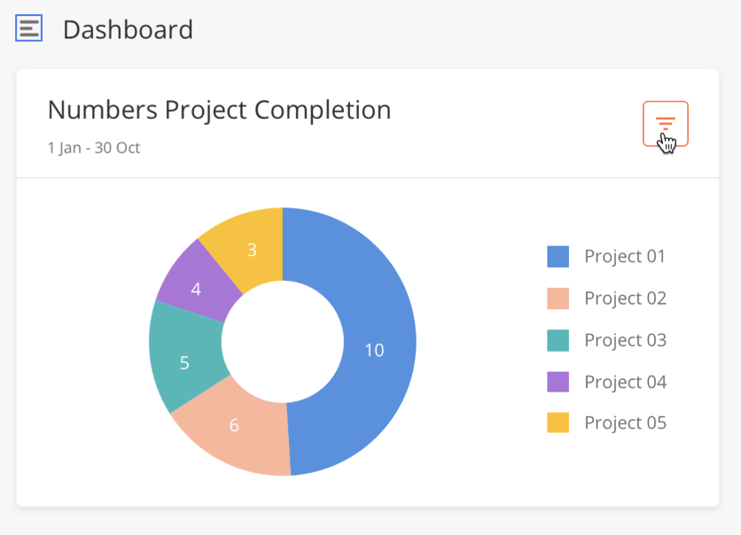
|
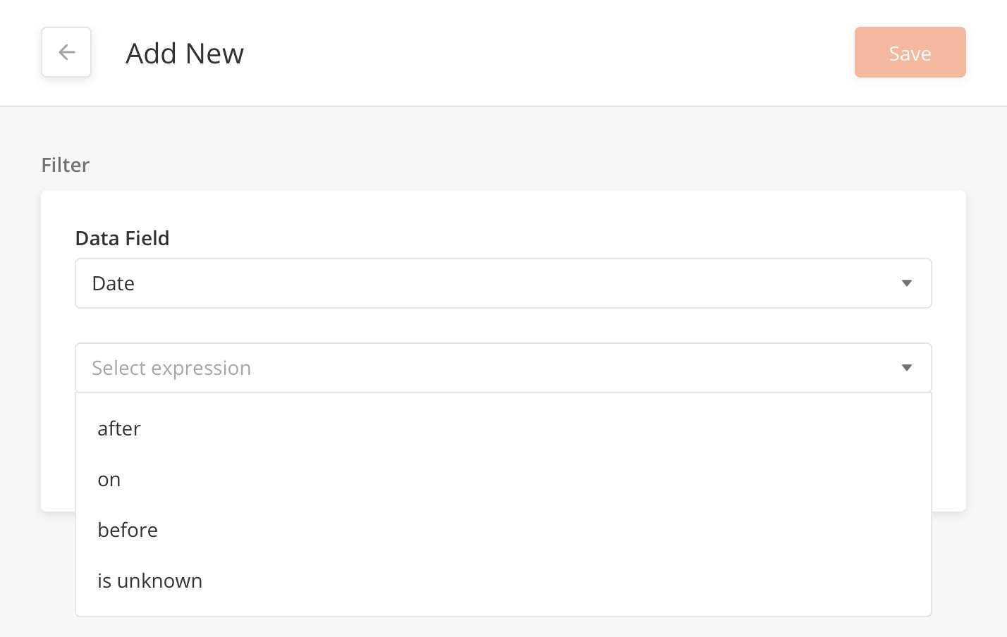
|
Types of data fields supported:
-
Boolean
-
Date range
-
Numeric
-
String
How to Configure
|
Field |
Type |
Required |
Description |
Example |
dynamicFilter |
Array |
Y |
Include the columns that can be filtered and their corresponding data type for that column |
Sample JSON
"dynamicFilter": {
   "mainstatus": "string",
   "workorderPlannedDate": "Date",
   "workOrderPriority": "numeric",
   "modifiedDate": "Date",
   "requestDate": "Date",
   "promisedDate": "Date"
 }
Heatmap Charts display data in a graded color density. It enables the user to get an overall view of the situation of the data being looked at.
|
How to Configure
|
Field |
Type |
Accepted Inputs / Definition |
Sample |
|
cellShape |
string |
rect, circle |
"cellShape": "rect" |
|
enableLabels |
boolean |
true, false |
"enableLabels" :false |
Sample JSON
"{
  ""dataSourceId"": {
    ""subQueryFilter"": [
      {
        ""Daily View"": {
          ""inputs"": {
            ""minDate"": ""2019-02-10"",
            ""maxDate"": ""2019-02-21""
          },
          ""subFilter"": ""{$createdDate} >= {@minDate} and {$createdDate} < {@maxDate}""
        }
      },
      {
        ""Weekly View"": {
          ""inputs"": {
            ""minDate"": ""2019-02-10"",
            ""maxDate"": ""2019-02-21""
          },
          ""subFilter"": ""{$createdDate} >= {@minDate} and {$createdDate} < {@maxDate}""
        }
      },
      {
        ""Monthly View"": {
          ""inputs"": {
            ""minDate"": ""2017-01-01"",
            ""maxDate"": ""2019-02-01""
          },
          ""subFilter"": ""{$createdDate} >= {@minDate} and {$createdDate} < {@maxDate}""
        }
      }
    ],
    ""dataToBeSent"": {
      ""filter"": """",
      ""models"": [
        ""WebWidget""
      ],
      ""columns"": {
        ""minHeight"": ""WebWidget.minHeight"",
        ""defaultX"": ""WebWidget.defaultX"",
        ""createdDate"": ""WebWidget.createdDate"",
        ""defaultHeight"": ""WebWidget.defaultHeight"",
        ""minWidth"": ""WebWidget.minWidth"",
        ""id"": ""WebWidget.id"",
        ""defaultWidth"": ""WebWidget.defaultWidth"",
        ""defaultY"": ""WebWidget.defaultY"",
        ""widgetType"": ""WebWidget.widgetType""
      },
      ""inputs"": {
        ""filter"": ""%%""
      },
      ""distinct"": true,
      ""orderBy"": ""id ASC"",
      ""groupBy"": ""widgetType""
    }
  },
  ""navigation"": [
    ""org config"",
    ""users"",
    ""models"",
    ""solution-builder""
  ],
  ""subTitle"": ""WidgetType"",
  ""dataMap"": {
    ""index"": ""widgetType"",
    ""id"": ""id"",
    ""value"": [
      ""defaultWidth"",
      ""defaultHeight"",
      ""minHeight"",
      ""minWidth""
    ]
  },
  ""dataType"": ""dynamic"",
  ""id"": ""heatMapChart2"",
  ""type"": ""heatMapChartWidget"",
  ""title"": ""Widget Type Stats(heatMapChart)""
}"
Line Chart enables the User to view the data over a period of time. Through this, the User can observe data trends as well as look at a specific data point at a particular point in time. The Line Chart supports multi-series data.
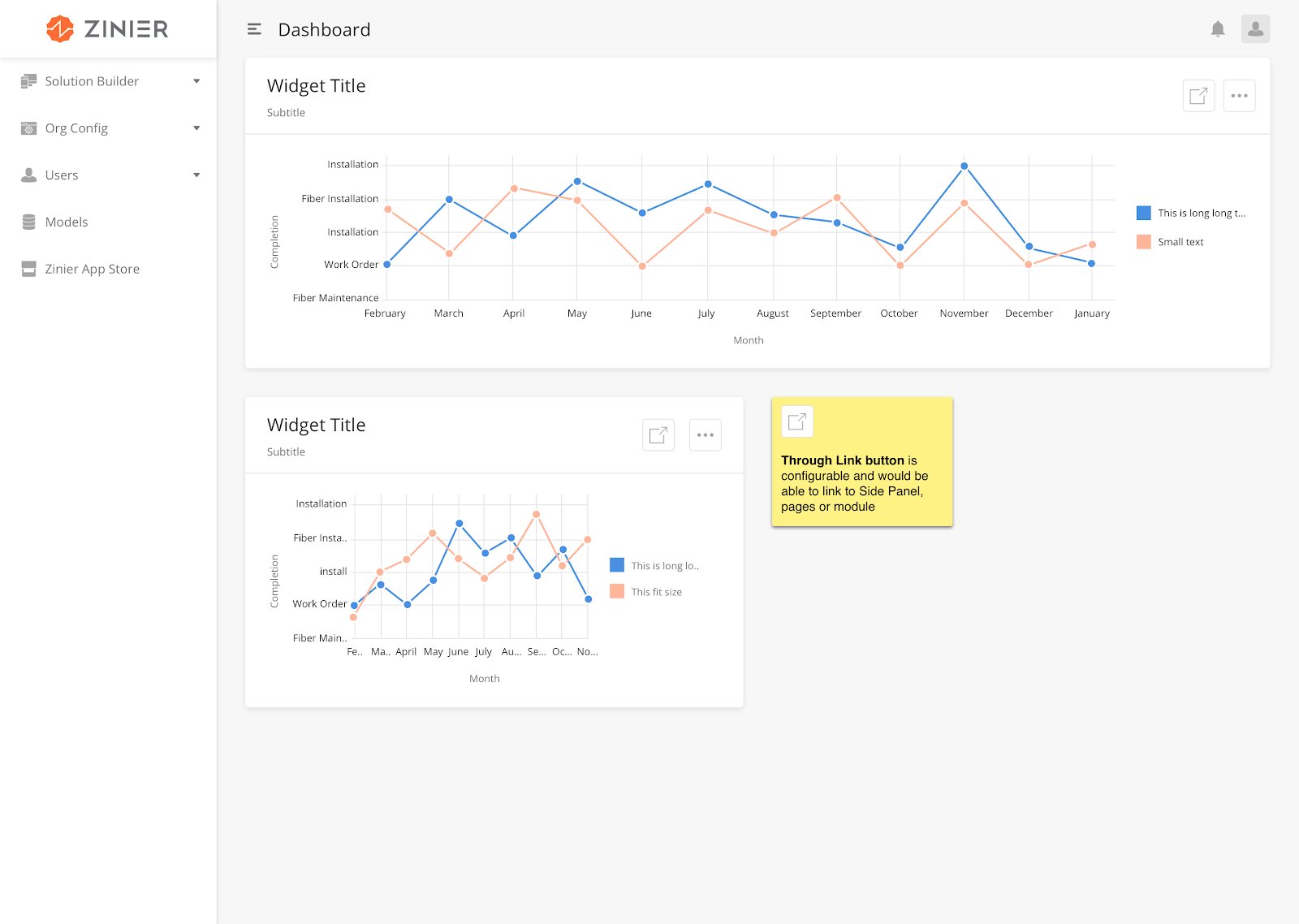
How to Configure
|
Field |
Type |
Accepted Inputs / Definition |
Sample |
|
curve |
String |
Linear, natural |
"curve" : "linear" |
|
stacked |
Boolean |
True/False |
|
|
xAxisLabel |
String |
Any valid string |
|
|
yAxisLabel |
String |
Any valid string |
Sample JSON
dataMap: {
x: "defaultHeight",
y: "defaultWidth",
id: "widgetType"
},
Type: "lineChar”
The User can use this widget to visualize data on a geographical map.
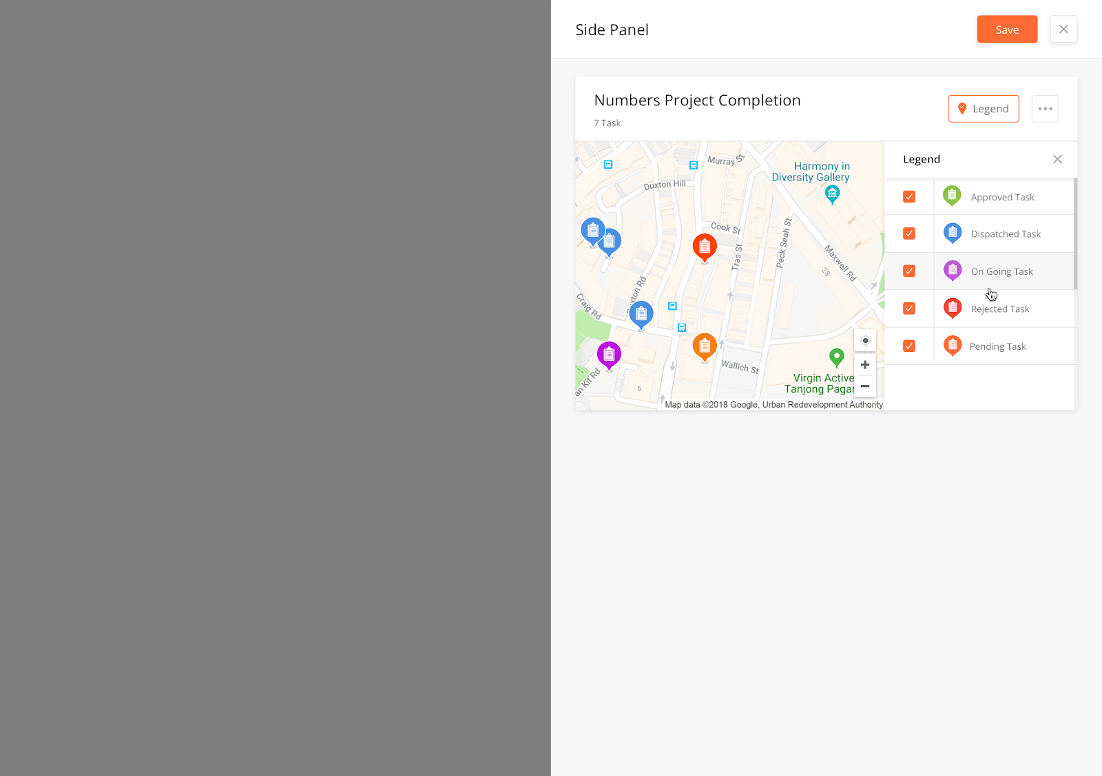
|
How to Configure
|
Field |
Type |
Accepted Inputs / Definition |
Sample |
Note |
|
label |
String |
Any Name |
||
|
lat |
double |
Latitude of the target location to be displayed on the device. |
||
|
long |
double |
Latitude of the target location to be displayed on the device. |
Sample JSON
{
  "containerElementHeight": "30rem",
  "dataSourceId": {
    "dataToBeSent": {
      "filter": "{$latitude} !='0' and {$longitude} !='0'",
      "models": [
        "userSettings",
        "User"
      ],
      "columns": {
        "latitude": "User.latitude",
        "userId": "userSettings.userId",
        "Name": "User.name",
        "longitude": "User.longitude"
      },
      "groupBy": "Name"
    }
  },
  "defaultZoom": 8,
  "preserveViewport": false,
  "fieldsToShow": {
    "Name": true
  },
  "label": "Workforce Location",
  "id": "map",
  "type": "mapWidget",
  "renderType": "location",
  "mapElementHeight": "100%"
}
Pie Charts display data to the Users in the form of percentages, as portions of a circle (pie).
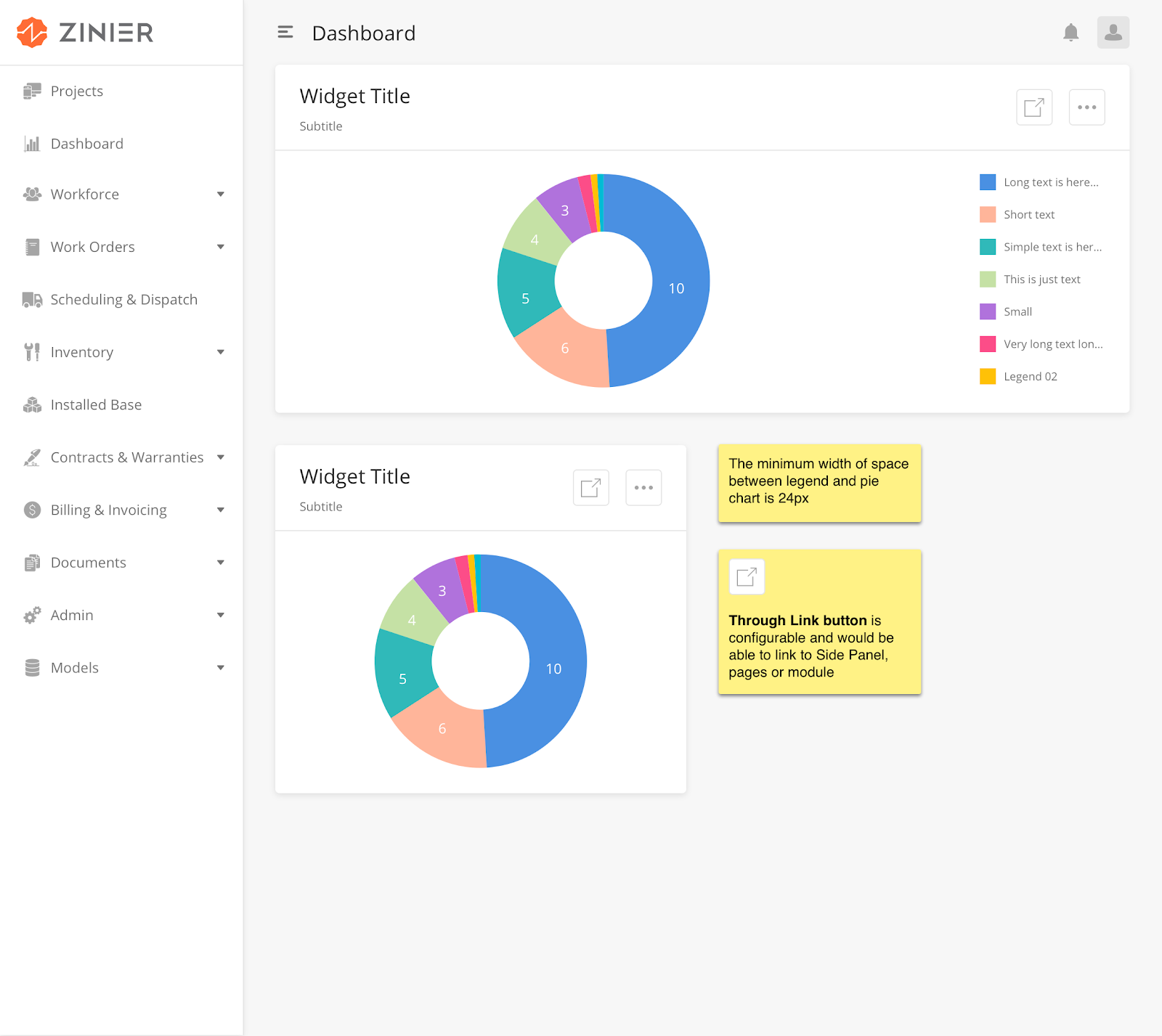
|
How to Configure
|
Field |
Type |
Accepted Input / Definition |
Sample |
|---|---|---|---|
|
dataMap |
JSON |
Horizontal, vertical |
"dataMap": {
"valueType": "number or percentage",
"name": "label",
"id": "id",
"value": "value"
}
|
Sample JSON
"dataMap"": {   ""valueType"": ""percentage"",   ""name"": ""label"",

   ""id"": ""id"",   ""value"": ""value""} "

“type”: “pieChartWidget”
Radar Chart enables the User to compare multi-series data across many different dimensions. The User is thus able to better evaluate the position/health of the data being considered.
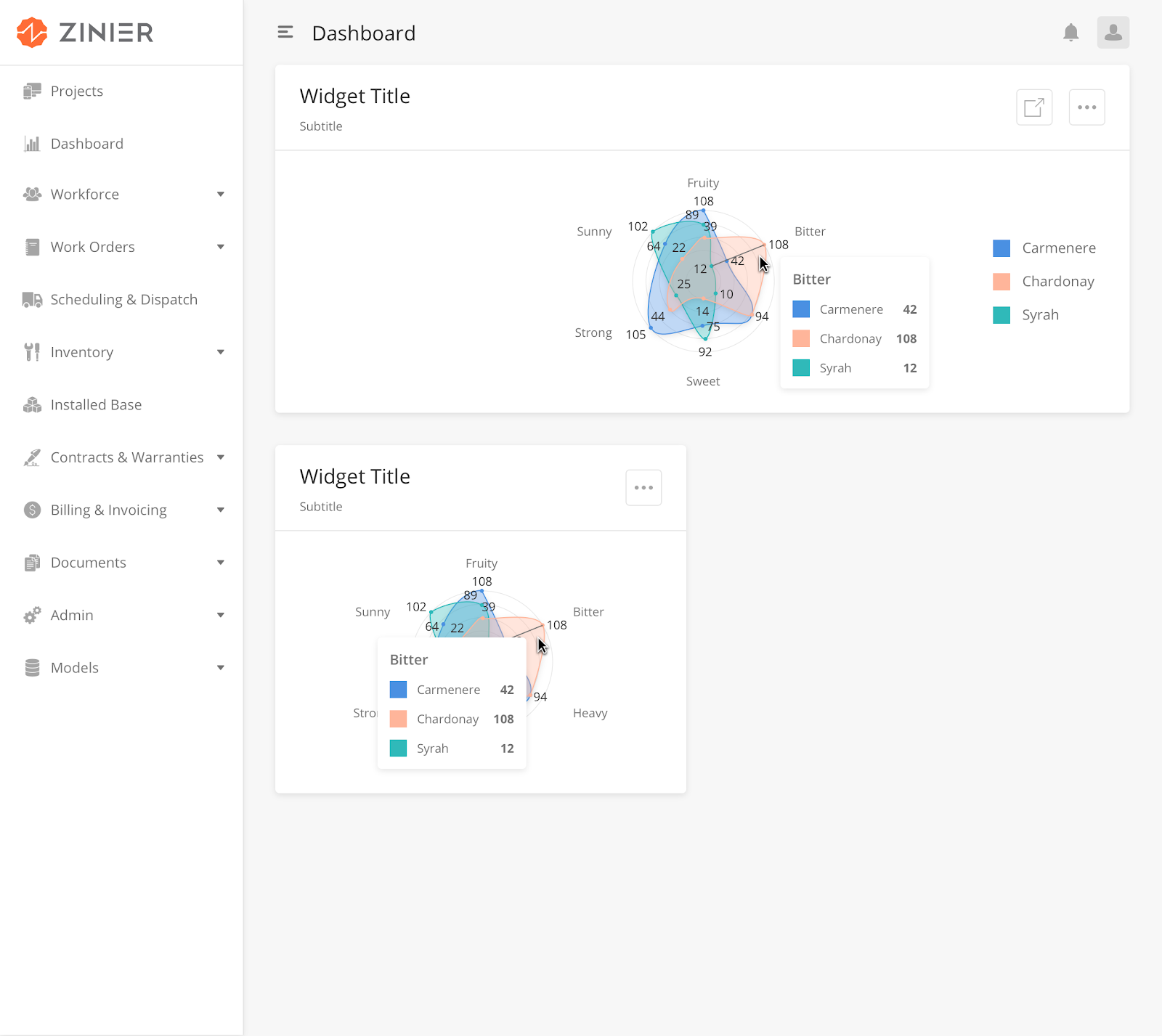
How to Configure
|
Field |
Type |
Accepted Inputs / Definition |
Sample |
|
curve |
string |
linearClosed, basisClosed, cardinalClosed |
"curve" : "linearClosed" |
|
gridShape |
string |
circular, linear |
"gridShape" : "circular" |
Sample JSON
"{
  ""dataSourceId"": {
        ""dataToBeSent"": {
        ""filter"": """",
        ""models"": [
        ""workOrderResource""
        ],
        ""columns"": {
        ""taxRate"": ""workOrderResource.taxRate"",
        ""totalAmount"": ""workOrderResource.totalAmount"",
        ""amount"": ""workOrderResource.amount"",
        ""price"": ""workOrderResource.price"",
        ""tax"": ""workOrderResource.tax""
        },
        ""inputs"": {
        ""filter"": ""%%""
        },
        ""distinct"": true,
        ""groupBy"": ""taxRate""
        }
  },
  ""subTitle"": ""WidgetType"",
  ""dataMap"": {
        ""value2"": ""price"",
        ""value1"": ""totalAmount"",
        ""value3"": ""amount"",
        ""index"": ""taxRate"",
        ""id"": ""id""
  },
  ""dataType"": ""dynamic"",
  ""id"": ""radarchart1"",
  ""type"": ""radarChartWidget"",
  ""title"": ""Widget Type Stats""
}"
A scatter plot is a type of plot which uses Cartesian coordinates to display values for typically two variables for a data set. If the points are color-coded, one additional variable can be displayed. The data is displayed as a collection of points, each having the value of one variable determining the position on the horizontal axis and the value of the other variable determining the position on the vertical axis.
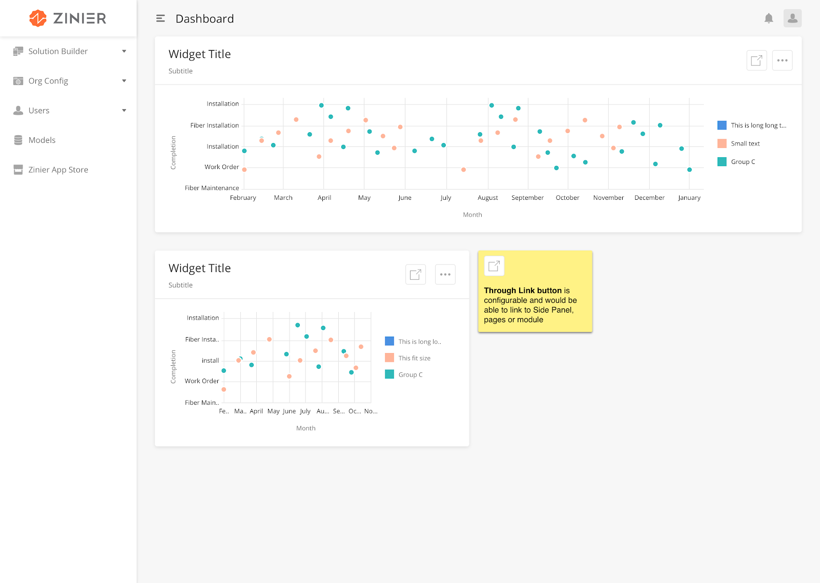
How to Configure
|
Key |
Value Type |
Accepted Inputs (Case Sensitive) |
Default Value |
Comment |
|
id |
String |
Any value |
||
|
type |
String |
"type"": ""scatterPlotChart" |
||
|
title |
String |
title"": ""ScatterPlot Title(scatterPlotDynamic)" |
||
|
title |
String |
"title"": ""Planned Tasks" |
||
|
dataType |
String |
"dataType"": ""dynamic" |
||
|
dataMap |
JSON Object |
"dataMap"": { ""x"": ""defaultWidth"", ""y"": ""defaultHeight"", ""id"": ""widgetType"" } |
Sample JSON
"{
  ""dataSourceId"": {
    ""subQueryFilter"": [
      {
        ""new Daily View to test the ticket and now checking for the maximum length value in the ticket for validation of the same"": {
          ""inputs"": {
            ""minDate"": ""2019-02-19"",
            ""maxDate"": ""2019-02-21""
          },
          ""subFilter"": ""{$createdDate} >= {@minDate} and {$createdDate} < {@maxDate}""
        }
      },
      {
        ""new Weekly View to test the ticket "": {
          ""inputs"": {
            ""minDate"": ""2019-02-10"",
            ""maxDate"": ""2019-02-21""
          },
          ""subFilter"": ""{$createdDate} >= {@minDate} and {$createdDate} < {@maxDate}""
        }
      },
      {
        ""Monthly View"": {
          ""inputs"": {
            ""minDate"": ""2017-01-01"",
            ""maxDate"": ""2019-02-01""
          },
          ""subFilter"": ""{$createdDate} >= {@minDate} and {$createdDate} < {@maxDate}""
        }
      }
    ],
    ""dataToBeSent"": {
      ""filter"": """",
      ""models"": [
        ""WebWidget""
      ],
      ""columns"": {
        ""createdDate"": ""WebWidget.createdDate"",
        ""defaultHeight"": ""WebWidget.defaultHeight"",
        ""id"": ""WebWidget.id"",
        ""defaultWidth"": ""WebWidget.defaultWidth"",
        ""widgetType"": ""WebWidget.widgetType""
      },
      ""inputs"": {
        ""filter"": ""%%""
      },
      ""orderBy"": ""id ASC""
    }
  },
  ""navigation"": [
    ""Users""
  ],
  ""staticMap"": {
    ""x"": ""defaultWidth"",
    ""y"": ""defaultHeight"",
    ""id"": ""id""
  },
  ""subTitle"": ""ScatterPlot Sub Title"",
  ""dataType"": ""dynamic"",
  ""dataMap"": {
    ""x"": ""defaultWidth"",
    ""y"": ""defaultHeight"",
    ""id"": ""widgetType""
  },
  ""id"": ""scatterPlotChart1"",
  ""type"": ""scatterPlotChart"",
  ""title"": ""ScatterPlot Title(scatterPlotDynamic)""
}"
Static filters allow users to filter a widget through preconfigured filters defined in the widget definition. If StaticFilter is used, Dynamic Filter cannot be used.
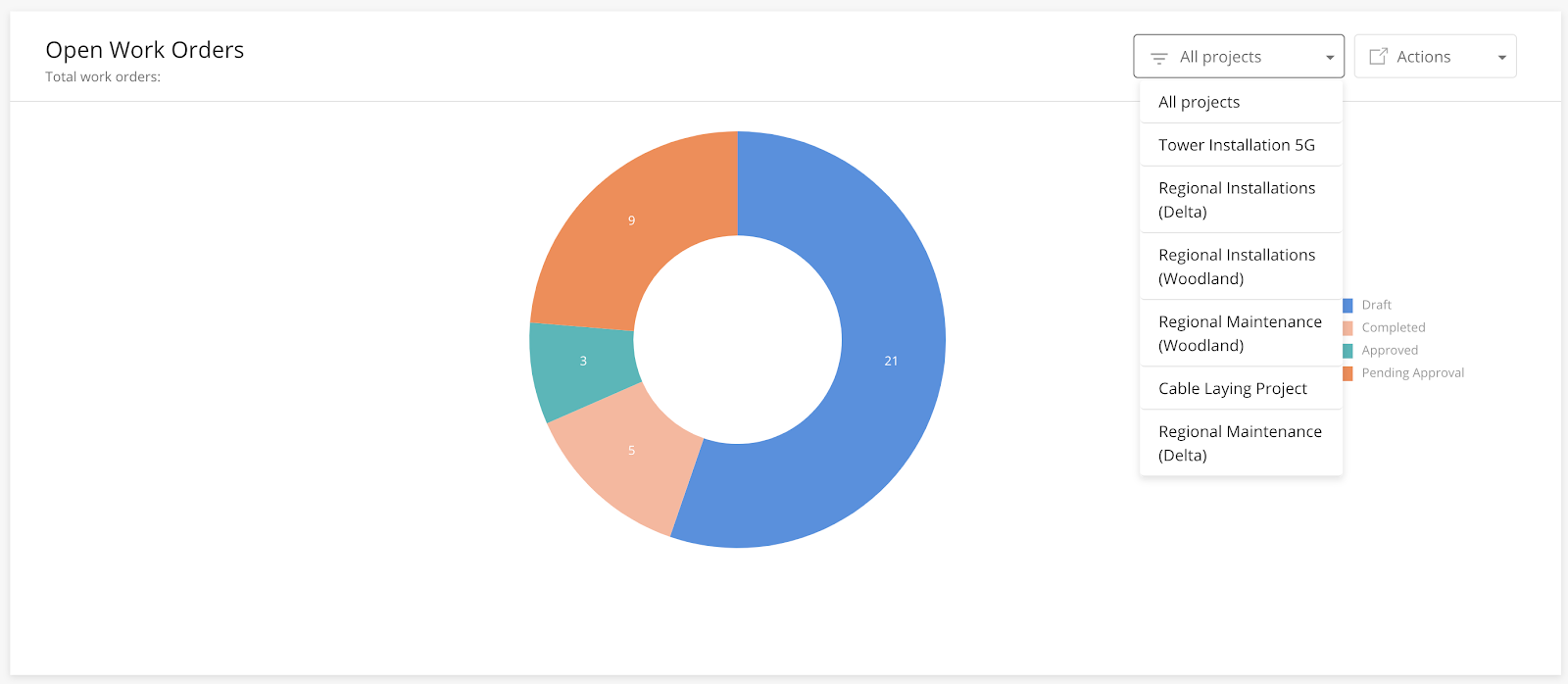
How to Configure
|
Field |
Type |
Required |
Description |
Example |
|
subQueryFilter |
Array |
Y |
Include the preconfigured filters into the array. |
Daily,Monthly, Yearly view |
Sample JSON
"subQueryFilter": [
     {
       "Daily View": {
         "inputs": {
           "minDate": "2019-02-19",
           "maxDate": "2019-09-21"
         },
         "subFilter": "{$createdDate} >= {@minDate} and {$createdDate} < {@maxDate}"
       }
     },
     {
       "Weekly View": {
         "inputs": {
           "minDate": "2019-02-10",
           "maxDate": "2019-04-21"
         },
         "subFilter": "{$createdDate} >= {@minDate} and {$createdDate} < {@maxDate}"
       }
     },
     {
       "Monthly View": {
         "inputs": {
           "minDate": "2017-01-01",
           "maxDate": "2019-09-22"
         },
         "subFilter": "{$createdDate} >= {@minDate} and {$createdDate} < {@maxDate}"
       }
     }
   ]
Stream Chart displays a stacked area graph for multi-series data over a period of time.
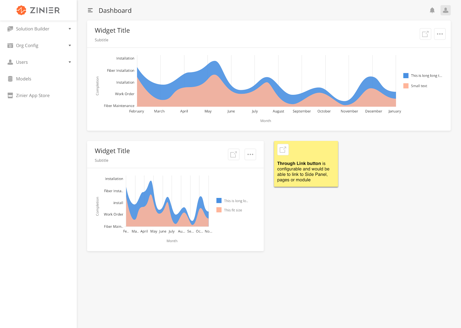
How to Configure
|
Field |
Type |
Accepted Input / Definition |
Sample |
|---|---|---|---|
|
curve |
string |
linear, natural |
“curve”: “linear” |
Sample JSON
"{
  ""dataSourceId"": {
    ""subQueryFilter"": [
      {
        ""Daily"": {
          ""inputs"": {
            ""minDate"": ""2019-02-19"",
            ""maxDate"": ""2019-02-21""
          },
          ""subFilter"": ""{$createdDate} >= {@minDate} and {$createdDate} < {@maxDate}""
        }
      },
      {
        ""Weekly"": {
          ""inputs"": {
            ""minDate"": ""2019-02-10"",
            ""maxDate"": ""2019-02-21""
          },
          ""subFilter"": ""{$createdDate} >= {@minDate} and {$createdDate} < {@maxDate}""
        }
      }
    ],
    ""dataToBeSent"": {
      ""filter"": """",
      ""models"": [
        ""WebWidget""
      ],
      ""columns"": {
        ""defaultHeight"": ""WebWidget.defaultHeight"",
        ""id"": ""WebWidget.id"",
        ""defaultWidth"": ""WebWidget.defaultWidth"",
        ""widgetType"": ""WebWidget.widgetType""
      },
      ""inputs"": {
        ""filter"": ""%%""
      }
    }
  },
  ""navigation"": [
    ""App storES""
  ],
  ""subTitle"": ""WidgetType"",
  ""dataMap"": {
    ""id"": ""id"",
    ""value"": [
      ""defaultHeight"",
      ""defaultWidth""
    ]
  },
  ""dataType"": ""dynamic"",
  ""id"": ""streamchart2"",
  ""type"": ""streamChartWidget"",
  ""title"": ""WebWidget Type Stats(streamChart_dynamic)""
}"
A Sunburst displays hierarchical data, where every level in the hierarchy is represented by a circle. The center represents the root node of the tree. The visualization bears a resemblance to both the Treemap and Pie Charts.
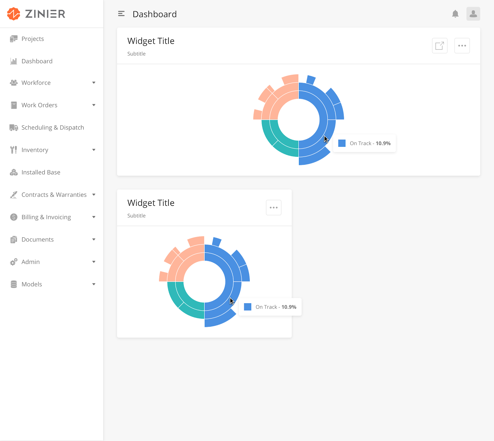
|
How to Configure
|
Key |
Value Type |
Accepted Values (Case Sensitive) |
Default Value |
Comments |
|
id |
String |
"id"": ""widgetType" |
||
|
type |
String |
type"": ""sunburstChartWidget" |
||
|
title |
String |
"title"": ""Sunburst chart title" |
||
|
widgetSize |
String |
"widgetSize"": ""medium" |
||
|
subTitle |
String |
"subTitle"": ""Sunburst chart sub title" |
||
|
dataType |
String |
"dataType"": ""dynamic" |
||
|
dataMap |
JSON Object |
"dataMap"": { ""valueType"": ""number"", ""id"": ""widgetType"", ""value"": ""defaultWidth"" } |
Sample JSON
"{
  ""dataSourceId"": {
    ""subQueryFilter"": [
      {
        ""Daily View"": {
          ""inputs"": {
            ""minDate"": ""2019-02-19"",
            ""maxDate"": ""2019-02-21""
          },
          ""subFilter"": ""{$createdDate} >= {@minDate} and {$createdDate} < {@maxDate}""
        }
      },
      {
        ""Weekly View"": {
          ""inputs"": {
            ""minDate"": ""2019-02-10"",
            ""maxDate"": ""2019-02-21""
          },
          ""subFilter"": ""{$createdDate} >= {@minDate} and {$createdDate} < {@maxDate}""
        }
      },
      {
        ""Monthly View"": {
          ""inputs"": {
            ""minDate"": ""2017-01-01"",
            ""maxDate"": ""2019-02-21""
          },
          ""subFilter"": ""{$createdDate} >= {@minDate} and {$createdDate} < {@maxDate}""
        }
      }
    ],
    ""dataToBeSent"": {
      ""filter"": """",
      ""models"": [
        ""WebWidget""
      ],
      ""columns"": {
        ""createdDate"": ""WebWidget.createdDate"",
        ""defaultHeight"": ""WebWidget.defaultHeight"",
        ""id"": ""WebWidget.id"",
        ""defaultWidth"": ""WebWidget.defaultWidth"",
        ""widgetType"": ""WebWidget.widgetType""
      },
      ""inputs"": {
        ""filter"": ""%%""
      },
      ""distinct"": true,
      ""orderBy"": ""id ASC"",
      ""groupBy"": ""widgetType""
    }
  },
  ""navigation"": [
    ""Users""
  ],
  ""subTitle"": ""Sunburst chart sub title"",
  ""dataType"": ""dynamic"",
  ""dataMap"": {
    ""valueType"": ""number"",
    ""id"": ""widgetType"",
    ""value"": ""defaultWidth""
  },
  ""errorDataImage"": ""/image/widgetErrorData.svg"",
  ""widgetSize"": ""medium"",
  ""type"": ""sunburstChartWidget"",
  ""title"": ""Sunburst chart title"",
  ""noDataImage"": ""/image/widgetNoData.svg""
}"
Overview
Page Editor allows solutions admin to build web pages in JSON, validate what they have built and preview how the page will look like. Page Editor also allows solutions admins to link actual models (adding data models) into the main page.
Edit Web Page with Page Editor
-
To use the Page Editor, Users can also enter the Page Editor directly by clicking on Web Projects > Page Editor.
-
Edit the Web Page by editing the JSON page definition
-
You can choose the Model underlying the Web Page.
-
You can add or delete components,actions, JsLibs and Data Source used in the page def from the panels on the right side of the Page Editor.
-
Click on 'Reset' to reset to an empty page. You cannot undo this action.
-
Click on Show Preview to view how the current page looks like.
-
Click on Copy PageDef to copy the existing page definition. You must manually copy over the edited page definition into the Web Page side panel, in order to lock down the edits done on the Page Editor.
Andrew “Probably worth having an entire section dedicated to the advanced features in Datagrids. We could also put this in the reference guide -- but this would cover creating data filters, filtering data access by group, and importing/exporting data using the data manager.”
Is this similar to https://zinier.atlassian.net/wiki/spaces/kb205/pages/861668264/Localisation+Best+practices?
Add-On Components are added on to a Base Component or a Widget Component as an add-on functionality. These components cannot exist on their own.
Overview
We have built this up for allowing the user to apply Dynamic table filters on Main page Data-Grid only from the selected column names added in the webpage JSON def.
For the dynamic filters to work correctly, id has to be added in the widget definition.
To enable dynamic table filter on the main page, we need two keys:
-
enableSidePanelFilter- its boolean keyword(i.e. true/false)
-
Dynamic filter - it’s an object type that has key-value pairs where column names from the dataTobeSent query as Key of an object on which we want to apply dynamic filters and their data types as the value of the key.
Note:Dynamic table filters have priority over the predefined table filter.
Dynamic table filter will only work for selected conditions only so make sure you have selected at least one condition from filters data-grid.
Sample JSON Definition
{
  "deleteAllowed": true,
  "isScrollAble": true,
  "id":"sampleWidgetDefinition",
  "dynamicFilter": {
    "mainstatus": "string",
    "workorderPlannedDate": "Date",
    "workOrderPriority": "numeric",
    "modifiedDate": "Date",
    "requestDate": "Date",
    "promisedDate": "Date"
  },
  "searchAllowed": true,
  "tableWidth": "150rem",
  "searchEmptyScreen": {
    "image": "https://s3-us-west-2.amazonaws.com/zinier-static/mastec/loc-search-cross.svg",
    "contentValue": "SORRY! YOUR SEARCH RESULTS CAME UP EMPTY",
    "type": "noData"
  },
  "rowActions": {
    "children": [
      {
        "activeIcon": "https://d122pusslfmuhu.cloudfront.net/field-service-elements/icons/edit-orange.svg",
        "hidden": {
          "mainstatus": "Completed"
        },
        "name": "edit",
        "icon": "https://s3.ap-south-1.amazonaws.com/zinier2/pencil.svg",
        "tooltip": "Edit",
        "actionOnClick": "updateWorkOrdersSidePanel",
        "type": "buttonIcon"
      },
      {
        "activeIcon": "https://d122pusslfmuhu.cloudfront.net/field-service-elements/icons/result-orange.svg",
        "hidden": {
          "mainstatus": [
            "Draft",
            "Pending Approval",
            "Rejected",
            "Approved",
            "Copy"
          ]
        },
        "name": "viewResults",
        "icon": "https://d122pusslfmuhu.cloudfront.net/field-service-elements/result-grey.svg",
        "tooltip": "Results",
        "actionOnClick": "@actions.viewCompletedWorkOrderSidePanel",
        "type": "buttonIcon"
      },
      {
        "activeIcon": "https://d122pusslfmuhu.cloudfront.net/field-service-elements/icons/documents-orange.svg",
        "hidden": {
          "mainstatus": "Completed"
        },
        "name": "Duplicate",
        "icon": "https://cdn.zeplin.io/5bb3375b174bc973cb7959d4/assets/4DEC5631-CC61-4B46-9BF1-65B4F104256B.png",
        "tooltip": "Duplicate",
        "actionOnClick": [
          "@actions.getWorkOrderId",
          "@actions.refreshDataGrid1",
          "@actions.openDuplicatePanel"
        ],
        "type": "buttonIcon"
      },
      {
        "activeIcon": "@iconlib.TrashOrange",
        "name": "delete",
        "icon": "@iconlib.TrashGray",
        "tooltip": "Delete",
        "actionOnClick": "@actions.deleteModal",
        "type": "buttonIcon"
      }
    ]
  },
  "emptyScreen": {
    "image": "https://s3-us-west-2.amazonaws.com/zinier-static/mastec/doc-clipboard.svg",
    "contentValue": "YOU DO NOT HAVE ANY RECORDS AVAILABLE AT THIS TIME",
    "type": "noData"
  },
  "tableHeader": [
    {
      "name": "Id",
      "options": {
        "hidden": true,
        "flex": 3,
        "showLabel": false
      },
      "key": "id",
      "primaryKey": true
    },
    {
      "name": "Status",
      "options": {
        "flex": 3,
        "sortOrder": "ASC",
        "colorCode": "mainstatusColor",
        "sortable": true,
        "showLabel": true
      },
      "key": "mainstatus"
    },
    {
      "name": "Work Order ID",
      "options": {
        "flex": 3.5,
        "sortOrder": "ASC",
        "sortable": true,
        "showLabel": true
      },
      "key": "workOrderId"
    },
    {
      "name": "Type",
      "options": {
        "flex": 3.5,
        "sortOrder": "ASC",
        "sortable": true,
        "showLabel": true
      },
      "key": "workOrderTypeName"
    },
    {
      "name": "Priority",
      "options": {
        "flex": 3,
        "sortOrder": "ASC",
        "sortable": true,
        "showLabel": true
      },
      "key": "priorityName"
    },
    {
      "name": "Customer",
      "options": {
        "flex": 3,
        "sortOrder": "ASC",
        "sortable": true,
        "showLabel": true
      },
      "key": "customerName"
    },
    {
      "name": "Project",
      "options": {
        "flex": 3,
        "sortOrder": "ASC",
        "sortable": true,
        "showLabel": true
      },
      "key": "projectId"
    },
    {
      "name": "Requested Date",
      "options": {
        "flex": 3,
        "sortOrder": "ASC",
        "sortable": true,
        "type": "date",
        "showLabel": true
      },
      "key": "requestDate"
    },
    {
      "name": "Promised Date",
      "options": {
        "flex": 3,
        "sortOrder": "ASC",
        "sortable": true,
        "type": "date",
        "showLabel": true
      },
      "key": "promisedDate"
    },
    {
      "name": "Planned Date",
      "options": {
        "flex": 3,
        "sortOrder": "ASC",
        "sortable": true,
        "type": "date",
        "showLabel": true
      },
      "key": "workorderPlannedDate"
    },
    {
      "name": "Revised Date",
      "options": {
        "flex": 3,
        "sortOrder": "ASC",
        "sortable": true,
        "type": "date",
        "showLabel": true
      },
      "key": "revisedDate"
    }
  ],
  "dataToBeSent": {
    "models": [
      "WorkOrder",
      "ZStatus",
      "workOrderTypes",
      "customer"
    ],
    "columns": {
      "priorityName": "WorkOrder.priorityName",
      "mainstatus": "WorkOrder.status",
      "slaId": "WorkOrder.slaId",
      "workOrderType": "WorkOrder.workOrderType",
      "mainstatusColor": "ZStatus.colorCode",
      "revisedDate": "WorkOrder.modifiedDate",
      "contract": "WorkOrder.contract",
      "customerName": "customer.companyName",
      "workOrderdescription": "WorkOrder.description",
      "workorderPlannedDate": "WorkOrder.plannedDate",
      "workOrderPriority": "WorkOrder.priority",
      "escalationHierarchyId": "WorkOrder.escalationHierarchyId",
      "recver": "WorkOrder.recver",
      "requestDate": "WorkOrder.requestDate",
      "modifiedDate": "WorkOrder.modifiedDate",
      "promisedDate": "WorkOrder.promisedDate",
      "calenderId": "WorkOrder.calenderId",
      "workOrderTypeName": "workOrderTypes.name",
      "id": "WorkOrder.id",
      "workOrderId": "WorkOrder.workOrderId",
      "projectId": "WorkOrder.projectId",
      "customer": "WorkOrder.customer"
    },
    "orderBy": "modifiedDate DESC",
    "outerJoinOnModel": "WorkOrder",
    "distinct": true
  },
  "tableFilters": {
    "priorityName": {
      "label": "All Priorities",
      "filters": [
        "High",
        "Medium",
        "Low"
      ]
    },
    "mainstatus": {
      "label": "All Status",
      "filters": [
        "Draft",
        "Pending Approval",
        "Completed",
        "Copy"
      ]
    }
  },
  "dataSourceId": "query/read",
  "rowTextLength": 20,
  "header": {
    "filterAllowed": true,
    "subHeaderText": "Records",
    "headerText": "Work Orders",
    "children": [
      {
        "buttonType": "primary",
        "actionOnClick": [
          "@actions.clearPageContext",
          "@actions.workOrdersAddNewSidepanel"
        ],
        "id": "addNew",
        "type": "button",
        "title": "Add New"
      }
    ]
  },
  "enableSidePanelFilter": true,
  "updateAllowed": true,
  "isSelectable": false,
  "actions": [
    {
      "name": "viewCompletedWorkOrderSidePanel",
      "type": "openPanel",
      "pageId": "166670876C078C74"
    },
    {
      "endPoint": "process/start",
      "name": "getWorkOrderId",
      "outputVarMap": {
        "data": "@pageContext.responseWorkOrderId"
      },
      "type": "api",
      "actionDef": {
        "data": [
          {
            "inputVar": {
              "priorityName": "@pageContext.priorityName",
              "workOrderType": "@pageContext.workOrderType",
              "slaId": "@pageContext.slaId",
              "escalationHierarchyId": "@pageContext.escalationHierarchyId",
              "contract": "@pageContext.contract",
              "calenderId": "@pageContext.calenderId",
              "id": "@pageContext.id",
              "projectId": "@pageContext.projectId",
              "customer": "@pageContext.customer"
            },
            "processId": "1696C4539BCE9E29",
            "contextVar": {
              "priorityName": "@pageContext.priorityName",
              "inputId": "@pageContext.id",
              "slaId": "@pageContext.slaId",
              "workOrderType": "@pageContext.workOrderType",
              "escalationHierarchyId": "@pageContext.escalationHierarchyId",
              "contract": "@pageContext.contract",
              "calenderId": "@pageContext.calenderId",
              "projectId": "@pageContext.projectId",
              "customer": "@pageContext.customer"
            }
          }
        ]
      }
    },
    {
      "endPoint": "model/delete",
      "name": "apiDelete2",
      "type": "api",
      "actionDef": {
        "data": [
          {
            "modelName": "WorkOrder",
            "recver": "@pageContext.recver",
            "id": "@pageContext.id"
          }
        ]
      }
    },
    {
      "subTitle": "Are you sure you want delete the Workorder?",
      "name": "deleteModal",
      "options": [
        {
          "buttonType": "primary",
          "name": "yes",
          "actionOnClick": [
            "@actions.apiDelete2",
            "@actions.closeModal1",
            "@actions.refreshDataGrid1"
          ],
          "type": "button",
          "title": "Yes, Continue"
        },
        {
          "buttonType": "secondary",
          "name": "no",
          "actionOnClick": "@actions.closeModal1",
          "type": "button",
          "title": "Cancel"
        }
      ],
      "type": "openModal",
      "title": "Confirm delete"
    },
    {
      "name": "workOrdersAddNewSidepanel",
      "type": "openPanel",
      "pageId": "16600DED55F05D42"
    },
    {
      "name": "updateWorkOrdersSidePanel",
      "type": "openPanel",
      "pageId": "166012AC45AB523F"
    },
    {
      "name": "openDuplicatePanel",
      "type": "openPanel",
      "pageId": "1696BCA0CD782A6B"
    },
    {
      "name": "closeModal1",
      "type": "closeModal"
    },
    {
      "name": "clearPageContext",
      "type": "clearPageContext"
    },
    {
      "name": "refreshDataGrid1",
      "type": "refreshDataGrid"
    }
  ],
  "searchKeys": [
    "customer",
    "mainstatus",
    "workOrderId",
    "workOrderType"
  ]
}
DynamicTableFilter.json
Displaying DynamicTableFilter.json.
Overview
We have built this up for allowing the user to apply Dynamic widget filters on the particular widget from the selected column names added in the widget JSON definition.
It’s quite similar to dynamic table filters.
To enable dynamic table filter on the main page we need only one key.
-
dynamicFilter - it’s an object type which has key-value pairs where column names from the dataTobeSent query as Key of an object on which we want to apply dynamic filters and their data types as the value of the key.
Note:Dynamic widget filter has priority over predefined widget filters.
Dynamic widget filter will only work for selected conditions only so make sure you have selected at least one condition from filters data-grid.
Sample JSON Definition
{
  "dataSourceId": {
    "sourceType": "query",
    "dataToBeSent": {
      "models": [
        "WorkOrder"
      ],
      "columns": {
        "RequestDate": "WorkOrder.requestDate",
        "createdDate": "workOrder.createdDate",
        "id": "WorkOrder.id",
        "label": "WorkOrder.status",
        "value": "count(WorkOrder.status)"
      },
      "inputs": {
        "filter": "%%",
        "priority": []
      },
      "distinct": true,
      "orderBy": "id ASC",
      "groupBy": "label"
    }
  },
  "dynamicFilter": {
    "RequestDate": "Date",
    "createdDate": "Date",
    "label": "string"
  },
  "subTitle": "Total work orders: ",
  "horizontalScroll": false,
  "dataType": "dynamic",
  "dataMap": {
    "valueType": "number",
    "name": "label",
    "id": "id",
    "value": "value"
  },
  "errorDataImage": "/image/widgetErrorData.svg",
  "id": "pieChart1",
  "type": "pieChartWidget",
  "title": "All Work Orders",
  "noDataImage": "/image/widgetNoData.svg",
  "verticalScroll": false
}
DynamicWidgetFilter.json
Displaying DynamicWidgetFilter.json.
Andrew
“I've added a section on generating output reports in PDF and CSV formats. I imagine providing information on how users use Doc Templates + PDF nodes in workflows to generate these types of documents. Likewise, how use can use the CSV node to create a "Download as CSV" button in a sidepanel and other use cases. Arguably, both of these sections could go in the Workflows section...”