This solution allows a solution admin to create and configure mobile projects for an organisation. Mobile Projects are what mobile users of the Zinier app interact with.
Mobile projects consist of the following modules
|
Module |
Description |
|---|---|
|
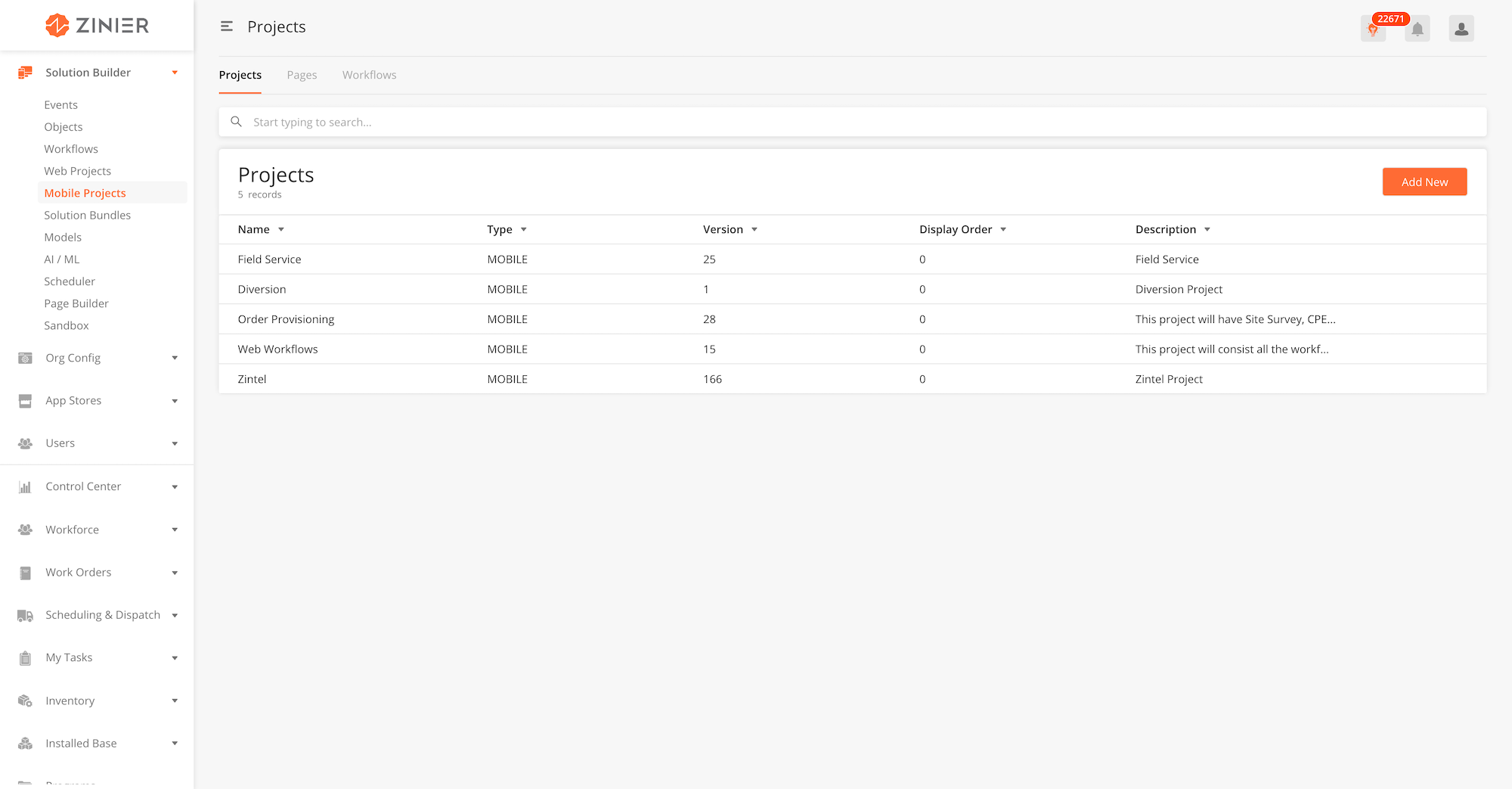
Projects (Mobile |
List of mobile projects created. Each mobile projects include workflows and pages. |
|
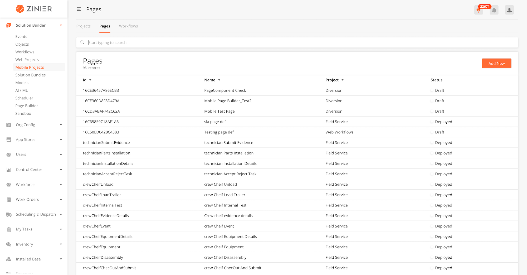
Pages (Mobile) |
List of mobile pages created. Pages are mobile pages which the mobile user will see when using the app |
|
Mobile Workflows |
List of Mobile workflows created. Mobile Workflows are a compilation of sequential steps that a mobile user needs to complete within the app. Workflows are built out of pages and nodes (model, rule, query etc) |
Hierarchy Overview: Projects, Task Types, Workflows and Pages
Mobile projects are a group of workflows and pages. Each project is assigned a to a group of users within the organisation. An organisation can have multiple projects for different user groups. As part of the solution builder, solutions admin can add new and edit mobile projects as part of this module.
-
From the main page, click Add New to open the side panel.
-
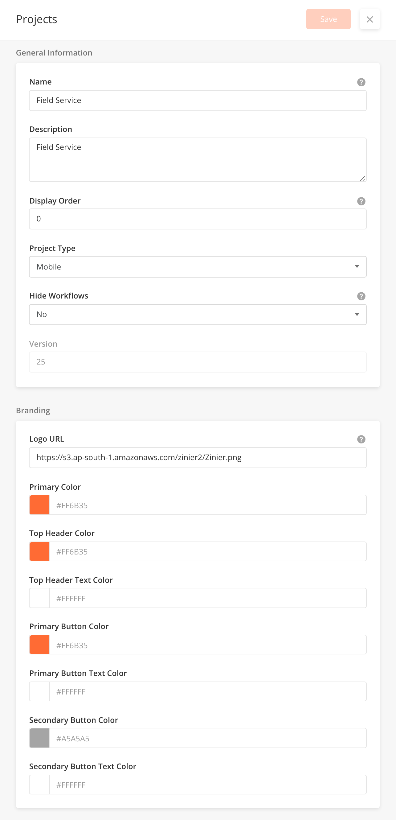
Enter General Information of the Mobile Project. Details of the required fields can be found below.
-
Enter Branding details. These are the colours that will be present in the mobile workflows in the project. The default branding colours will be Zinier colours.
-
Click Save to save the mobile project and close the sidepanel
-
To edit, hover over a record and click on the edit icon, to open the sidepanel.
-
You cannot delete Mobile Projects
-
Hover over a record, and click on the
Assign Groupicon to open the side panel. -
Select the Groups which will have access to the workflows within the Mobile Project. Groups are configured under Users > Groups.
-
Click Save to close the sidepanel
|
Module |
Relationship |
|---|---|
|
Assign a mobile project to a user group. You must create the group first before assigning a project to it. |
|
|
Add mobile projects to a solution bundle. This will automatically include the pages and workflows within each project into the bundle |
|
Field Name |
Description |
Example |
|---|---|---|
|
Name |
Name of the mobile project. |
Order Provisioning |
|
Description |
Description of the mobile project |
This project will consist all the workflows that are being use in FSE. |
|
Display Order |
Display Order for Mobile Project in the list. Display order value 1, the project will on top of the list for the user. |
1 |
|
Project Type |
If the project is for a mobile app or a tablet app |
Mobile |
|
Hide Workflows |
Option to hide workflows in the project.If Yes, workflows will not be visible to the mobile user in the mobile app. |
Yes |
|
Version |
This is an auto-generated field depending on how many times the project is deployed. |
1 |
|
Logo URL |
These configurations are used for branding purposes for the mobile app. The default values would be Zinier logo and colours. |
Zinier logo is the default option |
|
Primary Color |
Configure the primary color in the mobile app. This should correspond to the organisation's main colours |
#FF6B35 |
|
Top Header Color |
Configure the Top Header Color |
#FF6B35 |
|
Top Header Text Color |
Configure the Top Header Text Color |
#FFFFFF |
|
Primary Button Color |
Configure the Primary Button Color |
#FF6B35 |
|
Primary Button Text Color |
Configure the Primary Button Text Color |
#FFFFFF |
|
Secondary Button Color |
Configure the Secondary Button Color |
#A5A5A5 |
|
Secondary Button Text Color |
Configure the Secondary Button Text Color |
#FFFFFF |
Mobile Pages are the actual pages a mobile user sees when using the Zinier app. As part of the solution builder, solutions admin can configure and build each mobile page in this module. System pages are pages that are in-built within the system. Most System Pages like Settings pages are not configurable. However, some like user-initiated workflow actions can be slightly configurable.
Mobile workflow pages are built out of mobile components. An updated list of mobile components and how they can be configured can be found here.
|
Module |
Relationship |
|---|---|
|
Tag the mobile page to a project to bundle it with the project during implementation. The mobile project must be created first under Mobile Projects > Projects, for it to be selectable in this field |
-
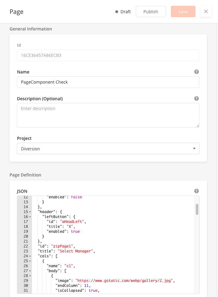
From the main page, click Add New to open the side panel.
-
Enter General Information section, which includes selecting the Mobile Project the page belongs to from a dropdown.
-
Enter the Page Definition section, which includes the JSON object which contains the entire mobile page
-
Click Save to save the mobile page. Once a new page is saved, it will be in Draft state by default.
-
Click Publish to publish the mobile page or close the sidepanel to remain in Draft status.
-
In Published state, click Deploy to deploy the workflow in the organisation. Once deployed, the mobile page will be active.
-
You can edit a record by hovering over the row of the desired record from the main page table and clicking the Edit icon. When you click Edit, the side panel will appear. Editing any page in Published or Deployed state will revert the workflow to Draft status.
-
You cannot delete mobile pages.
-
You can duplicate a mobile page by hovering over the row of the desired record from the main page table, and clicking the Duplicate icon.
-
A new sidepanel will open for the duplicated mobile page.
-
You can use Mobile Page Builder to build and preview your mobile pages in a drag-and-drop GUI interface. You can enter Mobile Page Builder by hovering over the row of the desired record from the main page table and clicking the Mobile Page Builder icon.
-
For more details on how to use Workflow Builder, go to Solution Builder > Page Builder
|
Field Name |
Field Type |
Description |
Example |
|---|---|---|---|
|
Name |
String |
Name of mobile page |
slaClockPage |
|
Description (Optional) |
Text box |
Description of the mobile page - what is the page used for |
|
|
Project |
Dropdown |
Tag the mobile page to a project to bundle it with the project during implementation. The mobile project must be created first under Mobile Projects > Projects, for it to be selectable in this field |
|
|
Page Definition |
JSON |
This is the JSON field to actually build the mobile page. An updated list of mobile components and how they can be configured can be found here. |
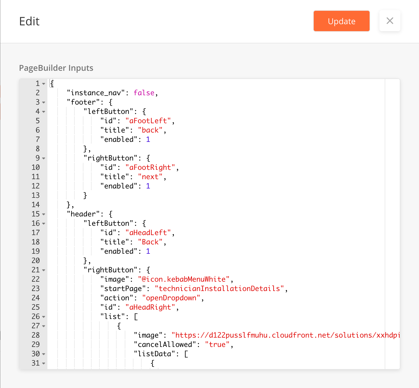
{
  "instance_nav": false,
  "footer": {
    "leftButton": {
      "id": "aFootLeft",
      "title": "Back",
      "enabled": "0"
    },
    "rightButton": {
      "id": "aFootRight",
      "title": "Next",
      "enabled": "1"
    }
  },
  "header": {
    "leftButton": {
      "id": "aHeadRight",
      "title": "X",
      "enabled": "1"
    }
  },
  "id": "partCatalog",
  "title": "SLA Clock",
  "cols": [
    {
      "name": "c1",
      "body": [
        {
          "endColumn": 11,
          "index": 2,
          "optTitleKey": "workOrderId",
          "title": "Reason",
          "type": "dropdown",
          "required": 1,
          "searchable": 0,
          "startColumn": 0,
          "options": [
            {
              "workorderPrimaryKey": "Item is not available",
              "workOrderId": "Item is not available"
            },
            {
              "workorderPrimaryKey": "Site is not opened",
              "workOrderId": "Site is not opened"
            }
          ],
          "id": "workOrderList",
          "optValueKey": "workorderPrimaryKey",
          "value": "@pageContext.selectedWorkOrder",
          "placeHolder": "Select a reason"
        },
        {
          "endColumn": 11,
          "startColumn": 0,
          "index": 3,
          "id": "noteIssue",
          "title": "Description",
          "type": "textarea",
          "value": "@pageContext.issueNotes",
          "placeHolder": "Enter description",
          "required": 0
        }
      ],
      "span": 1
    }
  ]
}
|
Overview
The Mobile Page Builder helps Solution Admins build mobile pages in a drag and drop GUI interface. Users can navigate to the mobile page builder through hovering on a record in Pages in Solution Builder > Mobile Projects > Pages, and clicking on the Mobile Page Builder icon.
This feature is still going through iterations
Add Basic Component or Layout
-
From the mobile page builder page, you can see a panel containing components and basic layouts on the left and a canvas of the page you are working on the right of the screen.
-
To add a component, drag a component or layout from the left panel into the canvas.
-
Once a component is successfully added to the canvas, double click on the component OR click on the red square above the component to open the Edit side panel.
-
The default Edit sidepanel will be on JSON View. You can edit the Component Details through JSON input.
-
You can also toggle to a Form View, by selecting the option from a dropdown button on the sidepanel header. Form view breaks down required node details without using many JSON input.
-
Toggling between JSON View and Form View will not impact any unsaved changes made. All changes will be carried over when toggling between views.
-
Once you are complete, click on Update to save the node and close the sidepanel.
-
To lock in changes made to a mobile page, click the Save button on the main mobile page builder screen.
Add Basic Component or Layout
(As of ISAC 19.8, not all components are compatible with form view)
-
From the mobile page builder page, you can see a panel containing components and basic layouts on the left and a canvas of the page you are working on the right of the screen.
-
To add a component, drag a component or layout from the left panel into the canvas.
-
Once a component is successfully added to the canvas, double click on the component OR click on the red square above the component to open the Edit side panel.
-
The default Edit sidepanel will be on JSON View. You can edit the Component Details through JSON input.
-
You can also toggle to a Form View, by selecting the option from a dropdown button on the sidepanel header. Form view breaks down required node details without using many JSON input.
-
Toggling between JSON View and Form View will not impact any unsaved changes made. All changes will be carried over when toggling between views.
-
Once you are complete, click on Update to save the node and close the sidepanel.
-
To lock in changes made to a mobile page component, click the Save button on the main mobile page builder screen.
Delete Basic Component or Layout
(As of ISAC 19.8, this functionality has not yet been refined)
-
To delete a component, double click on the component OR click on the red square above the component to open the Edit side panel. In the Edit sidepanel, delete the JSON input and click Update to delete the added component.
-
Deleted components will be automatically removed from the preview canvas.
Edit Page Definition
-
To edit the entire Page Definition, click on the PageDef button on the top right hand of the canvas. This will open the Page Definition side panel which contains the JSON definition of all the components in the page.
-
Click on Update to save changes made directly to the page definition.
-
Changes made to individual components JSON within the Page Definition will be automatically updated in the canvas and in the corresponding individual components JSON.
-
To lock in changes made to a mobile page definition, click the Save button on the main mobile page builder screen.
Overview
Mobile Components are the building blocks of a mobile page definition. A component can have a dependency on other components or may be independent. The structure of each mobile component is in the form of a JSON object. All components have attributes that can be used to define their behavior.
Locale Support
Zinier mobile app uses device locale to represent the following data:
-
Date
-
DateTime
-
Currency
-
Numeric Value
These data types will always use device locale and org config will not affect this.
Newer components, their requirements and meeting notes are captured here:-
|
ID |
String |
||
|
startColumn |
integer |
Component start position from the left of a page. Accepted value 0 to 11. |
|
|
endColumn |
integer |
Component start position from the right in a page. Accepted value 0 to 11. |
|
|
hidden |
Boolean |
FALSE |
This is to control the visibility of the component on the page. JS will trigger this property if required. |
|
required |
Boolean |
FALSE |
This is to control the required attribute of the component. JS will trigger this property if required. Only works if the key is present in the component definition. |
|
enabled |
Boolean |
FALSE |
This is to control the disabled attribute of the component. JS will trigger this property if required. Only works if the key is present in the component definition. |
|
index |
integer |
Vertical position number - Lowest numbered component will be at the top of the page |
Common Keys
Each Mobile Component has a certain set of attributes that define its look and behavior. In the following table, we list the common attributes across all the different Mobile Component types.
|
Key |
Value Type |
Default Value |
Comments |
|---|---|---|---|
|
id* |
String |
Unique identifier of the Component. |
|
|
index* |
integer |
Vertical position number - Lowest numbered Component will be at the top of the page. |
|
|
startColumn* |
integer |
0 |
Component start position from the left of a page. Accepted value 0 to 11. |
|
endColumn* |
integer |
11 |
Component start position from the right of a page. Accepted value 0 to 11. |
|
capturedTime |
String |
Current time |
This is used to store the last modified date of the component. format for this will be "yyyy-MM-dd HH:mm:ss" This is only captured when the key is present in the JSON andused only in components that accept input from a user. |
|
locationCoordinates |
String |
Current location |
These are the coordinates of the user which are sent back to the server. Lat and long are separated by a comma. This is only captured when the key is present in the JSON and used only in components that accept user input. |
|
hidden |
Boolean |
false |
This is to control the visibility of the component on the page. JS will trigger this property if required. |
|
required |
Int |
0 |
This is to control the required attribute of the component. JS will trigger this property if required. Only works if the key is present in the component definition.This should only be used in components that accept user input. |
|
enabled |
, |
false |
This is to control the disabled attribute of the component. JS will trigger this property if required. Works only if the key is present in the component definition. |
Current Mobile Components Definition: https://docs.google.com/spreadsheets/d/1SFctZah6Got5nAScI0UoYu972x5WpjzwUexukZ8MtHs/edit#gid=959718115
Overview
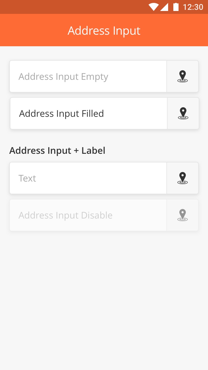
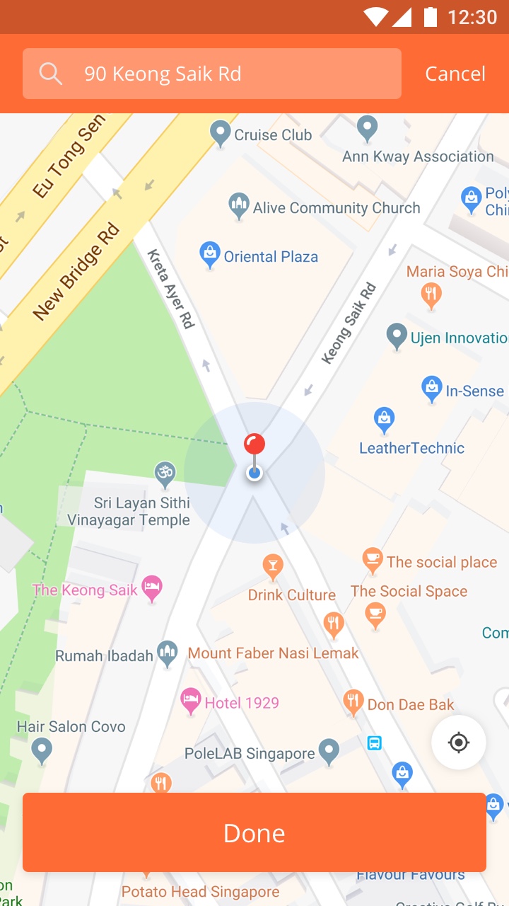
Input field that specific for address input. The component will open up the map and pull the address from the pin location.
There is also additional feature to search the address from search bar or drop pin directly to the map.
The information then will be display in the address input field. User still able to edit by tapping on the field or icon.
Best Practice
-
Use clear and short helper text
-
Avoid to add multiple line text in the label if possible.
|
|
|
Overview
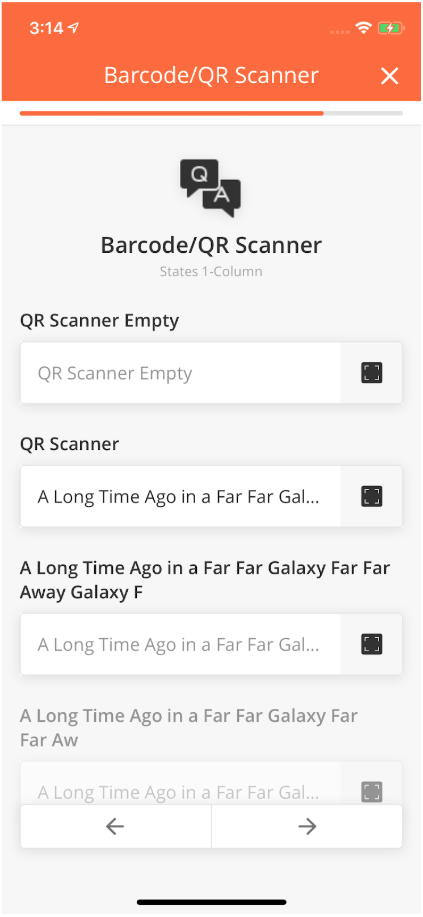
Barcode/QR Scanner Component allows a Mobile User to scan a barcode or a QR code from a Mobile page.
For example, a Technician could use it to scan the barcode of a Spare Part he is using.
Best Practice
-
Always provide clear instruction about the Barcode Scanner if possible.
-
Avoid long text for label and helper text.
-
You can add multiple Barcode Scanner component in one page if needed
How to Configure
|
Type |
Key |
Value Type |
Default Values |
|---|---|---|---|
|
barcode |
title |
String |
|
|
*value |
String |
||
|
placeHolder |
String |
||
|
Common Keys |
|||
|
id |
|||
|
index |
|||
|
startColumn |
|||
|
endColumn |
|||
|
capturedTime |
|||
|
locationCoordinates |
|||
|
required |
Sample JSON
{
"index":1,
"id":"id of the Component",
"type":"barcode",
"startColumn":0,
"endColumn":11,
"title":"title of the Component",
"value":"@pageContext.ComponentID",
"placeHolder":"placeholder text for the Component",
}
|
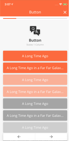
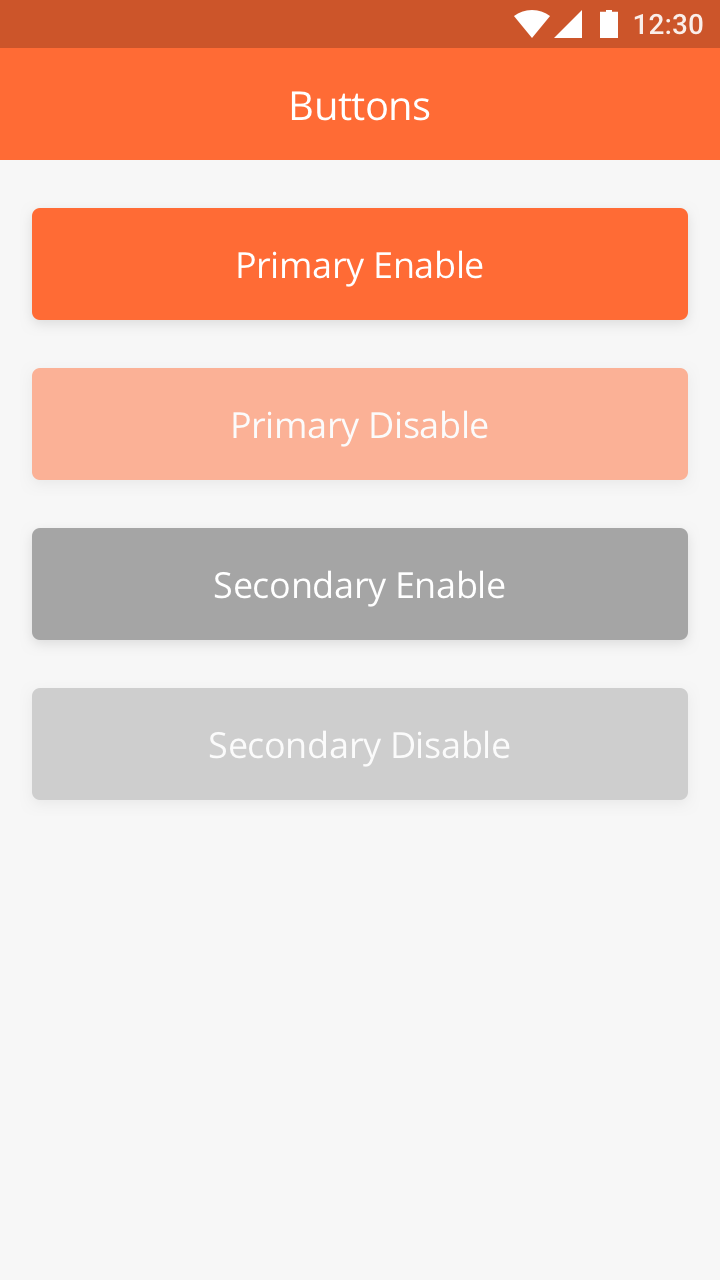
Overview
Buttons are clickable components that enable a user to perform different actions such as submit a request or navigate from one page to the other. They may appear in different layouts. The button states what the User can achieve by clicking on it. Their color, icons, and text can be customized from the Mobile Builder.
|
Filled Button
Filled buttons have the highest visibility and do a good job of grabbing User attention. Use primary for the main action on the page.
Variations
-
Primary Active: Filled with the default value of the main color of the app.
-
Primary Inactive: Filled with the default value of the main color but with 50% opacity
Best Practice
-
Do not use more than one filled button in one page
-
Keep it simple. Use short text to describe the action in the button.
|
Button with Icon, Arrow, and Text
Button with icon, arrow, and text are used to direct the user from one page to the other
Button
How to Configure
|
Type |
Key |
Value type |
Accepted Values (Case Sensitive) |
Default Value |
|---|---|---|---|---|
|
button |
buttonType |
String |
primary, secondary |
primary |
|
*title |
String |
|||
|
action |
String |
submitInstance, direction |
submitInstance |
|
|
Common Keys |
||||
|
lat |
Double |
|||
|
lng |
Double |
|||
|
travelMode |
String |
driving, transit, bicycling, walking |
driving |
Sample JSON
{
 "id": "jbuttonPrimary",
 "type": "button",
 "buttonType": "primary",
 "title": "A Long Time Ago",
 "enabled": "1",
 "startColumn": 0,
 "endColumn": 11,
 "index": 36
}
Button Icon Arrow
|
Type |
Key |
Value type |
Accepted Values (Case Sensitive) |
Default Value |
|---|---|---|---|---|
|
buttonIconarrow |
leftImage |
String |
||
|
rightImage |
String |
|||
|
Common Keys |
||||
|
*title |
String |
|||
|
buttonType |
String |
primary, secondary |
primary |
|
|
action |
String |
submitInstance, direction |
submitInstance |
|
|
lat |
Double |
|||
|
lng |
Double |
|||
|
travelMode |
String |
driving, transit, bicycling, walking |
driving |
Sample JSON
{
 "id": "jButtonArrow",
 "leftImage": "https://cdn.zeplin.io/assets/05D98EBC-FBCC-4983-8AE9-F9C5F9401950.png",
 "rightImage": "",
 "type": "buttoniconarrow",
 "title": "A Long Time Ago",
 "enabled": "1",
 "startColumn": 0,
 "endColumn": 11,
 "index": 38
}
Comments
action : Each action may have some Mandatory/optional parameters with them.
|
Action |
Key |
|
|---|---|---|
|
direction |
lat |
mandatory |
|
lng |
mandatory |
|
|
travelMode |
optional |
Overview
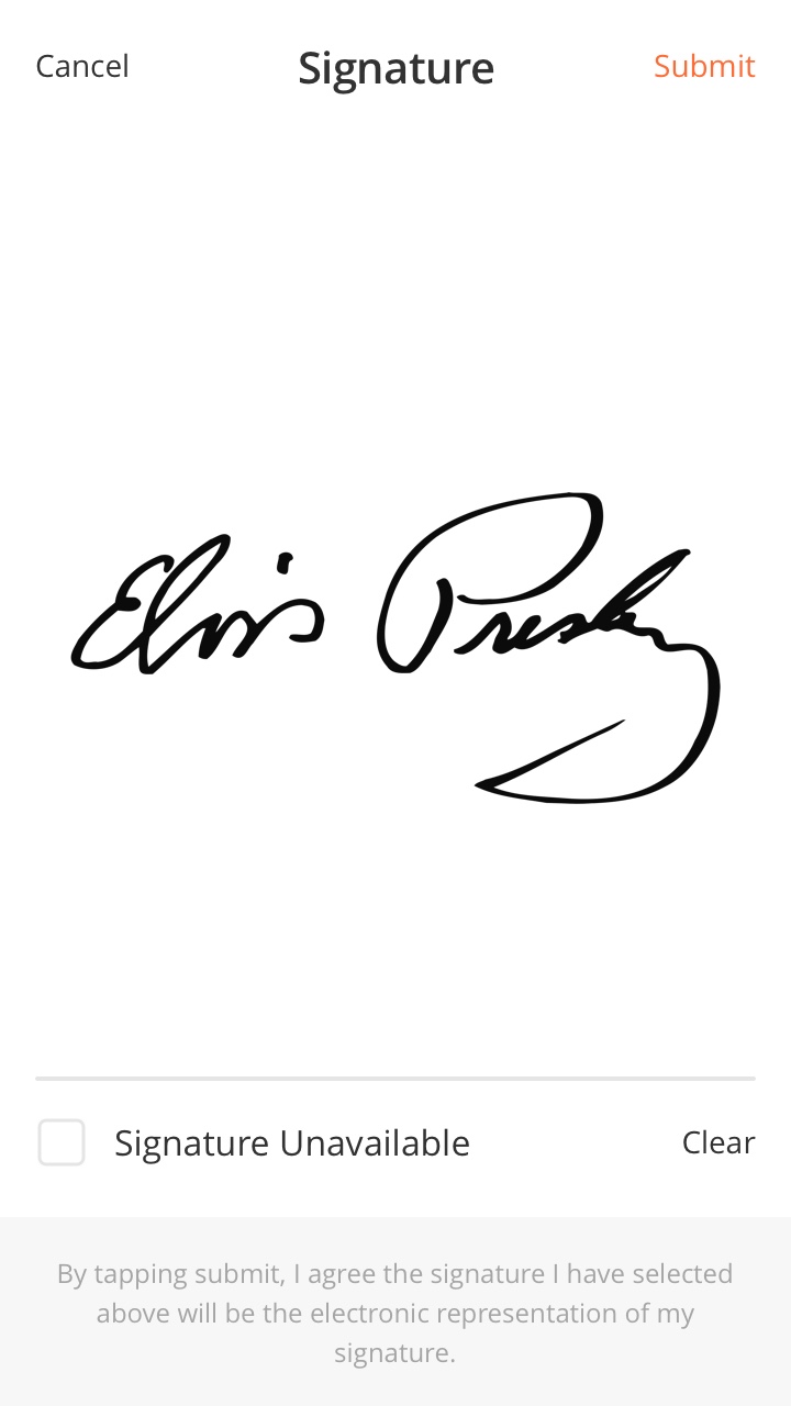
List of items or things to be done by add a signature as compulsory requirement.
Best Practice
-
Use this component if you want user to take signature as compulsory requirement.
-
Use simple instruction and try avoid to have two lines text in the item.
CHECKLIST - SIGNATURE
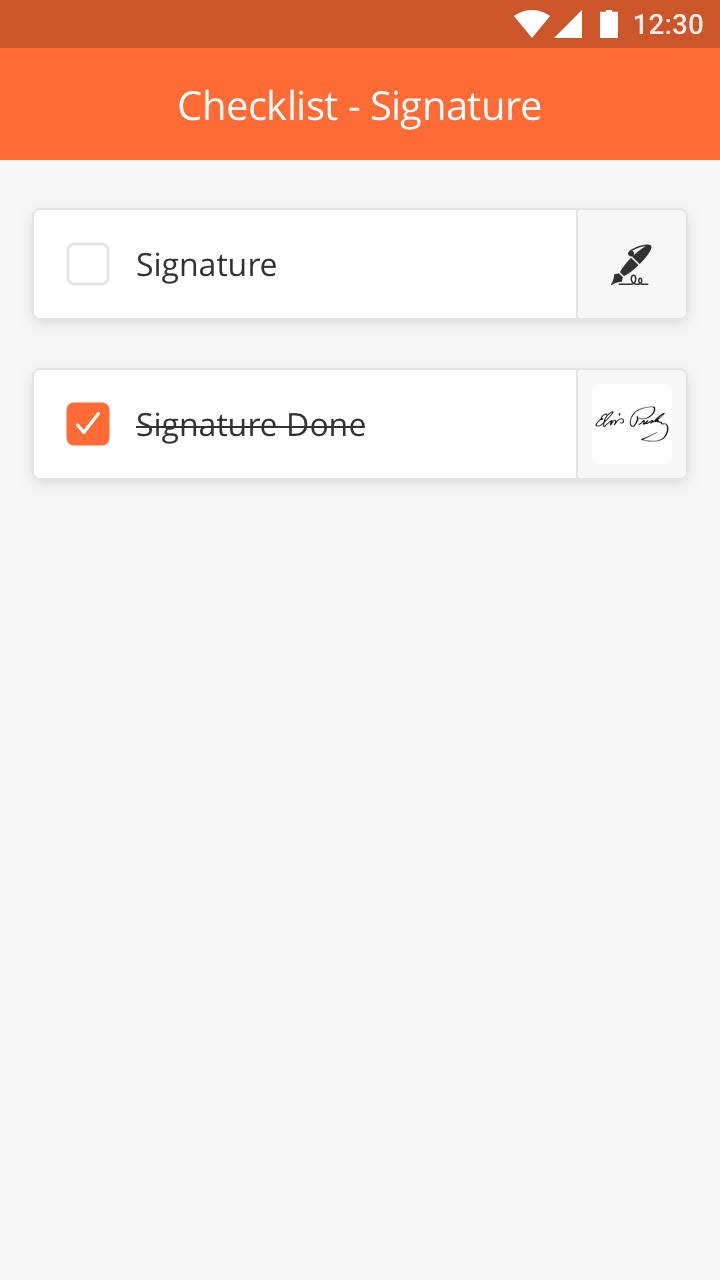
CHECKLIST - SIGNATURE
Overview
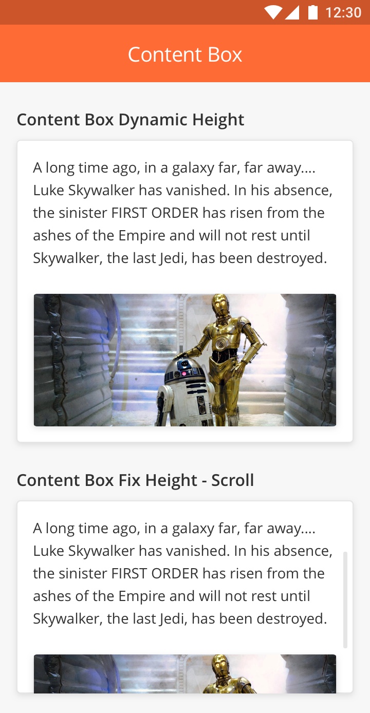
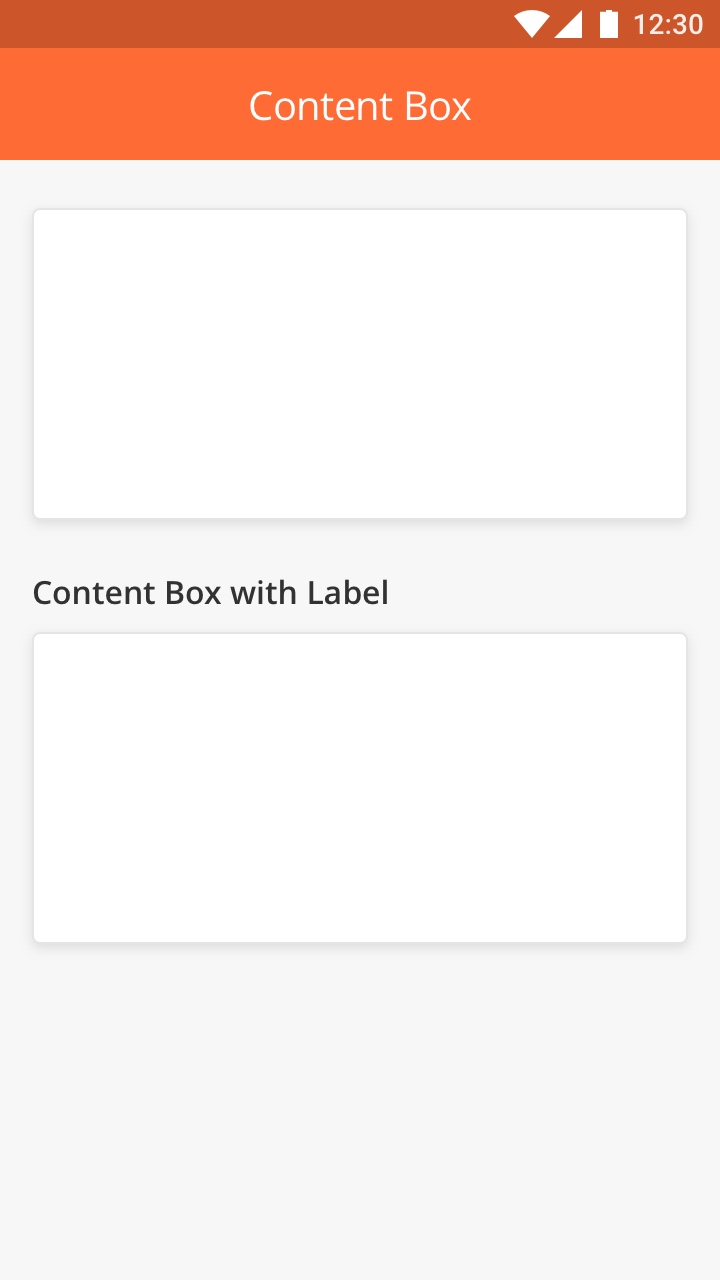
ContentBox is used to group items in a particular section within a Mobile page. For example, text and a photo can be placed within ContentBox. The Collapsible Content Box allows users to collapse all items within the ContentBox in order to be able to display more items on the same page.
Features
-
Content box with dynamic height is responsive and adjusts according to the amount of content in the Component
-
Content box with fixed height is scrollable if the content is longer than the predefined box size
-
The Content Box may or may not have a 'Label'. The 'Label' refers to the Title of Content Box.
Best Practice
-
Try to always use content box to wraps other components in the app
-
Don't leave an empty content box in a page
-
Don't create nested content box.
|
|
How to Configure
|
Component |
Type |
Key |
Value Type |
Default Value |
Comments Android |
Comments iOS |
|
Content Box |
contentbox |
title |
String |
header label of content box |
header label of content box |
header label of content box |
|
height |
double |
By default, it's dynamic. |
If calculatedHeight < definedHeight, the container won't be scrollable. |
|||
|
*content |
JSON Array |
|||||
|
Common Keys |
Overview
Data Grid allows data to be displayed in a table. For Example, when a Spare Part needs to be added to a task, the Technician can do so by selecting the type of part and entering the quantity required. This will then be added to a Table as seen in the image.
How to Configure
|
Type |
Key |
Value Type |
Default Value |
|---|---|---|---|
|
datagrid |
*title |
String |
|
|
*value |
JSON Array |
||
|
heading |
String |
||
|
*columns |
JSON Array |
||
|
*editable |
Boolean |
false |
|
|
*addRowPageId |
String |
||
|
allowDelete |
Boolean |
false |
|
|
disableAdd |
Boolean |
false |
|
Sample JSON
{
 "allowDelete": 1,
 "endColumn": 11,
 "heading": "Select Spare Parts",
 "columns": [
   {
     "col": 1,
     "name": "Part Name",
     "row": 1,
     "key": "selectItemPart[0].name"
   },
   {
     "col": 2,
     "name": "Quantity",
     "row": 1,
     "key": "quantity"
   }
 ],
 "editable": 1,
 "index": 2,
 "type": "datagrid",
 "title": "Spare Parts",
 "editRowPageId": "1677839485449375",
 "startColumn": 0,
 "addRowPageId": "1677839485449375",
 "id": "selectDataGrid1",
 "value": "@pageContext.selectDataGrid1"
}
Comments
*editable : if true then only the User can add/update list item
*addRowPageId : Page id used to render page for add item
editRowPageId : Page id used to render page for add item, if not provided then addRowPageId will be used
allowDelete : if true then User can delete item/row
disableAdd : if true then User can not add new record
Important to note - Page Id used for addRowPageId & addRowPageId will be treated as sub page for the Component. We can add any supported Component inside subpage definition.
While creating Sub page, we need to keep the following in mind:
-
For Example, @pageContext.ComponentID should be written as @subContext.ComponentID
-
The input collected from sub page will be used to add item/row in Data Grid. So we need to configure Columns definition accordingly
-
No footer is required for sub page and only page title is required for header definition.
-
The dynamic value of the Component inside sub page needs to have @subContext instead of @pageContext.
Datagrid Component can be nested in it’s child page, but we need to take care of the cyclic dependency between the two child pages i.e. use a new child page for every level of nesting.
Overview
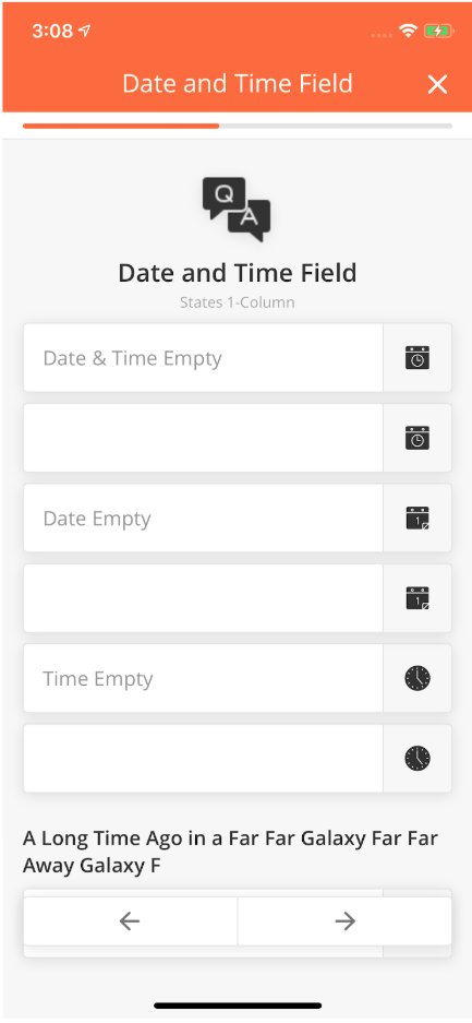
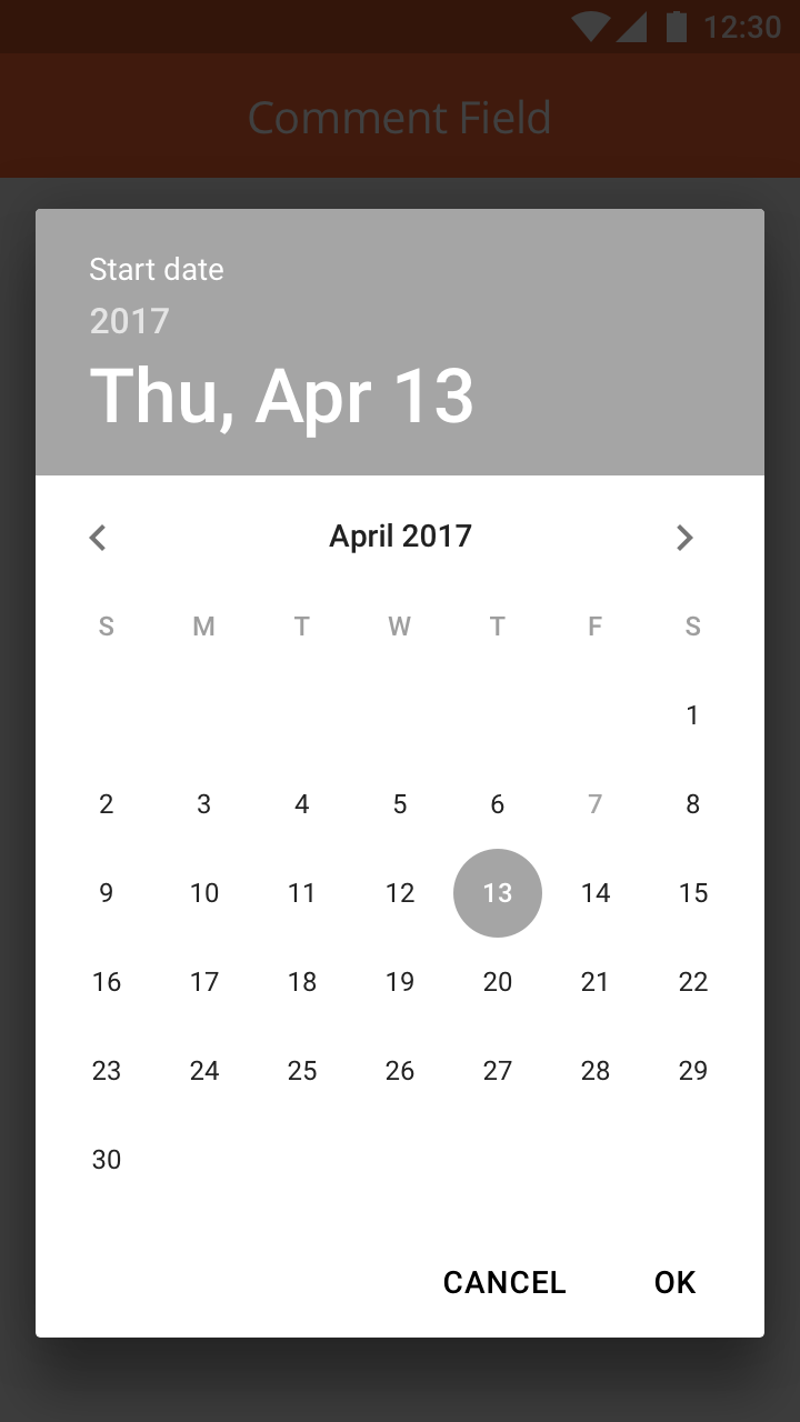
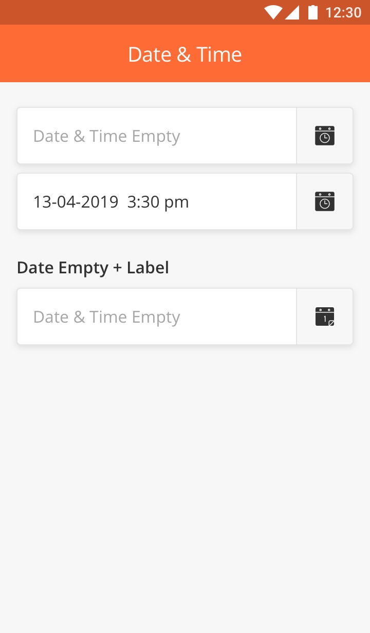
Date & Time Component enables the mobile user to select the Date and Time in specific formats within a mobile page.
Date Input Field
This component is used if only the date needs to be captured. Clicking on this component will display a calendar which will allow the User to choose a date.
Display format: DD-MM-YYYY
How to Configure
|
Type |
Key |
Value Type |
Comments |
|---|---|---|---|
|
inputdate |
title |
String |
|
|
*value |
String |
Will always return a date object in "yyyy-MM-dd HH:mm:ss" format Note: Needs to be implemented for Android. |
|
|
placeHolder |
String |
||
|
min |
String |
format for this will be "yyyy-MM-dd HH:mm:ss" Note: Needs to be implemented for Android |
|
|
max |
String |
format for this will be "yyyy-MM-dd HH:mm:ss" Note: Needs to be implemented for Android |
|
|
Common Key |
|||
|
id |
|||
|
index |
|||
|
startColumn |
|||
|
endColumn |
|||
|
capturedTime |
|||
|
enable |
|||
|
required |
Sample JSON
{
 "startColumn": 0,
 "endColumn": 11,
 "index": 1,
 "id": "iDatetComponent",
 "type": "inputDate",
 "title": "Select Meeting Date",
 "placeHolder": "Select Meeting Date",
 "value": "@pageContext.inputMeetingDate",
 "min": "2018-01-23 12:12:12",
 "max": "2018-01-25 12:12:12"
}
|
|
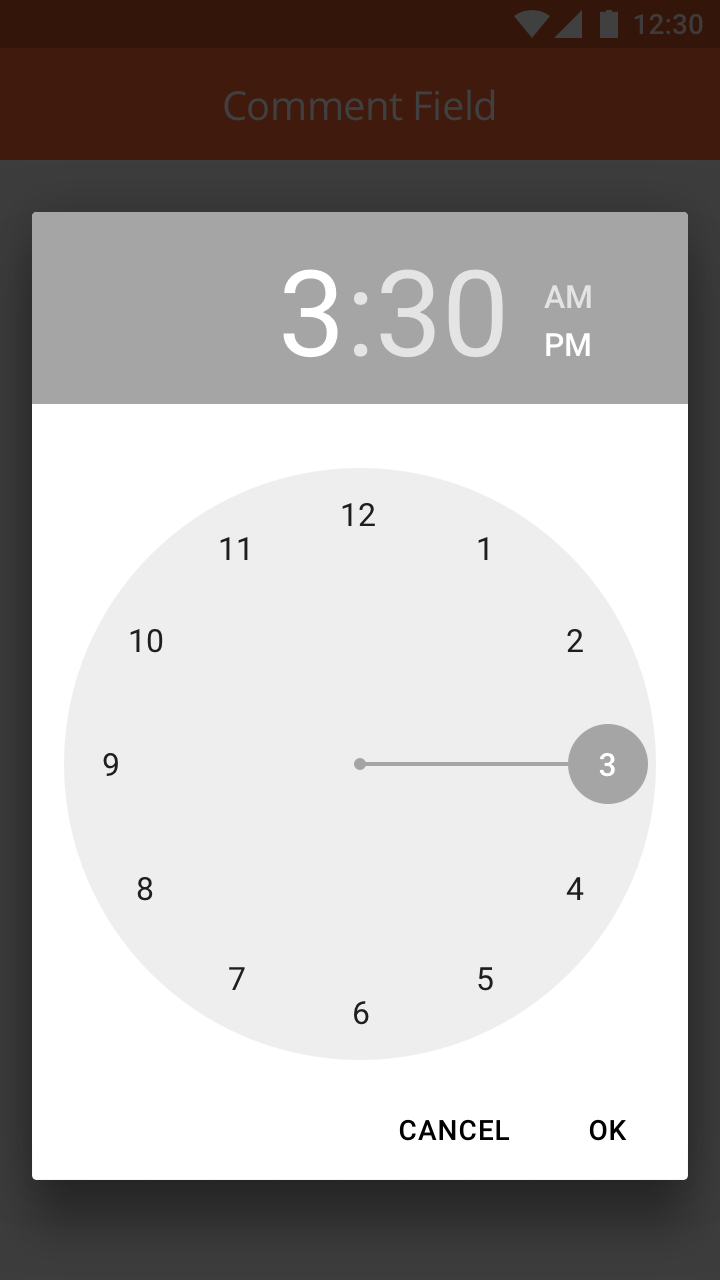
Time Input Field
Use it if you want to capture time only. It will bring time pop up and display the time format to am/pm
This component is used if only the time needs to be captured. Clicking on this component will display a clock which will allow the User to choose a time and specify AM / PM.
How to Configure
|
Type |
Key |
Value Type |
Comments |
|---|---|---|---|
|
inputtime |
title |
String |
|
|
*value |
String |
Will always return a date object in "yyyy-MM-dd HH:mm:ss" format Note: Needs to be implemented for Android. |
|
|
placeHolder |
String |
||
|
min |
String |
format for this will be "yyyy-MM-dd HH:mm:ss" Note: Needs to be implemented for Android. |
|
|
max |
String |
format for this will be "yyyy-MM-dd HH:mm:ss" Note: Needs to be implemented for Android. |
|
|
Common Key |
|||
|
id |
|||
|
index |
|||
|
startColumn |
|||
|
endColumn |
|||
|
capturedTime |
|||
|
enable |
|||
|
required |
|||
Sample JSON
{
 "startColumn": 0,
 "endColumn": 11,
 "index": 1,
 "id": "iDatetComponent",
 "type": "inputTime",
 "title": "Select Meeting Time",
 "placeHolder": "Select Meeting Time",
 "value": "@pageContext.inputMeetingTime",
 "min": "2018-01-23 12:12:12",
 "max": "2018-01-25 12:12:12"
}
|
Date & Time Input Field
Use it if you want to capture the date and time. It will bring a calendar and clock pop up. It would display both date and time in the input field.
How to Configure
|
Type |
Key |
Value Type |
Comments |
|---|---|---|---|
|
inputdatetime |
title |
String |
|
|
*value |
String |
Will always return a date object in "yyyy-MM-dd HH:mm:ss" format |
|
|
placeHolder |
String |
||
|
min |
String |
format for this will be "yyyy-MM-dd HH:mm:ss" |
|
|
max |
String |
format for this will be "yyyy-MM-dd HH:mm:ss" |
|
|
Common Key |
|||
|
id |
|||
|
index |
|||
|
startColumn |
|||
|
endColumn |
|||
|
capturedTime |
|||
|
enable |
|||
|
required |
Sample JSON
{
 "startColumn": 0,
 "endColumn": 11,
 "index": 1,
 "id": "iDatetComponent",
 "type": "inputDateTime",
 "title": "Select Meeting Date And Time",
 "placeHolder": "Select Meeting Date And Time",
 "value": "@pageContext.inputMeetingDateTime",
 "min": "2018-01-23 12:12:12",
 "max": "2018-01-25 12:12:12"
}
|
Comments
*value key : will always return a date object in "YYYY-MM-DD HH:MM:SS" format
Min key : format for this will be "YYYY-MM-DD HH:MM:SS"
Max key : format for this will be "YYYY-MM-DD HH:MM:SS"
All date and time need to be in UTC Time zone.
Overview
The Divider component acts as a partition between different sections of a mobile page.
How to Configure
|
Type |
Key |
Value type |
Accepted Values |
Default Value |
|
divider |
backgroundColor |
String |
#ff6b35 |
$primaryColor |
|
Common Keys |
||||
|
startColumn |
||||
|
endColumn |
Sample JSON
{
"index":1,
"id":"id of the Component",
"type":"divider",
"startColumn":0,
"endColumn":11,
"backgroundColor":"#ff6b35",
}
|
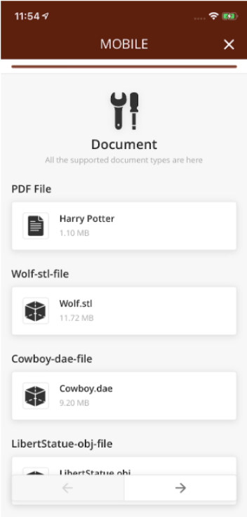
The Document Component.
Iteration 1: Current Implementation
This component allows the users to download and view a file within Zinier Application.
File types supported are pdf, obj, stl, dae.
Iteration 2:
Enhancement to this component will let the user to download other file formats to be downloaded or shared through other applications.
When the user taps on the Download icon of the component, the file will start downloading.
-
If the file is a pdf or 3D object file, the user can Preview, Download or Share the file by tapping the icon on the top right corner of the Preview screen.
-
If the file is of any other type, the user will be given an option to Download or share the file.
Note: Files can be downloaded only on the component page with active internet connection, it cannot be Downloaded/ Opened when the user is Offline.
Design: zpl://project?pid=5ea919024c42b7267ad1e56e
How to Configure
|
Key |
Value Type |
Accepted Values |
Comments |
|---|---|---|---|
|
heading |
String |
Supported image file formats: JPEG/JPG |
Optional heading for component |
|
*title |
String |
The title of the document component; e.g. Task Details.pdf. |
|
|
*size |
integer |
media file size in KB to displayPDF Document URL for the component |
|
|
*url |
Type of the document |
||
|
*docType |
string |
pdf, obj, stl, dae |
|
|
Common Keys |
|||
|
id |
Public PDF: https://rc.library.uta.edu/uta-ir/bitstream/handle/10106/26853/EWALD-THESIS-2017.pdf?sequence=1&isAllowed=y Private Pdf: https://s3.amazonaws.com/zinier3/sagemaker/1537863139963sidepanel.pdf |
||
|
index |
Sample JSON
12th May 2020 Engineering Meeting Notes
Rajnikant Hole Madan Gupta Dhananjay Mohnot
1. For download we follow current default behavior - we dont check maxSize
2. For upload we check the maxSize - if file size exceeds maxSize then we show alert "The file size exceeds maximum allowed size. We can't upload"
3. For PDF, 3D, photo etc - the existing components, we change the UI as per new Zeplin. This includes for new file upload and download
4. maxSize - for ioS we check this org config and if photo exceeds this maxSize, then we cancel the download.
5. for android we check the maxSize for document component (@dhan confirm)
6. We will have seperate component - download and download+upload. UI can seperate. But lets have a common module
7. Mobile will additionally send file size in upload component
8. Web can optionally send the file size for upload component
9. For download there is already Size parameter
10. If size is not available for upload from web, then we can show "size unknow"
11. Discuss the keys to finalize - @madan mention those here
Specification of component
{
"endColumn": 11,
"disableShare": false,
"heading": "videoFile",
"docType": "any",
"index": 23,
"type": "document",
"title": "ddsdaa.mp4",
"url": "https://s3.amazonaws.com/z2-raman/168BC10ED0ADFB96/SEEZZR9DA5/1588569478669.mp4",
"required": 1,
"size": 10000,
"startColumn": 0,
"enableShare": false,
"id": "2documen22tddwwwC222omponent1"
}
Note:-
-
We adding new key as “
disableShare” - used for enabling/disable share option of the file (default - false) -
If the document type is like to pdf/obj then docType is likely pdf/obj
-
If the document is any means no restriction then need to mention docType = 'any' this is what we committed for the first phase.
-
As discussed as of now, We are not changing any existing UI for the document component.
New feature added in existing the document component -
-
Any file end-user can download.
-
Users can share files (type - pdf / any ) based on configuration (default - false).
Overview
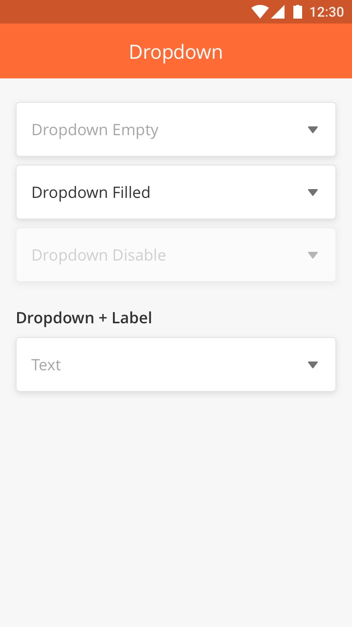
Dropdown Component allows mobile users to select a value from the list of options on a mobile page.
Best Practice:
-
Use for secondary or less important options because user can't see the content until they open / expand the dropdown.
-
Display items that related to each others
-
Don't use dropdown if you only have two option. Instead it's better to use Single Select component.
|
How to Configure
|
Type |
Key |
Value Type |
Default Values |
Comments |
|---|---|---|---|---|
|
dropdown |
title |
String |
||
|
*value |
String |
|||
|
placeHolder |
String |
This should be added as the first option in the dropdown and dropdown should be treated as nothing is selected in this case. Also, in the case of searchable: true; do not display this value in the search list. |
||
|
*options |
JSON Array |
Options will consist an object with "optTitleKey", "optValueKey" and "optChecked" |
||
|
*optTitleKey |
String |
|||
|
*optValueKey |
String |
|||
|
searchable |
Boolean |
false |
||
|
Common Keys |
||||
|
id |
||||
|
index |
||||
|
startColumn |
||||
|
endColumn |
||||
|
enable |
||||
|
required |
Sample JSON
{
 "id": "iCountry",
 "type": "dropdown",
 "title": "Select Country",
 "placeHolder": "Select Country of residence",
 "value": "@pageContext.country",
 "options": "@pageContext.infoTitle",
 "optTitleKey": "title",
 "optTitleValue": "value",
 "startColumn": 0,
 "endColumn": 11,
 "index": 1,
 "searchable": "true"
}
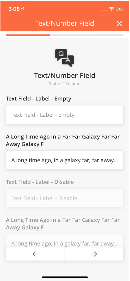
Overview
Input Text Component allows the User to enter text within a Mobile Page.
We have 3 types of Text Input Fields:
-
Text InputThe Text Input Field is an input form that is able to capture numeric and alphabetical data entry. There are two variations of the Text Input Field:
-
Regular Text Input for short text
-
Comment Input Field for long text
-
-
Number InputClicking on the Number Input Field opens up the Numeric Keyboard. It is used if the input can only be a number, for instance, Postal Code, Phone Number, etc
-
PasswordThe Password Field is a special Input Field which enables the User to enter Passwords. For security reasons, black dots replace the characters typed in.
If the User wants to view the Password, they can do so by tapping on the eye icon located on the far right of the Input Field.
How to Configure
|
Component |
Type |
Key |
Value Type |
Accepted Values |
Default Values |
Comments |
|---|---|---|---|---|---|---|
|
Text/Number field |
input |
inputType |
String |
number/decimal/email/password |
text |
This will render respective keyboard type in the mobile app And validate text accordingly Note: Needs to be implemented in iOS |
|
maxLength |
int |
>0 |
unlimited |
0 will be treated as unlimited |
||
|
title |
String |
|||||
|
placeHolder |
String |
|||||
|
*value |
String |
|||||
|
validationRegEx |
String |
This regEx will be treated on a higher priority thaninputType. Optional |
If regEx is provided then irrespective of inputType app will validate text with regEx. |
|||
|
computeValue |
String |
|||||
|
Comment Field |
textarea |
title |
String |
|||
|
placeHolder |
String |
|||||
|
*value |
String |
|||||
|
maxLength |
int |
>0 |
unlimited |
0 will be treated as unlimited |
||
|
Integer field |
intergerinput |
value |
int |
|||
|
maxLength |
int |
> 0 and < 16 |
unlimited |
default is 16 char |
||
|
validationRegEx |
String |
if provided, then it will be used to validate integer number |
||||
|
title |
String |
|||||
|
placeHolder |
String |
|||||
|
Decimal Field |
decimalinput |
value |
||||
|
maxLength |
unlimited |
default is 16 char |
||||
|
validationRegEx |
If provided, then it will be used to validate the decimal number |
|||||
|
title |
||||||
|
placeHolder |
||||||
|
Common Keys |
||||||
|
id |
||||||
|
index |
||||||
|
startColumn |
||||||
|
endColumn |
||||||
|
enable |
||||||
|
required |
Sample JSON
{
 "endColumn": 11,
 "startColumn": 0,
 "index": 7,
 "id": "engComments",
 "capturedTime": "@pageContext.engCommentsTime",
 "locationCoordinates": "@pageContext.engCommentsLocation",
 "type": "input",
 "title": "Engineer comments",
 "value": "@pageContext.engComments",
 "placeHolder": "Enter your text here",
 "required": 1
}
|
|
|
Overview
The Jumbotron Component is a combination of Icon and Text which acts as a Header to enable the User to better understand the context of the Page.
This Component includes:
-
Icon
-
Header
-
Sub Title
All of these elements are configurable from the Mobile App Builder.
Best Practice
-
Don't use more than one Jumbotron on one page
-
Use a few words for the Title
-
Use a maximum of two paragraphs for the Sub Title
-
Use an Icon that is related to the content in order to avoid confusion for the User. It is better to leave it empty if you don't have an Icon that is related to the content of the Page
|
How to Configure
|
Type |
Key |
Value Type |
Accepted Values |
|---|---|---|---|
|
jumbo |
*image |
String URL of the image |
Supported image file formats: JPEG/JPG |
|
*title |
String |
||
|
subTitle |
String |
||
|
Common Keys |
|||
|
id |
|||
|
index |
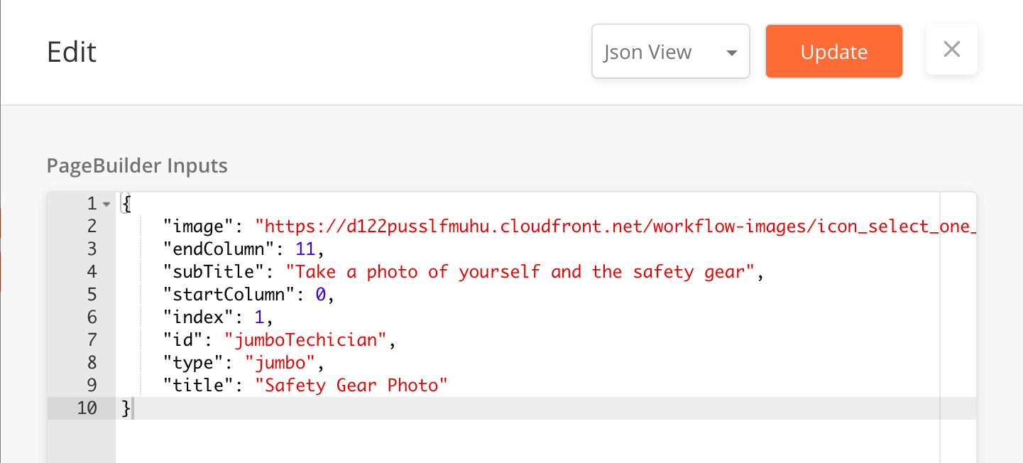
Sample JSON
 {
            "image": "https://s3-us-west-2.amazonaws.com/zinier.png",
            "id": "jqaImage1",
            "type": "jumbo",
            "alignment": "center",
            "title": "Text",
            "subTitle": "1 - Column",
            "startColumn": 0,
            "endColumn": 11,
            "index": 6
          }
The KMZ Viewer enables the User to view an entire segment with multiple points within it. In this way, there can be multiple points associated with a single Task. This feature is especially useful in cases like Patrolling or segment Maintenance Tasks when a Technician is expected to walk along a particular segment and check the status at multiple defined points along the way.
Features
-
Each point can have a workflow associated with it
-
The User can see the status of job done at each of the points on the segment
-
The icons used to represent each of the points can be configured
-
If configured in that way, these icons on the segments can change according to the status of the work done at each point
-
Depending on business requirement, the route joining the points can be shown/hidden - the color, as well as thickness of each of the points, is configurable
-
User can view their current location on the map with the segment points as well
|
Component Definition
|
Key |
Value Type |
Accepted Values |
Default Value |
Comments |
|---|---|---|---|---|
|
heading |
String |
empty |
||
|
description |
String |
empty |
||
|
showCurrentLocation |
Boolean |
true/false |
true |
Shows blue dot at user's current location on the map similar to google maps app. |
|
currentLocationIcon |
String |
valid URL |
NOT implemented as of now |
|
|
type |
String |
kmzviewer |
Expand source [
{
"status": "Started",
"description": "Started",
"statusColor": "#2C3E50",
"startPage": "16DB98E87FCEF84A",
"startProcessId": "16DB98E87FCEF84A",
"lng": 77.084916406232,
"title": "AB-4456 Public",
"lat": 12.42112212822116,
"url": "@pageContext.startedURL"
},
{
"status": "In Progress",
"description": "Started",
"statusColor": "#2C3E50",
"startPage": "16DB98E87FCEF84A",
"startProcessId": "16DB98E87FCEF84A",
"lng": 77.0842193868167,
"title": "AB-5456 Public",
"lat": 12.42112212801626,
"url": "@pageContext.inprogressURL"
},
{
"status": "@pageContext.status",
"description": "Started",
"statusColor": "@pageContext.statusColor",
"startPage": "16DB98E87FCEF84A",
"startProcessId": "16DB98E87FCEF84A",
"lng": 77.0844121128284,
"title": "AB-3091 Public AWS",
"lat": 12.42177253003091,
"url": "@pageContext.completedURL"
}
]
|
|
|
routeThickness |
Integer |
0 or above |
0 |
|
|
routeColor |
String(color code- hex value) |
valid color code- hex value having 7 characters like #00E800 |
primary branding color of the app |
No route is displayed when the value is 0. |
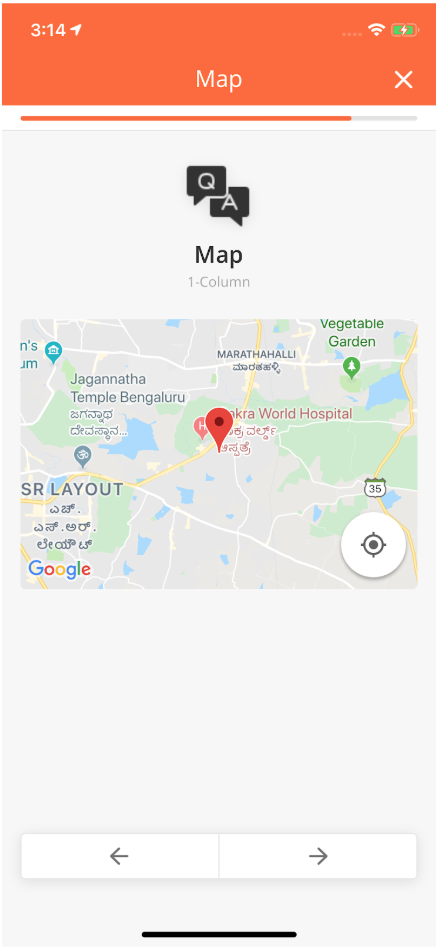
Overview
Map & GPS Component shows the different locations in Map View and captures Geotags.
For example, if the Technician wants to know the exact location of the Customer Site, he can select the relevant address and view the exact location on the map.
Features
-
Ability to view a location on the Map on the Phone
-
GPS should be able to use the User's location and detect how close / far they are from a site in order for Geo-fencing to take place and for them to be able to Check-In at a site
-
Ability to add an address in the Address Input text box which would pin the location on a map. This map can be manually moved around to (re)set the location at a specific point.
How to Configure
|
Type |
Key |
Value Type |
Accepted Values |
|---|---|---|---|
|
map |
*lat |
String |
|
|
*lng |
String |
|
Type |
Key |
Value Type |
Accepted Values |
|---|---|---|---|
|
geocheckin |
*title |
String |
|
|
*radius |
double |
||
|
*lat |
String |
||
|
*lng |
String |
||
|
*value |
String |
|
Type |
Key |
Value Type |
Accepted Values |
|---|---|---|---|
|
mapaddress |
title |
String |
|
|
heading |
String |
||
|
*value |
JSON |
edited_address<String> |
|
|
address<String> |
|||
|
longitude<Double> |
|||
|
latitude<Double> |
|
Type |
Key |
Value Type |
Accepted Values |
|---|---|---|---|
|
gpsinput |
title |
String |
|
|
placeHolder |
String |
||
|
*lat |
String |
||
|
*lng |
String |
|
Type |
Key |
Value Type |
Accepted Values |
|---|---|---|---|
|
gpssearchinput |
title |
String |
|
|
placeHolder |
String |
||
|
*lat |
String |
||
|
*lng |
String |
||
|
*value |
String |
|
Sample JSON
{
 "endColumn": 11,
 "lng": "77.69",
 "startColumn": 0,
 "index": 2,
 "id": "gCustomerLocation",
 "radius": 50,
 "type": "map",
 "value": "",
 "lat": "12.93"
}

{
 "endColumn": 11,
 "lng": "77.69",
 "index": 3,
 "type": "geocheckin",
 "title": "Start Check-In",
 "required": 1,
 "startColumn": 0,
 "id": "gCustomerLocation",
 "capturedTime": "@pageContext.checkinLatLongTime",
 "locationCoordinates": "@pageContext.checkinLatLongLocation",
 "radius": 50,
 "value": "@pageContext.checkinLatLng",
 "lat": "12.93"
}
{
 "col": "c1",
 "startColumn": 0,
 "endColumn": 11,
 "enabled": "0",
 "index": -30333030304,
 "id": "mapaddress3",
 "type": "mapaddress",
 "heading": "id: mapaddress3",
 "title": "Enter address of office home",
 "value": "@pageContext.mapaddress3",
 "required": 1
}
Comments
lat : latitude of the target location to be displayed on the device
long : longitude of the target location to be displayed on the device
*value : map of location details will be saved in values with keys in Accepted Values column
|
Component |
Type |
Key |
Value Type |
Accepted Values |
Default Value |
Comments |
Comments: Android |
Comments: iOS |
Comments: QA |
Comments: Backend |
Implementation Comments |
|
Map |
map |
*lat |
String |
Latitude of the target location to be displayed on the device. |
Changed title key to label |
||||||
|
*lng |
String |
Longitude of the target location to be displayed on the device. |
|||||||||
|
Common Keys |
|||||||||||
|
startColumn |
|||||||||||
|
endColumn |
|||||||||||
|
Geo Check-In |
geocheckin |
*title |
String |
||||||||
|
*radius |
double |
||||||||||
|
*lat |
String |
Latitude of the target location to be displayed on the device. |
|||||||||
|
*lng |
String |
Latitude of the target location to be displayed on the device. |
|||||||||
|
*value |
String |
These are the coordinates of the user which are sent back to the server. |
|||||||||
|
Common Keys |
|||||||||||
|
id |
|||||||||||
|
index |
|||||||||||
|
startColumn |
|||||||||||
|
endColumn |
|||||||||||
|
required |
|||||||||||
|
enable |
|||||||||||
|
hidden |
|||||||||||
|
MapAddress |
mapaddress |
title |
String |
||||||||
|
heading |
String |
||||||||||
|
*value |
String |
edited_address<String> |
Map of location details wil be saved in values with keys in Accepted Values column. |
||||||||
|
address <String> |
|||||||||||
|
longitude <Double> |
|||||||||||
|
latitude <Double> |
|||||||||||
|
Common Keys |
|||||||||||
|
id |
|||||||||||
|
index |
|||||||||||
|
startColumn |
|||||||||||
|
endColumn |
|||||||||||
|
required |
|||||||||||
|
enable |
|||||||||||
|
hidden |
|||||||||||
|
Below components are not implemented on mobile. |
|||||||||||
|
GPS Input |
gpsinput |
title |
String |
NOTE: This component will show comma seperated latitude and longitude of the user. |
|||||||
|
placeHolder |
String |
||||||||||
|
*lat |
String |
Latitude of the user location. |
send it to server |
||||||||
|
*lng |
String |
Longitude of the user location. |
|||||||||
|
Common Keys |
|||||||||||
|
id |
|||||||||||
|
index |
|||||||||||
|
startColumn |
|||||||||||
|
endColumn |
|||||||||||
|
required |
|||||||||||
|
enable |
|||||||||||
|
hidden |
|||||||||||
|
GPS Search Input |
gpssearchinput |
title |
String |
NOTE: This component will show searched address by the user. |
|||||||
|
placeHolder |
String |
||||||||||
|
*lat |
String |
Latitude of the searched location. |
send it to server |
||||||||
|
*lng |
String |
Longitude of the searched location. |
send it to server |
||||||||
|
*value |
String |
address of the searched place |
|||||||||
|
Common Keys |
|||||||||||
|
id |
|||||||||||
|
index |
|||||||||||
|
startColumn |
|||||||||||
|
endColumn |
|||||||||||
|
required |
|||||||||||
|
enable |
|||||||||||
|
hidden |
|||||||||||
All these components support Media content to be viewed or uploaded by the User on the Zinier App.
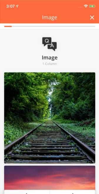
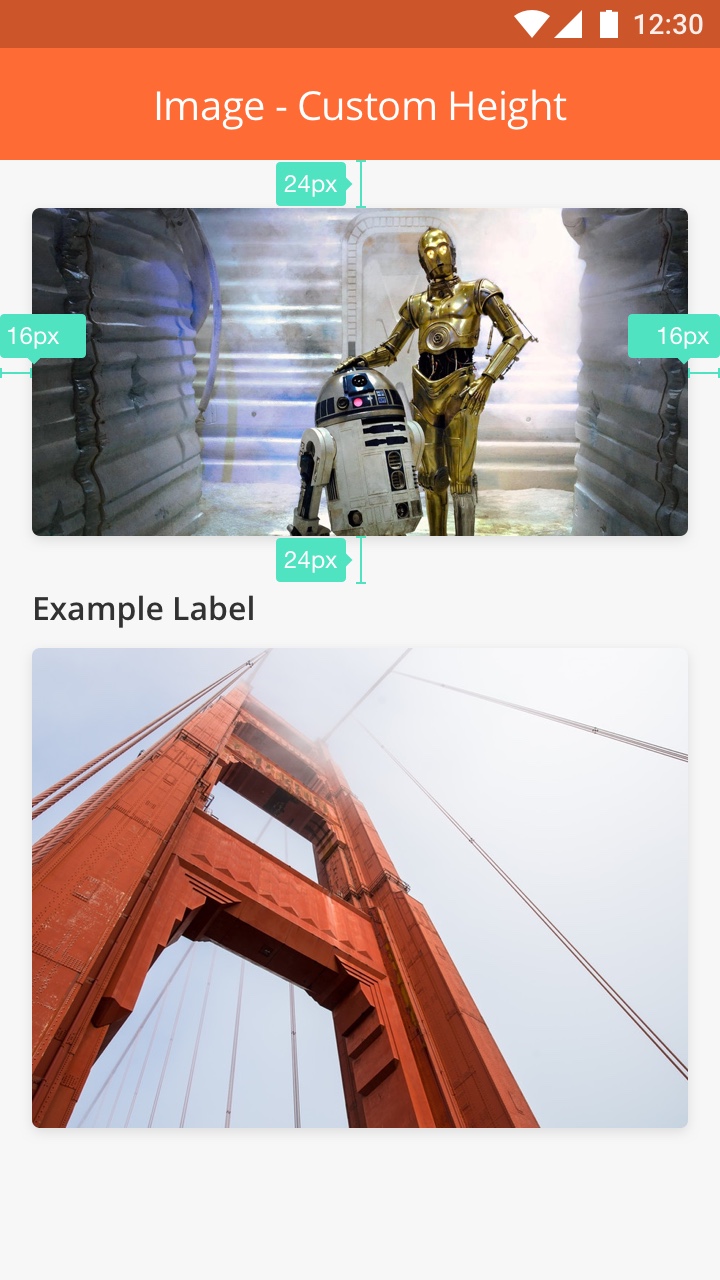
The Image Component displays an image that has been uploaded on to the platform.
For example, when a Technician wants to view the current state of the Asset at the Customer Site, the Image Component enables the image uploaded by the Web User to be displayed on the Technician’s device.
-
The height of the image is customizable.
-
The width of the image is responsive to device's size.
-
The margins on the left and right are 16px.
-
The margins on the top and bottom are 24px/
-
Always try to avoid full-height image size if possible to save space in a small screen device. (A user can still see the full view by tapping on the image.)
-
Always use a label if possible to give context of the image and to avoid confusion for the user
-
Avoid blurry and low-light images.
-
Add multiple images in one page if needed.
-
Format: JPEG or PNG
-
Max file size: 10MB
-
Color format: RGB
|
Type |
Key |
Value Type |
Accepted Values |
|---|---|---|---|
|
image |
*aspectRatio |
double |
|
|
*url |
String |
String URL of the image. Supported image file formats: JPEG/JPG. |
|
|
imageActionUrl |
String |
||
|
id |
|||
|
index |
{
            "url": "https://s3-us-west-2.amazonaws.com/zinier.png",
            "id": "jqaImage1",
            "type": "image",
            "aspectRatio": "1.0",
            "startColumn": 0,
            "endColumn": 11,
            "index": 4
          }
|
|
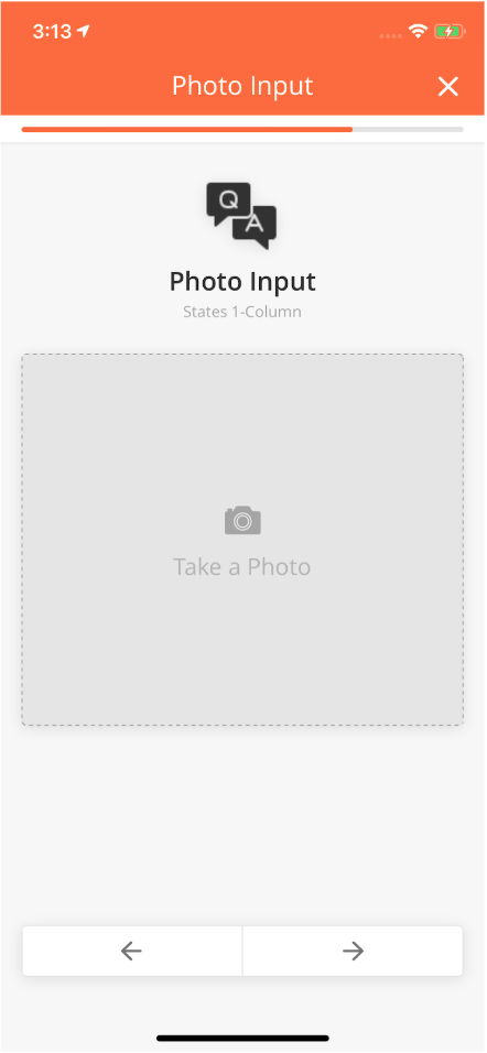
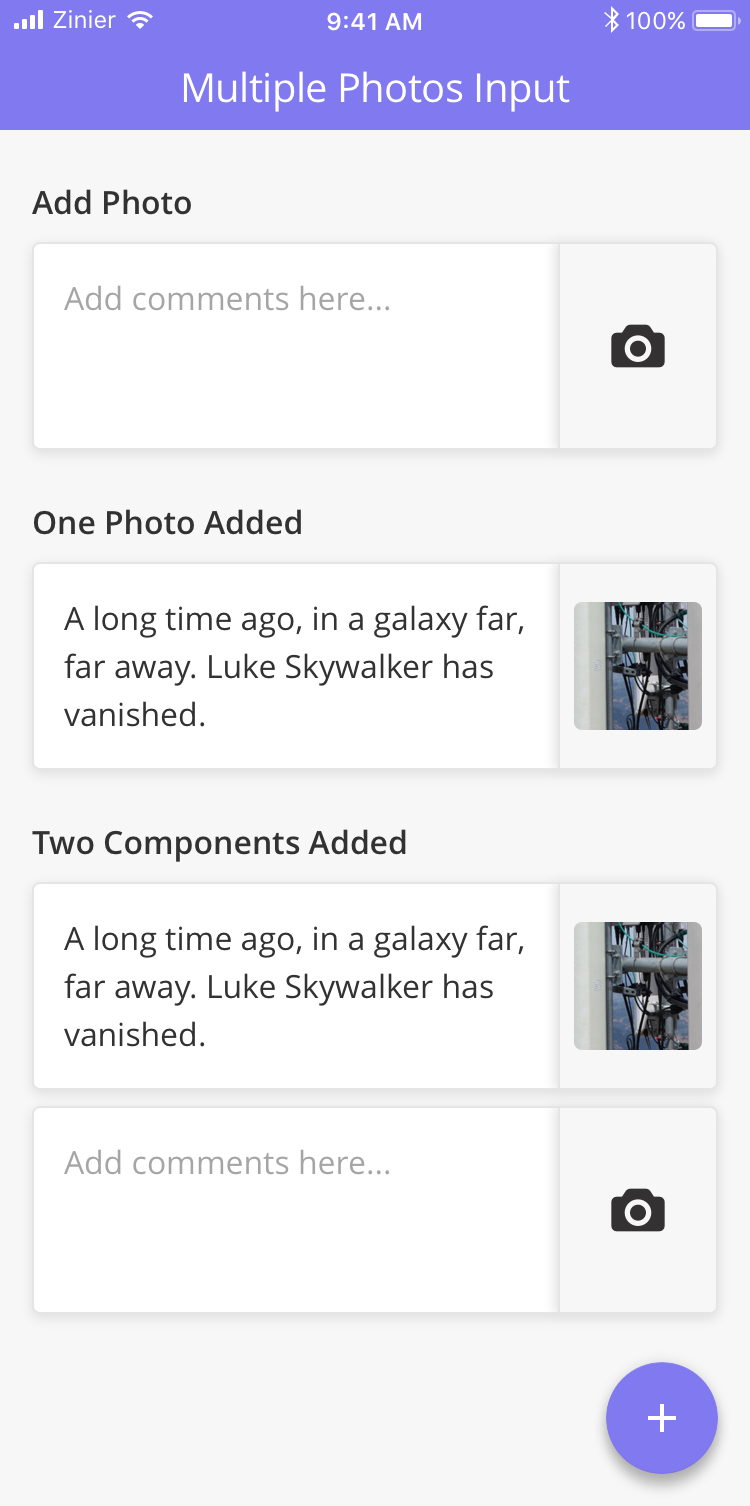
Photo input is a component used to take a photo or upload images to the app. The component will trigger native camera functionality and send back the image to the app.
-
Take picture
-
Preview picture
-
Zoom in and out
-
Use photo input if you want to capture a single image.
-
Photo input is good to capture user attention.
-
Don't add multiple photo input in one page. Instead use Checklist - Photo to save more space
|
|
Type |
Key |
Value Type |
Accepted Values |
Default Value |
|---|---|---|---|---|
|
photocheck |
title |
String |
Photo |
|
|
*value |
String |
|||
|
galleryAllowed |
Boolean |
false |
||
|
watermarkContent |
JSON |
|||
|
heading |
String |
|||
|
allowCrop |
Boolean |
false |
||
|
allowAnnotation |
Boolean |
false |
|
Type |
Key |
Value Type |
Accepted Values |
Default Value |
|---|---|---|---|---|
|
photo |
title |
String |
Photo |
|
|
*value |
String |
|||
|
galleryAllowed |
Boolean |
false |
||
|
watermarkContent |
JSON |
|||
|
height |
Double |
150 |
||
|
heading |
String |
|||
|
allowCrop |
Boolean |
false |
||
|
allowAnnotation |
Boolean |
false |
{
"index":1,
"id":"id of the Component",
"type":"photo",
"startColumn":0,
"endColumn":11,
"height":150,
"allowAnnotation":true,
"allowCrop":true,
"galleryAllowed":true,
"watermarkContent":{"topLeft": [
                 [
                        {
                        "label": "Task",
                        "delimeter": " : ",
                        "value": "@pageContext.ComponentID",
                        "maxlen": 20
                        }
                ]
                ]

"title":"title of the Component",
"value":"@pageContext.ComponentID",
"heading":"heading of the Component,
}
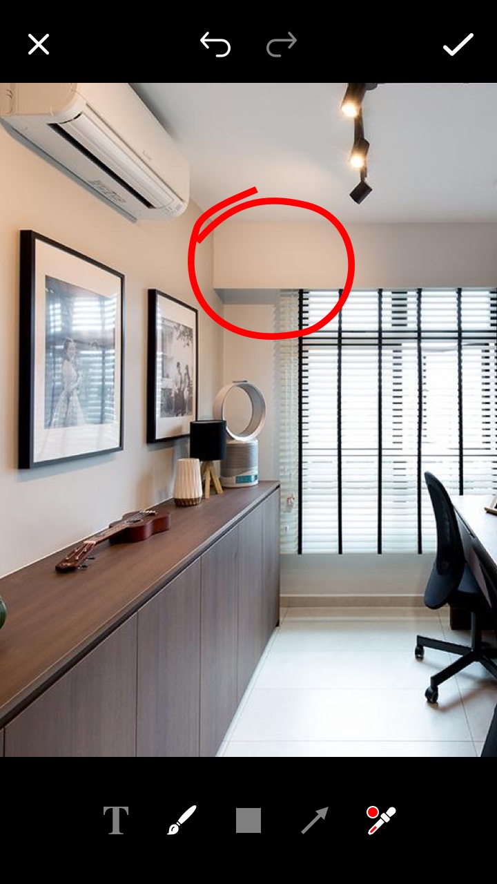
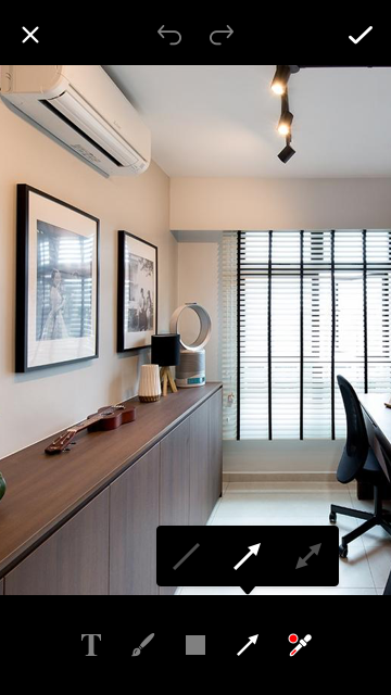
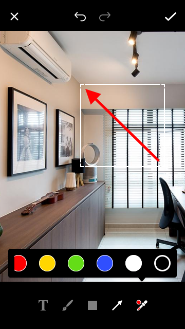
Image Annotation is additional component to add text, shapes, arrow, lines and more to the picture. The purpose of this component is to help user to visually communicate with project manager when sending image to the task.
Specs
-
Text
-
Brush
-
Shape
-
Arrow
-
Color Dropplet

|
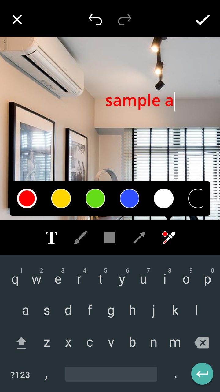
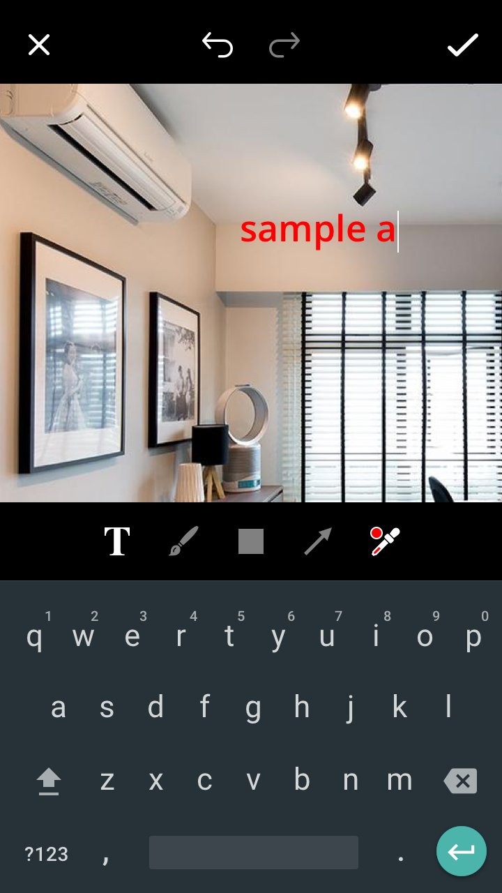
Tap "T" icon in the toolbar to bring up the keyboard and start typing. You can also change the color by tap the color dropplet to bring up the pallete.
|
|
Use brush to draw shape or lines in the image. Tap "Brush" icon to activate this feature.
|
|
Tap on the "Rectangle" icon to bring up the shape toolbar. Select one of the shape and it will appear in the image. Change the color of the shape by selecting the object and change the color from the color droplet.
Tap "Arrow" icon to bring up the arrow toolbar. Select one of the lines or arrows and it will automatically add it on the image. You can change the color by selecting the arrow and choosing the color from color droplet.
|
|
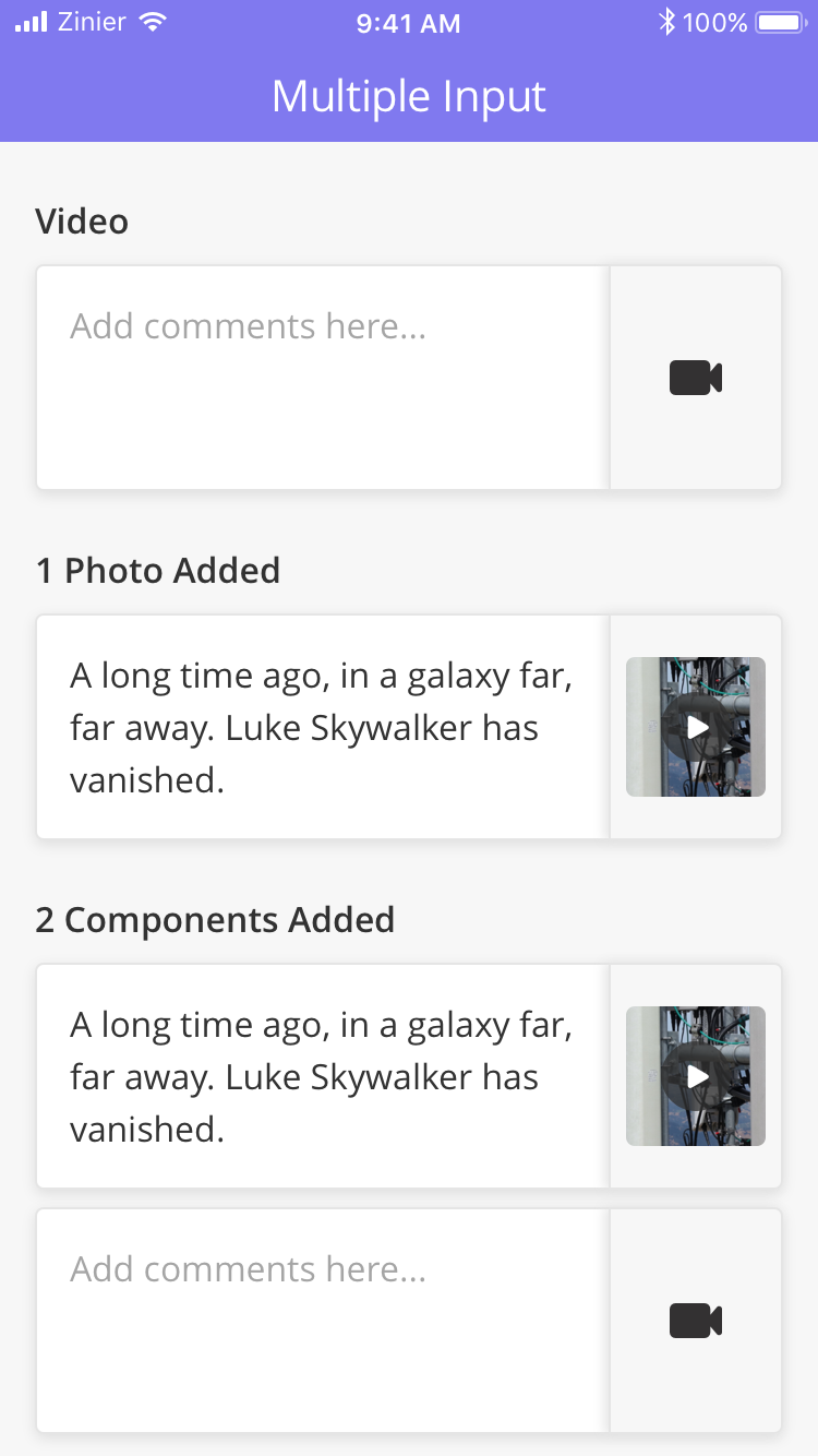
Video Input Component allows a Technician to capture a video using the device camera or upload a video from the device gallery. The file format of the video is .mp4. It also allows the user to preview, edit and delete a video.
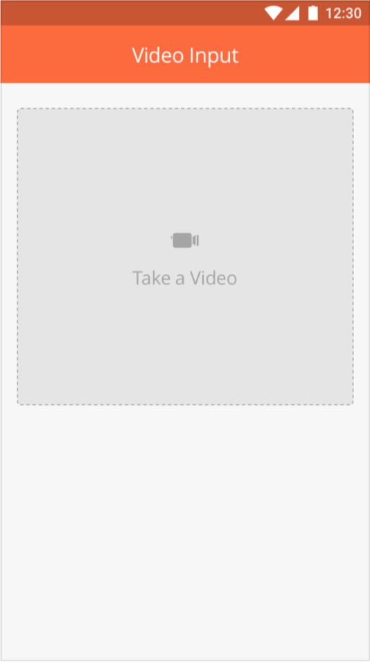
|
|
Type |
Key |
Value Type |
Accepted Values |
Default Value |
Comments |
|---|---|---|---|---|---|
|
videoInput or videoInputCheck |
title |
String |
Take a video |
This is displayed inside the box. |
|
|
*value |
String |
Video URL |
|||
|
*thumbnailURL |
String |
Thumbnail URL of image. Supported image file formats: JPEG / JPG |
|||
|
galleryAllowed |
Boolean |
false |
|||
|
fileFormat |
String |
mp4 |
mp4 |
No other file formats are supported as of now. |
|
|
videoQuality |
String |
low, medium, high |
low |
Android: low- 480p, medium- 720p, high- 1080p |
|
|
maxVideoDuration |
Integer |
60 |
Value is specified in seconds. If value provided is below 1 then we consider default value only. |
||
|
heading |
String |
This is displayed above the Component. |
|||
|
allowCrop |
Boolean |
false |
Android: feature not available in Android app as of now. |
{
  "id": "videoInputComponent1",
  "startColumn": 0,
  "endColumn": 11,
  "index": 1,
  "galleryAllowed": false,
  "heading": "Video Input",
  "type": "videoInput",
  "value": "@pageContext.videoInput1",
  "maxVideoDuration": 10,
  "fileFormat": "mp4",
  "title": "Take a Video",
  "allowCrop": false,
  "videoQuality": "high",
  "thumbnailURL": "@pageContext.thumbnailUrl1",
  "required": true,
  "enabled": true
}
{
  "id": "videoInputCheckComponent1",
  "startColumn": 0,
  "endColumn": 11,
  "index": 2,
  "galleryAllowed": true,
  "heading": "Video Input Check",
  "type": "videoInputCheck",
  "value": "@pageContext.videoInputCheck1",
  "maxVideoDuration": 0,
  "fileFormat": "mp4",
  "title": "Take a Video",
  "allowCrop": true,
  "videoQuality": "medium",
  "thumbnailURL": "@pageContext.thumbnailUrl2",
  "required": false,
  "enabled": true
}
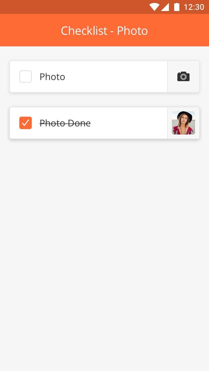
List of items or things to be done by add a picture as compulsory requirement.
-
Use this component if you want to user to take pictures as compulsory requirement.
-
Use simple instruction and try avoid to have two lines text in the item.

This component is especially useful when the User wants to attach comments to the Photos or Videos uploaded by them.
Please note that this component is different from the Photo / Video Input and Photo Check Components.
|
|
|
Key |
Value Type |
Default Value |
Comments |
|
value |
JSON |
Value will be the json of photo url and user comment. comment is a mendetory field if component is required true. eg: "value": { "media": photoURL", "comment": "user comments" } |
|
|
galleryAllowed |
Boolean |
false |
|
|
watermarkContent |
JSON |
||
|
heading |
String |
this is dispayed above the component |
|
|
allowAnnotation |
Boolean |
false |
If true then user can annotate image |
|
Key |
Value Type |
Accepted Values |
Default Value |
Comments |
|
value |
JSON |
Value will be the json of video url and user comment. comment is a mendetory field if component is required true. eg: "value": { "media": "videoURL", "comment": "user comments" } |
||
|
thumbnailURL |
String |
Thumbnail URL of image. Supported image file formats: JPEG/JPG. |
||
|
fileFormat |
String |
mp4 |
mp4 |
No other file formats are supported as of now. |
|
videoQuality |
String |
low, medium, high |
low |
|
|
maxVideoDuration |
Integer |
60 |
Value is specified in seconds. If value provided is below 1 then we consider default value only. |
|
|
heading |
String |
This is displayed above the component. |
Document Component allows Mobile users to download and read different document types in the following formats:
-
.PDF
-
.OBJ
-
.STL
-
.DAE
For example, a Technician can download and read additional manuals required for an ongoing task.
The Document Component is capable of previewing 3D models (3D Viewer) as well. For the time being, the platform supports the following file types to view 3D models:
-
.OBJ
-
.STL
-
.DAE
|
|
Type |
Key |
Value Type |
Default Values |
|---|---|---|---|
|
document |
heading |
String |
|
|
*title |
String |
||
|
*size |
Integer |
||
|
*url |
String |
||
|
*docType |
String |
pdf, obj, stl, dae |
{
 "id": "tDocumentComment",
 "type": "document",
 "heading": "title",
 "title": "pdf Component",
 "url": "https://s3.amazonaws.com/zinier3/sagemaker/FastWebView.pdf",
 "size": 9420,
 "startColumn": 0,
 "endColumn": 11,
 "index": 1,
}
Heading key : the optional heading title for Component
*title key : title of the document Component; e.g. Task Details.pdf
*size key : size of the media file in KB, for display
*url key : URL of the PDF Document for the Component
*docType key : document type
The Photo Component.
![[Note]](../css/image/note.png)
|
Note |
|---|---|
|
to follow up: New component added based on the spreadsheet Need to follow up on JSON samples |
Photo Checkbox
How to Configure
|
Component |
Key |
Value Type |
Accepted Values |
Default Value |
Comments |
|---|---|---|---|---|---|
|
photocheck |
*title |
String |
Take a Photo |
This is displayed inside the box. |
|
|
*value |
String |
String URL of image. Supported image file formats: JPEG/JPG. |
This is the URL that will saved in the database after successful upload to S3. Mostly, goes in the output map. outputVarMap is defining all values that are provided in Page_def. InputVarMap is picking up the values of all fields and saving in the model. |
||
|
galleryAllowed |
Boolean |
false |
Type of the document |
||
|
watermarkContent |
JSON |
pdf, obj, stl, dae |

JSON for watermark content definition Expand source {
"topLeft": [
[
{
"label": "Task",
"delimeter": " : ",
"value": "@pageContext.mopName",
"maxlen": 20
}
]
],
"topRight": [
[
{
"label": "Date",
"delimeter": " : ",
"type": "dateTime",
"value": "@pageContext.capturedTime"
}
]
],
"bottomLeft": [
[
{
"label": "User",
"delimeter": " : ",
"value": "@pageContext.userName",
"maxlen": 20
}
],
[
{
"label": "Site",
"delimeter": " : ",
"value": "@pageContext.siteId"
}
]
],
"bottomRight": [
[
{
"label": "City",
"delimeter": " : ",
"value": "@pageContext.cityName",
"maxlen": 20
},
{
"label": "",
"delimeter": " , ",
"value": ""
},
{
"label": "Area",
"delimeter": " : ",
"value": "@pageContext.areaName"
}
],
[
{
"label": "Location",
"delimeter": " : ",
"type": "geolocation",
"value": "@pageContext.locationCoordinates",
"format": "%.4f , %.4f"
}
]
]
}
|
||
|
heading |
String |
||||
|
allowCrop |
Boolean |
false |
If true, the user will prompt to crop the image. Note: Not implemented in Android; implementation in progress for iOS |
||
|
allowAnnotation |
Boolean |
false |
If true, the user can annotate an image Note: Not implemented in Android; implementation in progress for iOS |
Sample JSON
Photo Input
|
Component |
Type |
Key |
Value Type |
Accepted Values |
Default Value |
Comments |
|---|---|---|---|---|---|---|
|
photo input |
photo |
title |
string |
Photo |
This is displayed inside the box |
|
|
*value |
string |
String URL of image. Supported image file formats: JPEG/JPG. |
This is the URL that will saved in the database after successful upload to S3. Mostly, goes in the output map. |
|||
|
galleryAllowed |
Boolean |
false |
||||
|
watermarkContent |
JSON |
JSON for watermark content definition Expand source {
"topLeft": [
[
{
"label": "Task",
"delimeter": " : ",
"value": "@pageContext.mopName",
"maxlen": 20
}
]
],
"topRight": [
[
{
"label": "Date",
"delimeter": " : ",
"type": "dateTime",
"value": "@pageContext.capturedTime"
}
]
],
"bottomLeft": [
[
{
"label": "User",
"delimeter": " : ",
"value": "@pageContext.userName",
"maxlen": 20
}
],
[
{
"label": "Site",
"delimeter": " : ",
"value": "@pageContext.siteId"
}
]
],
"bottomRight": [
[
{
"label": "City",
"delimeter": " : ",
"value": "@pageContext.cityName",
"maxlen": 20
},
{
"label": "",
"delimeter": " , ",
"value": ""
},
{
"label": "Area",
"delimeter": " : ",
"value": "@pageContext.areaName"
}
],
[
{
"label": "Location",
"delimeter": " : ",
"type": "geolocation",
"value": "@pageContext.locationCoordinates",
"format": "%.4f , %.4f"
}
]
]
}
|
||||
|
height |
double |
150 |
This parameter will set the height of component. |
|||
|
heading |
string |
This is displayed above the component. |
||||
|
allowAnnotation |
Boolean |
false |
If true, the user can annotate an image Note: Not implemented in Android; implementation in progress for iOS |
Sample JSON
Photo Comment
|
Component |
Type |
Key |
Value Type |
Accepted Values |
Default Value |
Comments |
|---|---|---|---|---|---|---|
|
Photo Comment |
photocomment |
value |
JSON |
Value will be the json of photo url and user comment. comment is a mendetory field if component is required true. eg: "value": { "media": photoURL", "comment": "user comments" } |
||
|
galleryAllowed |
||||||
|
watermarkContent |
||||||
|
heading |
This is displayed above the component |
|||||
|
allowAnnotation |
boolean |
false |
If true, the user can annotate an image Note: Not implemented in Android |
Sample JSON
Delete Alert Info for these components
|
Component |
Type |
Key |
Value Type |
Accepted Value |
Default Value |
Comments |
|---|---|---|---|---|---|---|
|
deleteAlert/Info |
JSON Object |
"deleteAlertInfo": {
"title" : "Title",
"description" : "description",
"alertButtons": {
"primaryButton": "Delete",
"secondaryButton": "Cancel"
}
}
|
Nil |
When this key is present with proper values, the user will be able to see an alert on tap of the delete photo. |
Overview
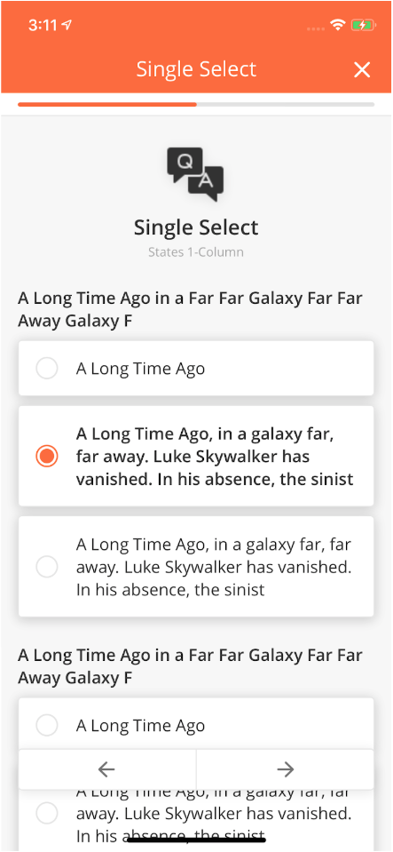
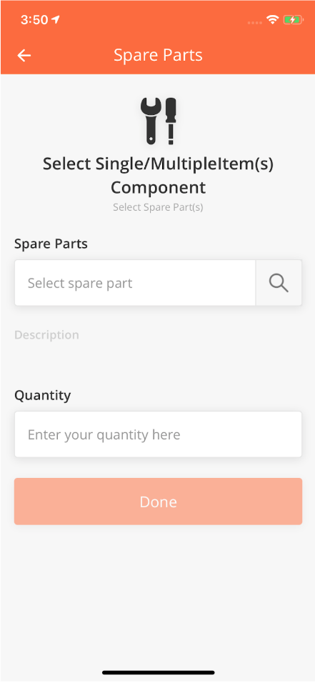
The Questions Component allows a Mobile user to select single or multiple values from a list on a Mobile page.
Radio Buttons enable the User to choose a single option from a list of options. Check Box, on the other hand, enables the User to select multiple options.
|
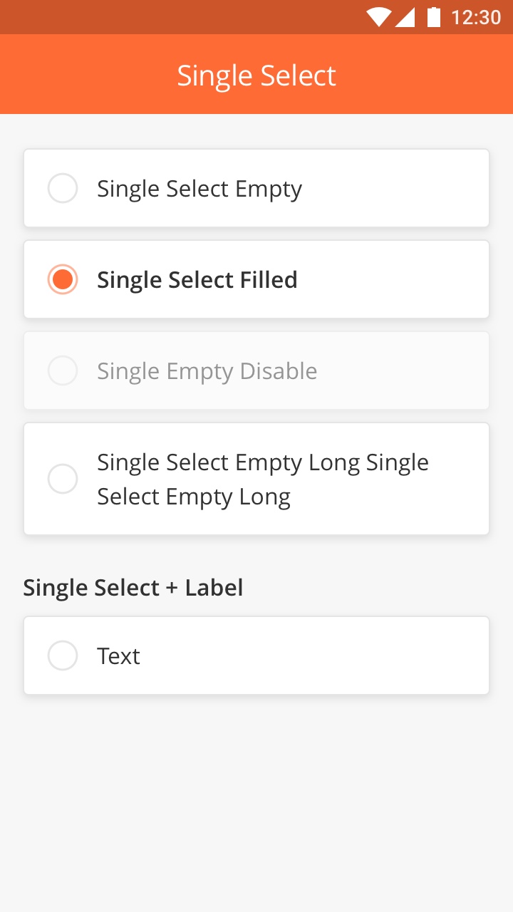
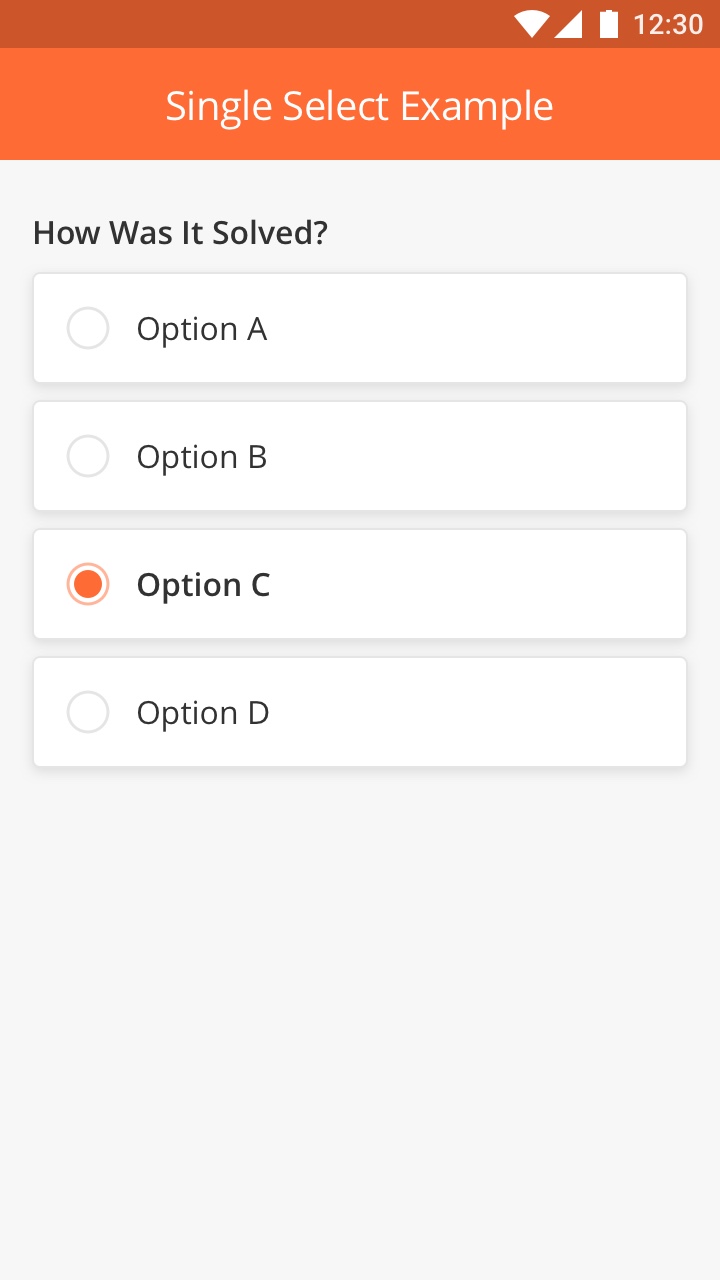
Radio Buttons
The Single Select Radio Buttons allow the User to select only a single option from a list of options. It is good to use it when there are only a few options available for the User to choose from.
Best Practice
-
Use Radio Button for lists with 2 - 8 options
-
Don't put text in more than two lines per choice
-
Don't use Radio Button for more than 10 choices (for eg. Country list). Use Drop Down component instead.
How to Configure
|
Type |
Key |
Value Type |
Comments |
|---|---|---|---|
|
radio |
title |
String |
|
|
*value |
String |
This is the value that is stored in the database. Mostly, goes in the output map. |
|
|
*options |
String / Array |
Options will consist an object with "optTitleKey", "optValueKey" |
|
|
*optTitleKey |
String |
||
|
*optValueKey |
String |
||
|
Common Keys |
|||
|
id |
|||
|
index |
|||
|
startColumn |
|||
|
required |
|||
|
enable |
Sample JSON
{
 "id": "rSalutationRadio",
 "type": "radio",
 "title": "A Long Time Ago in a Far Far Galaxy Far Far Away Galaxy F",
 "value": "@pageContext.rSalutationRadio",
 "enabled": "1",
 "optTitleKey": "title",
 "optValueKey": "value",
 "startColumn": 0,
 "endColumn": 11,
 "index": 69,
 "options": [
   {
     "title": "Option 1",
     "value": "v1"
   },
   {
     "title": "Option 2",
     "value": "v2"
   },
   {
     "title": "Option 3",
     "value": "v3"
   }
 ]
}
|
|
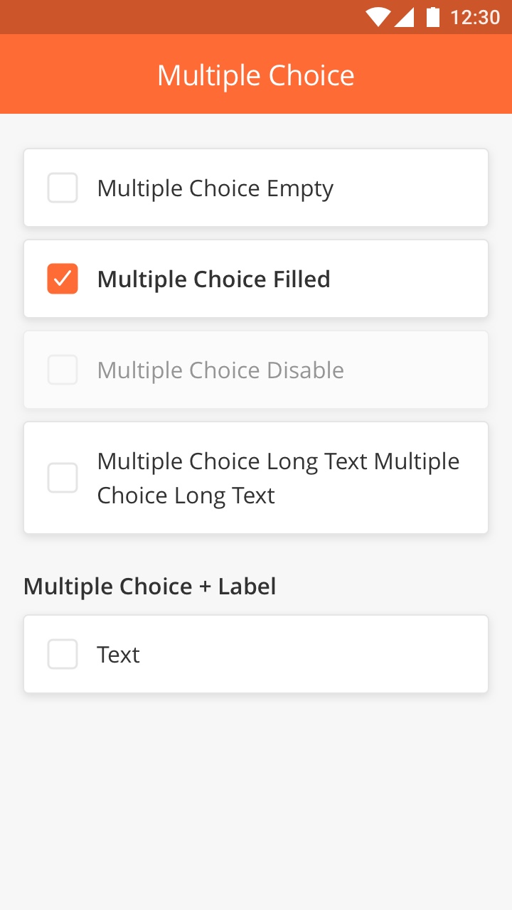
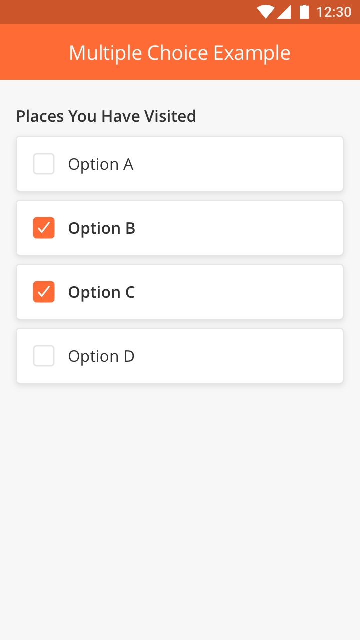
CheckBox
Multiple Choice (Checkbox) is a way of presenting a list of options where the User can choose more than one option. This component can also be used to activate or deactivate a certain function.
Best Practice
-
Keep the length of the text per choice to a maximum of 2 lines
-
Avoid adding too many options in a single list
-
List the items in logical order
How to Configure
|
Type |
Key |
Value Type |
Default Values |
Comments |
|---|---|---|---|---|
|
checkbox |
heading |
String |
||
|
*limited functionality. Each checkbox maps to different field in the model. |
*value |
String |
This is the value that is stored in the database. Mostly, goes in the output map. |
|
|
*title |
String |
This is displayed inside the box. |
||
|
strikeable |
Boolean |
false |
||
|
Common Keys |
||||
|
id |
||||
|
index |
||||
|
startColumn |
||||
|
required |
||||
|
enable |
Sample JSON
{
 "id": "customer_checkbox",
 "type": "checkbox",
 "title": "A Long Time Ago",
 "value": "@pageContext.customer_checkbox",
 "enabled": "0",
 "startColumn": 0,
 "endColumn": 11,
 "index": 71
}
|
|
Overview
This Component enables the User to select multiple items from a given list.
For example, if a Technician wants to Order multiple Spare Parts to complete a Task, he can do so by going to the list of Spare Parts and clicking on the radio button beside each Part that he requires.
How to Configure
|
Type |
Key |
Value Type |
Accepted Values |
Default Value |
|---|---|---|---|---|
|
selectitem |
*title |
String |
||
|
*value |
JSON Array |
|||
|
heading |
String |
|||
|
*columns |
JSON Array |
|||
|
*searchFilterString |
String |
|||
|
*searchQuery |
String |
|||
|
*favQuery |
String |
|||
|
*displayValue |
String |
|||
|
*selectionType |
String |
single / multiple |
single |
|
Sample JSON
{
 "endColumn": 11,
 "heading": "Select Spare Parts",
 "columns": [
   {
     "col": 1,
     "name": "Name",
     "row": 1,
     "key": "name"
   },
   {
     "col": 2,
     "name": "Description",
     "row": 1,
     "key": "description"
   },
   {
     "col": 1,
     "name": "Unit Price",
     "row": 2,
     "key": "unitPrice"
   },
   {
     "col": 2,
     "name": "Catalog Type",
     "row": 2,
     "key": "catalogType"
   }
 ],
 "index": 2,
 "type": "selectitem",
 "title": "Spare Parts",
 "searchFilterString": "searchFilter",
 "required": 0,
 "displayValue": "@subContext.selectItemPart[0].name",
 "favQuery": "167834FC726CD66A",
 "selectionType": "single",
 "startColumn": 0,
 "searchQuery": "167834F38628AB54",
 "id": "selectItemPart",
 "value": "@subContext.selectItemPart"
}
Comments
*searchFilterString : column against which user's input will be sent for filter
*searchQuery : queryId for search
*favQuery : queryId for favourite search items
*displayValue : mapped to key from value json array to display selected jsonObjects property
*selectionType : single will allow single select only and multiple will allow the selection of multiple options
Overview
Single item table component has multiple screens (as part of flow) and can be used for multiple use case:
-
Add item(s) from the table. From within the flow, it allows technicians to select an item from a table, add details (of the selected item), edit details, delete item, and add more items afterwards
-
Add item details from a pre-selected item(s)
-
Add multiple item(s) from the table at once
However, essentially these are a customized version of the main flow below,

|
Step 1:
Tap the "+" to add an item. This screen and the following underneath are both dynamic screens which are configurable from the Solution Builder.
|
|
Step 2:
The item details screen will appear afterwards, allows technicians to:
-
Select an item from a table
-
Add more details
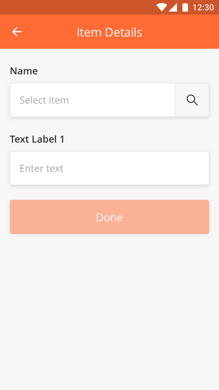
|
Step 3:
The item details screen will appear afterwards, allows technicians to:
-
Select an item from a table
-
Add more details
Note that this is a static screen thus non-configurable.
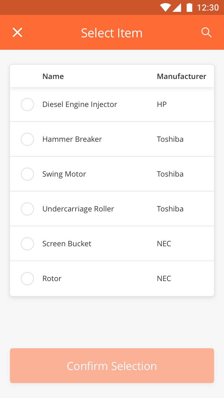
|
Step 4:
Here, technicians can search the item to display the populated list. Next, they can either:
-
Select an item from the table and confirm selection
-
Cancel the search (and go back to the original list above)
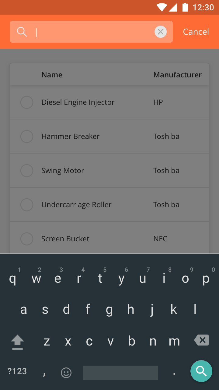
|
Step 5:
When a search doesn't show any result, it will appear as an empty screen.
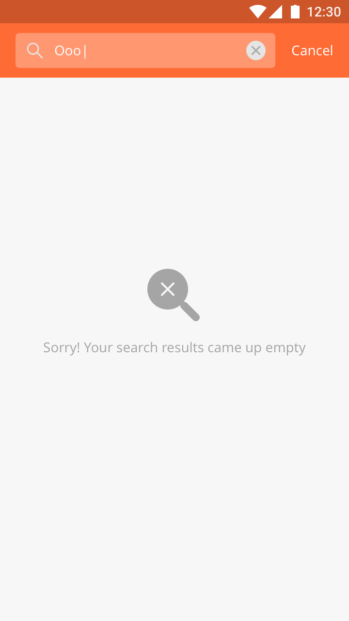
|
Step 6:
Once a selection is confirmed, the same previous screen will appear (with pre-selected item), and technicians will be able to add more details. Tap the "back" button on the top left corner to go back to the table otherwise.
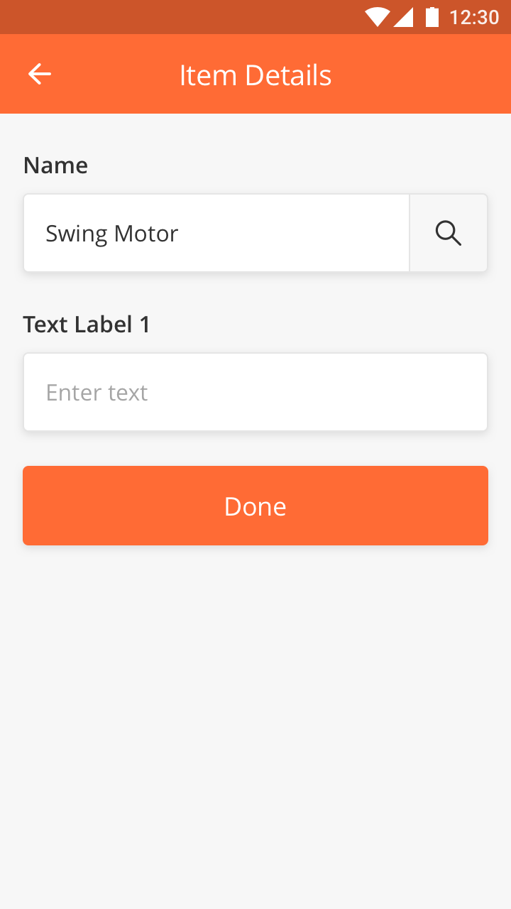
|
Step 7:
Tap "Done" to view all selected items. Here, the technicians may add more items or tap "X" from the top left corner to go back to the main screen (refer to "step 9"). Tap any item from the list will open up a "View Details" screen below.
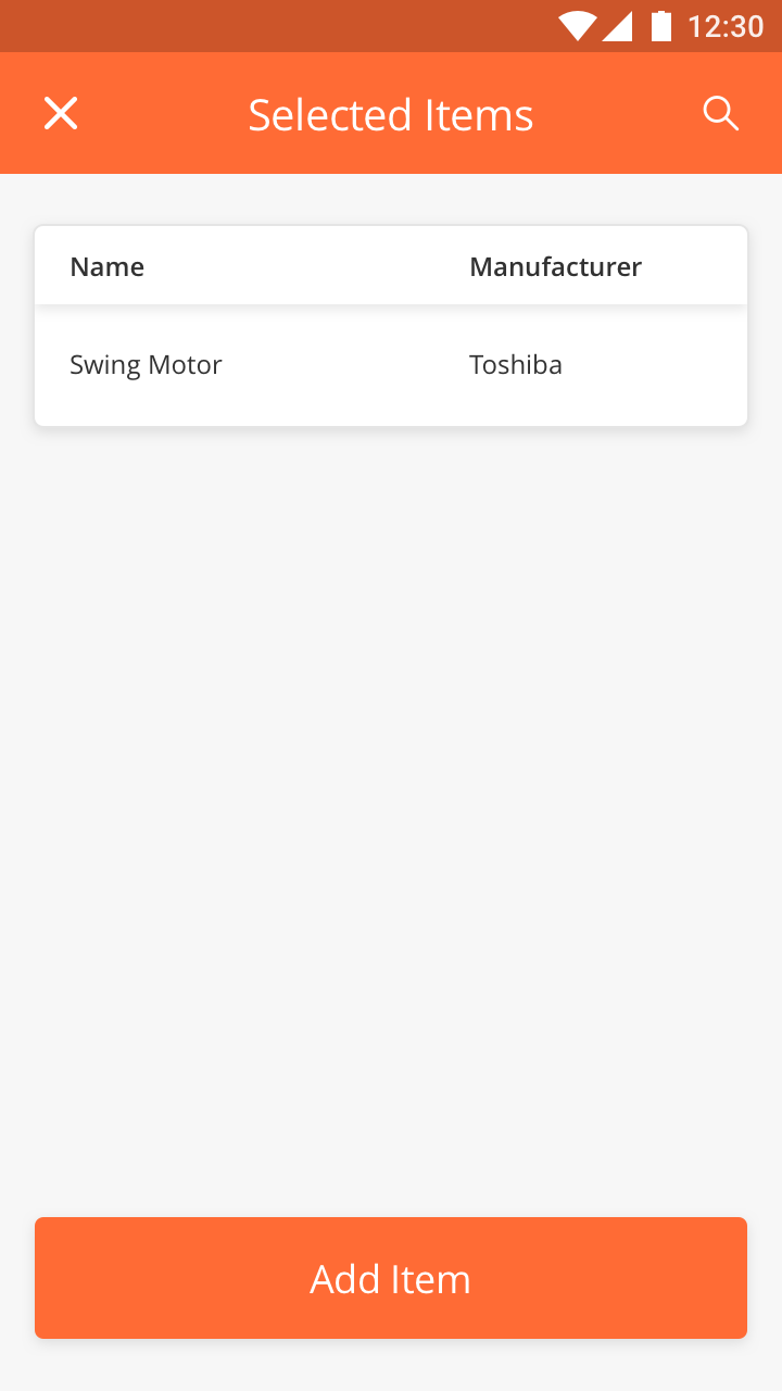
|
Step 8:
Here, the technicians can either:
-
Update details (re-select an item or update the available input fields) and tap "Save" (to go back to the table view above)
-
Delete an item
-
Go back to the table view above
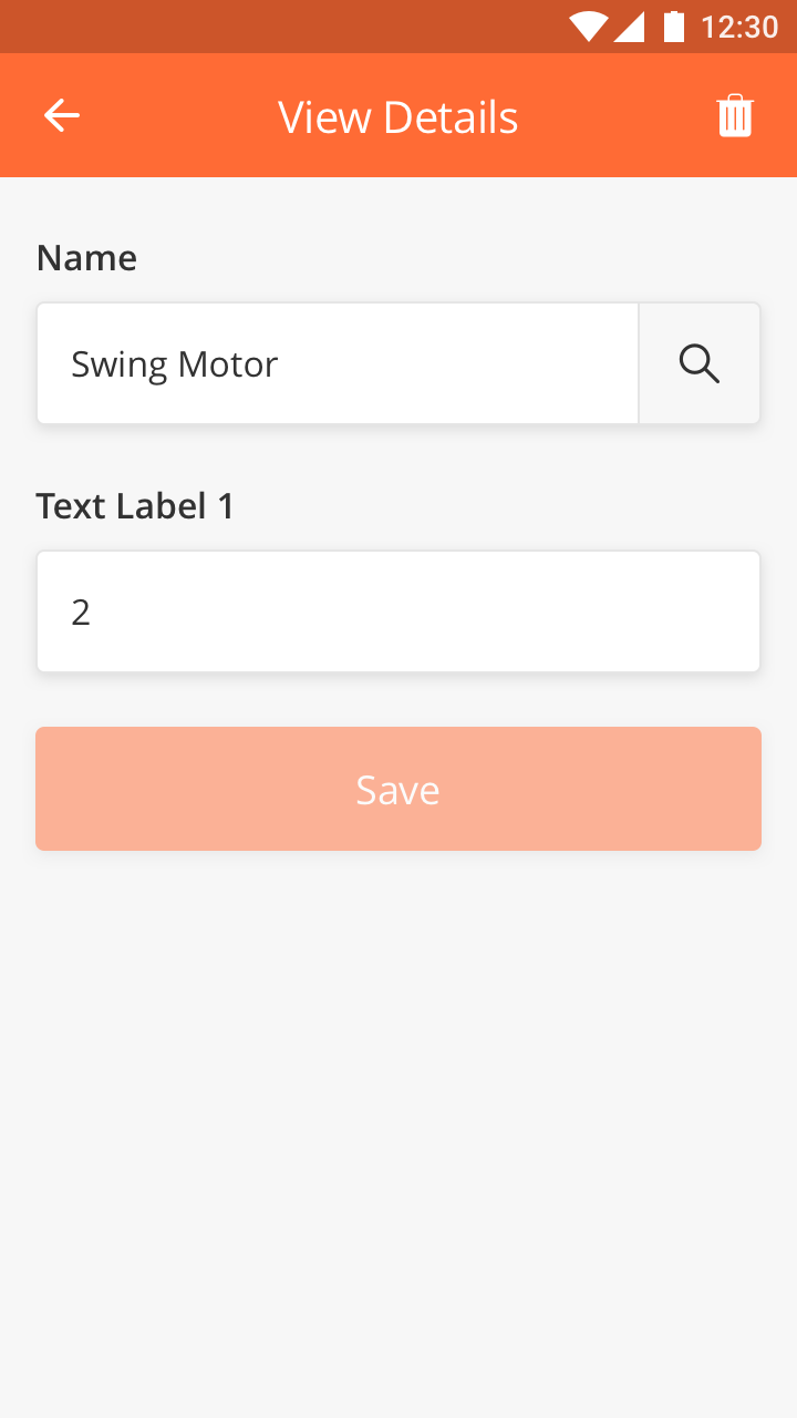
|
Step 9:
When done, the main screen will show the number of record(s) and technicians may tap the "pencil" icon to add more items.

|
Signature is an input component where the input must be drawn. This component enables the Mobile User to capture a signature on a mobile device.
The component is good to capture user attention because of its distinguished style and the size.
Best Practice
-
Use Signature component if you need only one single signature in the page.
-
We recommend to use Checklist - Signature if you need to add multiple signature in one page to save some space.
-
Use short text for label
Specs
-
The width of the component is responsive to device size
-
Minimum height is 96px
-
Margins left and right is 16px
-
Margins top and bottom is 24px
-
Label is optional and customizable
How to Configure
|
Type |
Key |
Value Type |
Default Values |
Comments |
|---|---|---|---|---|
|
signaturecheck |
title |
String |
Signature |
This is displayed inside the box. |
|
*value |
String |
This is the URL that will saved in the database after successful upload to S3. Mostly, goes in the output map. |
||
|
heading |
String |
Title for the component. |
||
|
id |
||||
|
startColumn |
||||
|
endColumn |
||||
|
capturedTime |
||||
|
locationCoordinates |
||||
|
required |
|
Type |
Key |
Value Type |
Default Values |
Comments |
|---|---|---|---|---|
|
signature |
title |
String |
Signature |
This is displayed inside the box. |
|
*value |
String |
If the user chooses "Signature Unavailable" from UI then this value will be "signature_unavailable", if there is any signature, then value contains signature URL. |
||
|
height |
Double |
150 |
This parameter will set the height of the component. Note: Needs to be implemented in Android |
|
|
heading |
String |
This is displayed above the component. |
||
|
id |
||||
|
index |
||||
|
startColumn |
||||
|
endColumn |
||||
|
capturedTime |
||||
|
locationCoordinates |
||||
|
required |
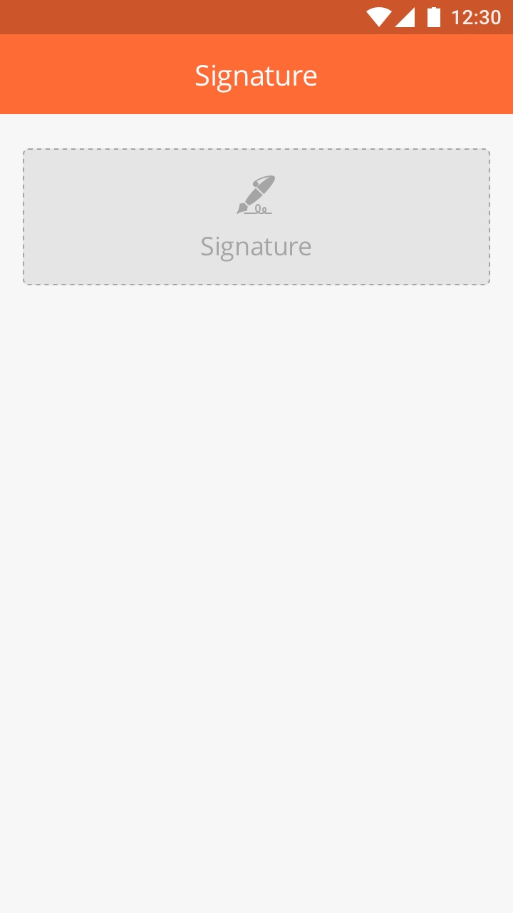
|
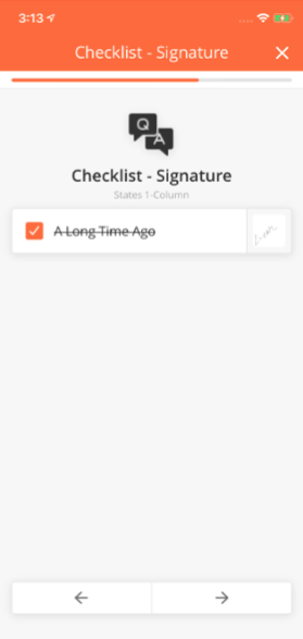
|
Sample JSON
Signature Check
{
 "endColumn": 11,
 "startColumn": 0,
 "Index": 6,
 "id": "sCustomerSign",
 "capturedTime": "@pageContext.custSignUrlTime",
 "locationCoordinates": "@pageContext.custSignUrlLocation",
 "Type": "signaturecheck",
 "value": "@pageContext.custSignUrl",
 "required": 1
}
Signature
{
 "endColumn": 11,
 "startColumn": 0,
 "Index": 5,
 "id": "engineerSignature",
 "capturedTime": "@pageContext.engineerSignTime",
 "locationCoordinates": "@pageContext.engineerSignLocation",
 "Type": "signature",
 "title": "Signature of the engineer",
 "value": "@pageContext.engineerSign",
 "required": 1
}
Overview
Text Component is a read-only field that contains text. For example, the Titles and Headers for all pages make use of this component. The text can have different alignments - Left, Right, Center and Justified.
The Header and Paragraph Text components support Tap to Call / Email / Go to URL. Through this feature, numbers, email addresses and URLs are highlighted. Tapping on these highlighted fields redirects a user to the phone's native phone calling, email application or browser, respectively.
|
|
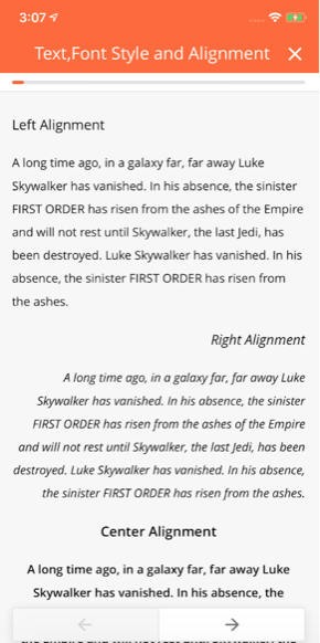
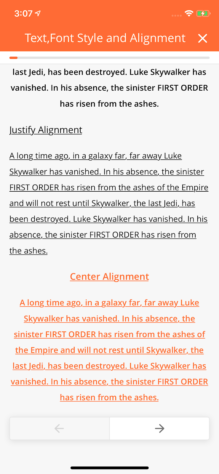
Header Text
Configuration
|
Type |
Key |
Value Type |
Accepted Values (Case Sensitive) |
Default Value |
Comments |
|---|---|---|---|---|---|
|
headertext |
title |
String |
Title = Text, in mobile page builder. |
||
|
*value |
String |
Any phone number (with country code), email address or hyperlink in the value will be highlighted automatically. |
|||
|
fontStyle |
String |
bold / italic / underline |
standard |
||
|
alignment |
String |
left / right / center / justify |
left |
||
|
dataType |
String |
date / time / datatime |
Supports the format, "yyyy-MM-dd HH:mm:ss" and it will always convert to the local device's format. Requires a valid date format to work otherwise the value will be displayed as it is. |
Sample JSON
{
        "id": "jText2",
        "type": "headerText",
    "fontStyle": "standard",
        "alignment": "left",
            "value": "Left Alignment",f
            "startColumn": 0,
            "endColumn": 11,
            "index": 5
          }
Paragraph Text
Configuration
|
Type |
Key |
Value Type |
Accepted Values (Case Sensitive) |
Default Value |
Comments |
|---|---|---|---|---|---|
|
paragraphtext |
title |
String |
Title = Text in mobile page builder |
||
|
value |
String |
Any phone number(with country code), email address or hyperlink in the value will be highlighted automatically. |
|||
|
fontStyle |
String |
bold / italic / underline |
standard |
||
|
alignment |
String |
left / right / center / justify |
left |
||
|
dataType |
String |
date / time / datetime |
Supports the format, "yyyy-MM-dd HH:mm:ss" and it will always convert to local device format. Requires a valid date format to work otherwise the value will be displayed as it is. |
Sample JSON
{
        "id": "jText2",
    "type": "paragraphtext",
        "fontStyle": "standard",
    "alignment": "left",
    "value": "Left Alignment",
    "startColumn": 0,
    "endColumn": 11,
    "index": 1
}
Hyperlink Header Text
Configuration
|
Type |
Key |
Value Type |
Accepted Values (Case Sensitive) |
Default Value |
Comments |
|---|---|---|---|---|---|
|
headerhyperlink |
title |
String |
Title = Text in mobile page builder |
||
|
value |
String |
||||
|
fontStyle |
String |
bold / italic / underline |
standard |
||
|
alignment |
String |
left / right / center / justify |
left |
||
|
url |
String |
Sample JSON
{
                "id": "jText2",
        "type": "headerhyperlink",
                "fontStyle": "standard",
                "alignment": "left",
        "value": "Left Alignment",
                "startColumn": 0,
            "endColumn": 11,
            "index": 2
          }
Hyperlink Paragraph Text
Configuration
|
Type |
Key |
Value Type |
Accepted Values (Case Sensitive) |
Default Value |
Comments |
|---|---|---|---|---|---|
|
paragraphhyperlink |
title |
String |
Title = Text in mobile page builder |
||
|
value |
String |
||||
|
fontStyle |
String |
bold / italic / underline |
standard |
||
|
alignment |
String |
left / right / center / justify |
left |
||
|
url |
Sample JSON
{
            "id": "jText2",
            "type": "paragraphhyperlink",
            "fontStyle": "standard",
            "alignment": "left",
            "value": "Left Alignment",
            "startColumn": 0,
            "endColumn": 11,
            "index": 3
}
{
                  "endColumn": 11,
                  "startColumn": 0,
                  "dataType": "datetime" or "date" or "time"
                  "index": 2,
                 "id": "headerText1",
                 "type": "headerText" or "paragraphtext"
                 "title": "DATE TIME",
                  "fontStyle": "standard",
                  "alignment": "left",
                 "value": "@pageContext.inputdatetime2",
                 "enabled": true
}
Comments
title: Title = Text, in Mobile page builder
The Timer Component provides the User with a countdown for the time left for an SLA breach.
-
This component does not support startColumn and endColumn. it will be always in the full-width component.
-
This component does not support the heading label.
-
For the SLA page, we don't need to add timer component. The mobile app will take care of it.
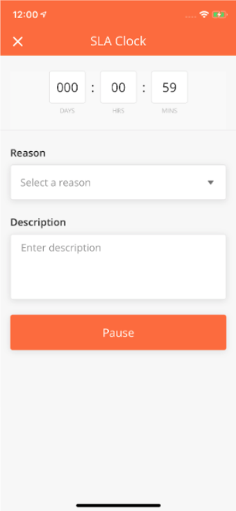
|
How to Configure
|
Type |
Key |
Value Type |
Accepted Values |
Default Value |
Comments |
|---|---|---|---|---|---|
|
timer |
*timeout |
String |
timeout time in UTC. The format for this will be "yyyy-MM-dd HH:mm:ss" In the ideal scenario, this time should be calculated by some JavaScript code or backend for real-time appearance |
||
|
*timeoutMessage |
String |
||||
|
executeTimer |
Boolean |
false |
Sample JSON
{
    "col": "c1",
    "type": "timer",
    "id": "timerId",
    "executeTimer": true,
    "timeout": "2019-06-12 11:12:56",  // yyyy-MM-dd HH:mm:ss
    "timeoutMessage": "The time has exceeded the initial target"
}
Video Component.
|
|
Note |
|---|---|
|
to follow up: New component added based on the spreadsheet Need to follow up on JSON samples |
Photo Checkbox
How to Configure
|
Component |
Type |
Key |
Value Type |
Accepted Values |
Default Value |
Comments |
|---|---|---|---|---|---|---|
|
Video Checkbox |
videoinputcheck |
title |
String |
Take a video |
This is displayed inside the box. |
|
|
*value |
String |
Video URL |
||||
|
*thumbnailURL |
String |
Thumbnail URL of image. Supported image file formats: JPEG/JPG. |
||||
|
galleryAllowed |
boolean |
false |
||||
|
fileFormat |
String |
mp4 |
mp4 |
No other file formats are supported as of now. |
||
|
videoQuality |
String |
low, medium, high |
low |
|
||
|
maxVideoDuration |
integer |
1 or above |
60 |
Value is specifed in seconds. If value provided is below 1 then we consider default value only. |
||
|
heading |
string |
|||||
|
allowCrop |
Boolean |
false |
If true, the user will prompt to crop the image. Note: This is not available in Android. |
Sample JSON
Video Input
|
Component |
Type |
Key |
Value Type |
Accepted Values |
Default Value |
Comments |
|---|---|---|---|---|---|---|
|
Video input |
videoinput |
title |
string |
Take a video |
This is displayed inside the box |
|
|
*value |
string |
Video URL |
||||
|
*thumbnailURL |
string |
Thumbnail URL of image. Supported image file formats: JPEG/JPG. |
||||
|
galleryAllowed |
boolean |
false |
||||
|
fileFormat |
String |
mp4 |
mp4 |
No other file formats are supported as of now. |
||
|
videoQuality |
string |
low, medium, high |
low |
|
||
|
maxVideoDuration |
integer |
60 |
Value is specified in seconds. If the value provided is below 1, then we consider default value only. |
|||
|
heading |
string |
This is displayed above the component. |
||||
|
allowCrop |
boolean |
false |
If true, the user will prompt to crop the image. Note: This is not available in Android. |
Sample JSON
Video Comment
|
Component |
Type |
Key |
Value Type |
Accepted Values |
Default Value |
Comments |
|---|---|---|---|---|---|---|
|
Video Comment |
videocomment |
value |
JSON |
Value will be the json of photo url and user comment. comment is a mendetory field if component is required true. eg: "value": { "media": photoURL", "comment": "user comments" } |
||
|
*thumbnailURL |
string |
Thumbnail URL of image. Supported image file formats: JPEG/JPG. |
||||
|
fileFormat |
string |
mp4 |
mp4 |
No other file formats are supported as of now. |
||
|
videoQuality |
string |
low, medium, high |
low |
|
||
|
maxVideoDuration |
Integer |
60 |
If true, the user can annotate an image Note: Not implemented in Android |
|||
|
heading |
string |
This is displayed above the component |
Sample JSON
Delete Alert Info for these components
|
Component |
Type |
Key |
Value Type |
Accepted Value |
Default Value |
Comments |
|---|---|---|---|---|---|---|
|
deleteAlert/Info |
JSON Object |
Expand source "deleteAlertInfo": {
"title" : "Title",
"description" : "description",
"alertButtons": {
"primaryButton": "Delete",
"secondaryButton": "Cancel"
}
}
|
Nil |
When this key is present with proper values, the user will be able to see an alert on tap of the delete video. |
Overview
Workflow Actions enable the user to call a separate page displaying a list of actions which can be performed, from within a Task. The available Workflows Actions can be found by tapping the “...” icon on the top left of the mobile navigation bar.
For instance, if the User wants to add an SLA to the Issue Details in a Task, they can select “SLA” by clicking on “...” found in the top right corner of the “Issue Details” page.
How to Configure
|
Type |
Key |
Value Type |
Accepted Values |
Default Value |
Comments |
|---|---|---|---|---|---|
|
rightButton |
image |
String |
Image / Icon URL |
||
|
action |
String |
openDropdown |
|||
|
id |
String |
||||
|
list |
Array |
Refer to list Configuration |
|||
|
title |
String |
||||
|
enabled |
String |
1/0 |
0 |
|
Type |
Key |
Value Type |
Accepted Values |
Default Value |
Comments |
|---|---|---|---|---|---|
|
list |
image |
String |
|||
|
startPage |
String |
||||
|
listData |
Array |
Refer to listData Configuration |
|||
|
name |
String |
||||
|
startProcessId |
String |
||||
|
cancelProcessId |
String |
||||
|
id |
String |
||||
|
type |
String |
||||
|
enabled |
String |
|
Type |
Key |
Value Type |
Accepted Values |
Default Value |
Comments |
|---|---|---|---|---|---|
|
listData |
rejectionMap |
JOSN dictionary |
Refer to rejectionMap configuration |
||
|
otherAllowed |
String |
||||
|
searchListQuery |
String |
||||
|
listMap |
JSON dictionary |
Refer to listMap configuration |
|||
|
inputs |
Array |
||||
|
rejectionQuery |
String |
||||
|
listQuery |
String |
|
Type |
Key |
Value Type |
Accepted Values |
Default Value |
Comments |
|---|---|---|---|---|---|
|
rejectionMap |
title |
String |
|||
|
value |
String |
|
Type |
Key |
Value Type |
Accepted Values |
Default Value |
Comments |
|---|---|---|---|---|---|
|
listMap |
date |
String |
|||
|
heading |
String |
||||
|
subHeading |
Array of Strings |
||||
|
status |
JSON dictionary |
Refer to status |
|
Type |
Key |
Value Type |
Accepted Values |
Default Value |
Comments |
|---|---|---|---|---|---|
|
status |
colorCode |
String |
|||
|
status |
String |
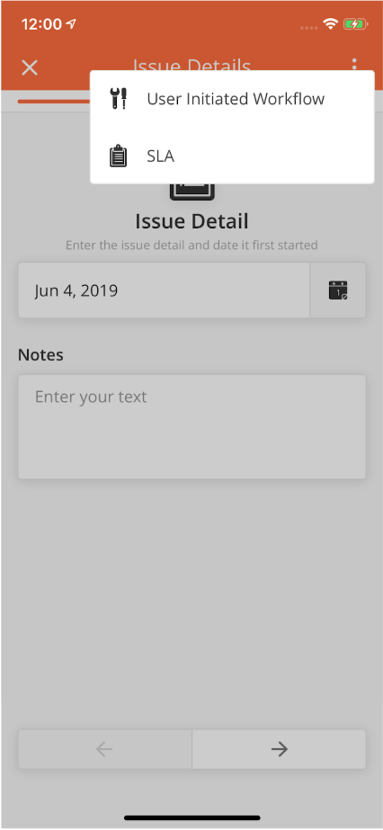
|
Sample JSON
{
"header": {
    "rightButton": {
        "image": "@icon.kebabMenuWhite",
        "action": "openDropdown",
        "id": "aFootRight",
        "list": [
                {
                    "image": "https://s3-us-west-2.amazonaws.com/zinier.png",
                    "cancelAllowed": "true",
                    "startPage": "16A963706634E550",
                    "listData": [
                                {
                                    "rejectionMap": {
                                    "title": "answerOptionText",
                                    "value": "answerOptionText"
                                },
                    "otherAllowed": "true",
                    "searchListQuery": "searchQueryforWorflowAction",
                    "listMap": {
                                    "date": "plannedDate",
                                    "heading": "header",
                                    "subHeading": [
                                                    "delivery",
                                                    "eta",
                                                    "status"
                                                  ],
                                    "status": {
                                                "colorCode": "color",
                                                "status": "status"
                                              }
                                },
                    "inputs": [
                                "workOrderId"
                              ],
                    "rejectionQuery": "rejectionForWorkflowAction",
                    "listQuery": "testQuery"
                }
                ],
        "name": "User Initiated Workflow",
        "startProcessId": "demo",
        "cancelProcessId": "workflowActionRejectionWorkflow",
        "id": "workflowActionID",
        "type": "partRequest",
        "enabled": "1"
        }
        ],
    "title": "Next",
    "enabled": "1"
        }
    }
}
Mobile Workflows are a compilation of sequential steps that a mobile user needs to complete within the app. As part of the solution builder, solutions admin can build, edit and simulate workflows in this module. Workflows are built out of pages and nodes (model, rule, query etc). For a list of the Type of Nodes used in mobile workflows, see article on Workflows here.
There can be multiple mobile workflows tagged to one project.
Examples of mobile workflows include;
-
Technician submits a spare parts request
-
Fiber Installation workflow
-
Site survey workflow
-
Attendance role call workflow
-
From the main page, click Add New to open the side panel.
-
Enter a Name and an optional Description for the mobile workflow.
-
Select a Mobile Project which the workflow belongs to. Mobile users can only use this workflow if added to that project.
-
Enter the Workflow Settings section, which includes the JSON object which contains the entire workflow
-
Include other Workflow settings including Instance List Map, Instance List Header and Max Latency. Details of these fields are found below.
-
Click Save to save the workflow. Once a new workflow is saved, it will be in Draft state by default.
-
Click Publish to publish the workflow or close the sidepanel to remain in Draft status.
-
In Published state, click Deploy to deploy the workflow in the organisation. Once deployed, the workflow will be active.
-
You can edit a record by hovering over the row of the desired record from the main page table and clicking the Edit icon. When you click Edit, the side panel will appear. Editing any workflow in Published or Deployed state will revert the workflow to Draft status.
-
You cannot delete mobile workflows.
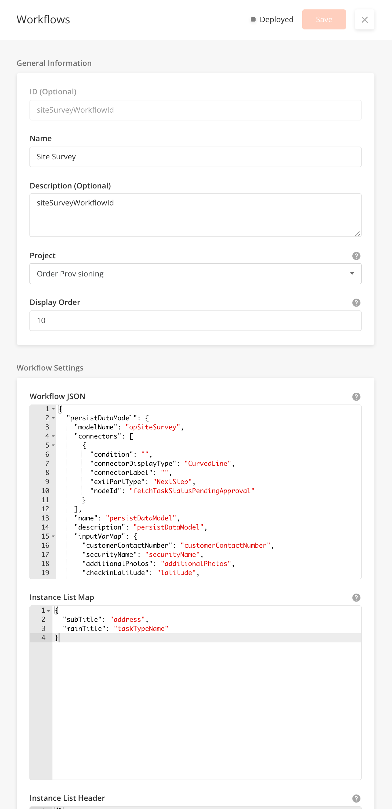
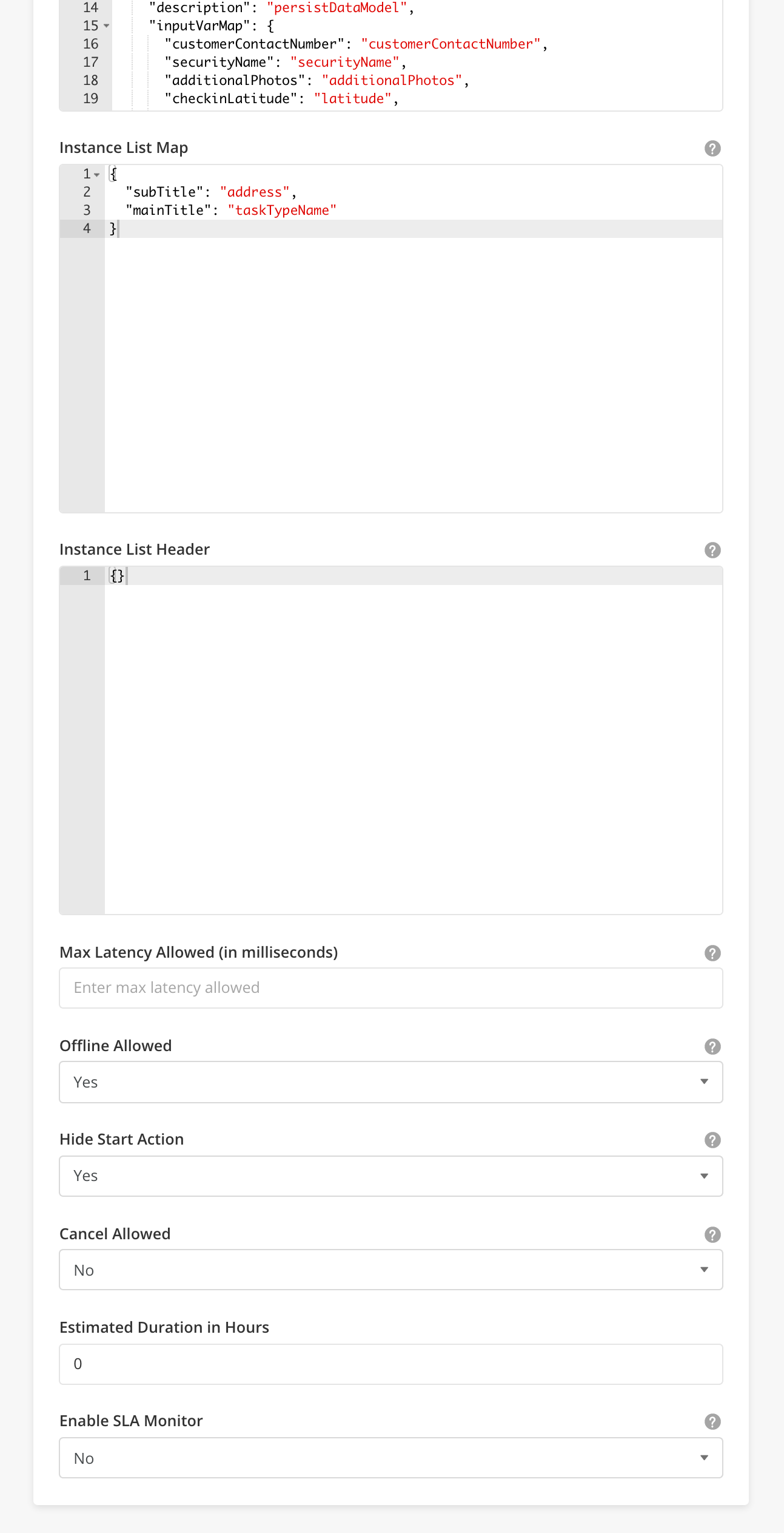
-
You can use Workflow Builder to build and simulate your workflows in a drag-and-drop GUI interface. You can enter Workflow Builder by hovering over the row of the desired record from the main page table and clicking the
Workflow Buildericon. -
For more details on how to use Workflow Builder, go to Solution Builder > Workflow Builder
-
Specifically for mobile workflows, you can build mobile pages directly within the Workflow Builder. Drag a Page Node into the workflow canvas. Once a page node is successfully added into the builder, double click on the node to edit the Page Definition directly in JSON Input.
-
You can also click on the 'PAGE DEF' button on the side panel header to open the Mobile Page Builder.
-
For more details on how to use Mobile Page Builder, go to Solution Builder > Page Builder
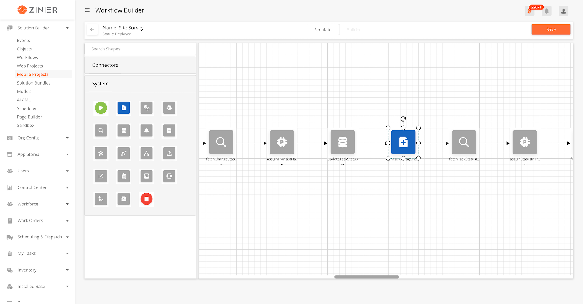
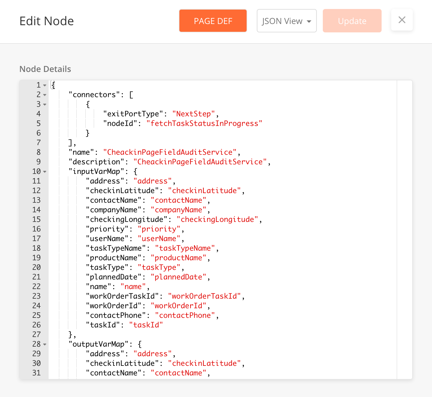
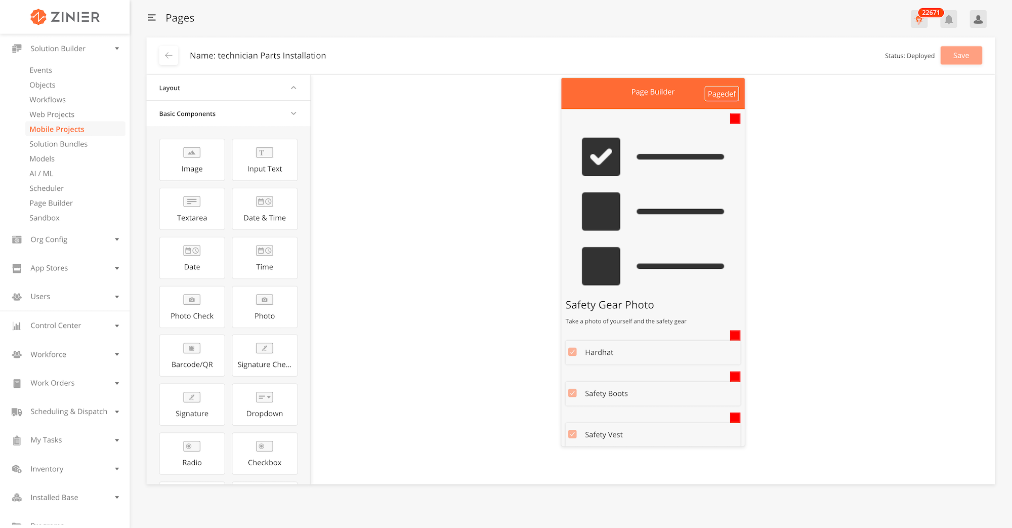
|
Module |
Relationship |
|---|---|
|
Tag the workflow to a project to bundle it with the project during implementation. The mobile project must be created first under Mobile Projects > Projects, for it to be selectable in this field |
|
Field Name |
Field Type |
Description |
Example |
|---|---|---|---|
|
ID (Optional) |
String |
System generated ID for Mobile workflows. Cannot be edited. |
|
|
Name |
String |
slaClockWorkFlow |
|
|
Description (Optional) |
Text Box |
To calculate Sla clock time |
|
|
Project |
Dropdown |
Tag the workflow to a project to bundle it with the project during implementation. The mobile project must be created first under Mobile Projects > Projects, for it to be selectable in this field |
Order Provisioning |
|
Display Order |
Integer |
Display Order value = 1, the mobile workflow will be on the top of the list in mobile (if workflow is not hidden) |
10 |
|
Workflow JSON |
JSON |
This JSON field is where the workflow is built. |
{
  "assignStatus": {
    "connectors": [
      {
        "exitPortType": "NextStep",
        "nodeId": "fetchSchedulingData"
      }
    ],
    "contextChangePermitted": true,
    "name": "assignStatus",
    "description": "assignStatus",
    "processRule": "{var statusFilter = [ 'Not Assigned','Scheduled','Dispatched'];contextVar.statusFilter = statusFilter;}",
    "nodeType": "PROCESS"
  },
  "start": {
    "connectors": [
      {
        "connectorDisplayType": "CurvedLine",
        "exitPortType": "NextStep",
        "nodeId": "assignStatus"
      }
    ],
    "name": "start",
    "description": "Start",
    "nodeType": "START",
    "displayPositionX": 45,
    "displayPositionY": 34
  },
  "end": {
    "name": "end",
    "description": "End",
    "processRule": "",
    "inputVarMap": {
      "schedulingResultData": "schedulingResultData"
    },
    "outputVarMap": {
      "schedulingResultData": "schedulingResultData"
    },
    "nodeType": "END",
    "displayPositionX": 250,
    "displayPositionY": 34
  },
  "fetchSchedulingData": {
    "models": [
      "WorkOrder",
      "WorkOrderTask",
      "techCalendar",
      "ZStatus",
      "taskTypes",
      "User",
      "priorityTimeFrames"
    ],
    "connectors": [
      {
        "condition": "",
        "connectorDisplayType": "CurvedLine",
        "connectorLabel": "",
        "exitPortType": "NextStep",
        "nodeId": "end"
      }
    ],
    "columns": {
      "priorityName": "priorityTimeFrames.priorityName",
      "techCalendarId": "techCalendar.id",
      "workOrderType": "WorkOrder.workOrderType",
      "statusColor": "ZStatus.colorCode",
      "taskAssest": "workOrderTask.asset",
      "taskDescription": "workOrderTask.taskDescription",
      "description": "WorkOrder.description",
      "assignToUserId": "workOrderTask.assignToUserId",
      "dueDateSLA": "WorkOrder.slaResolutionTime",
      "taskTypeName": "taskTypes.name",
      "taskType": "workOrderTask.taskType",
      "instanceId": "WorkOrderTask.instanceId",
      "deployable": "WorkOrderTask.deployable",
      "escalationHierarchyId": "WorkOrder.escalationHierarchyId",
      "recver": "workOrderTask.recver",
      "requestDate": "WorkOrder.requestDate",
      "workOrderTaskId": "workOrderTask.id",
      "createdDateWo": "WorkOrder.createdDate",
      "id": "WorkOrder.id",
      "slaTime": "timestampdiff(HOUR, {$workOrderTask.dueDateTime}, now())",
      "slaId": "WorkOrder.slaId",
      "wopriority": "WorkOrder.priority",
      "revisedDate": "workOrderTask.modifiedDate",
      "contract": "WorkOrder.contract",
      "estimatedTaskDuration": "WorkOrderTask.estimatedTaskDuration",
      "taskPriority": "workOrderTask.priority",
      "mobileProcessId": "taskTypes.mobileProcessId",
      "userName": "User.name",
      "customerSite": "workOrderTask.site",
      "techCalendarRecver": "techCalendar.recver",
      "site": "WorkOrderTask.site",
      "plannedDate": "workOrderTask.plannedDate",
      "plannedDateWo": "WorkOrder.plannedDate",
      "modifiedDate": "WorkOrderTask.modifiedDate",
      "taskDependency": "WorkOrderTask.taskDependency",
      "promisedDate": "WorkOrder.promisedDate",
      "calenderId": "WorkOrder.calenderId",
      "workOrderId": "WorkOrder.workOrderId",
      "projectId": "WorkOrder.projectId",
      "taskId": "workOrderTask.taskId",
      "selectedUserId": "User.id",
      "customer": "WorkOrder.customer",
      "status": "workOrderTask.status"
    },
    "orderBy": "modifiedDate DESC",
    "outerJoinOnModel": "WorkOrderTask",
    "distinct": true,
    "description": "fetchSchedulingData",
    "inputVarMap": {
      "statusFilter": "statusFilter"
    },
    "groupBy": "workOrderTaskId",
    "nodeType": "QUERY",
    "filter": "{$status} in {@statusFilter} and ({$deployable} IS TRUE) and {$workOrderId} IS NOT NULL",
    "name": "fetchSchedulingData",
    "outputVarMap": {
      "data": "schedulingResultData"
    },
    "displayPositionX": 45,
    "displayPositionY": 34
  },
  "workflowNodes": [
    "start",
    "assignStatus",
    "fetchSchedulingData",
    "end"
  ]
}
|
|
Instance List Map |
JSON |
Defines Mapping for Title, Subtitle and Priority in the Instance List Header. |
|
|
Instance List Header |
JSON |
Defines the Title, Subtitle and Priority for the Mobile Task. |
|
|
Offline Allowed |
Boolean |
If disabled (no), tasks will not show up when mobile app is offline |
No |
|
Hide Start Action |
Boolean |
If enabled (yes), workflow will not show up when clicking on the plus sign icon in the mobile app |
Yes |
|
Icon URL (Optional) |
String |
||
|
Cancel Allowed |
Boolean |
When Cancel Allowed is Enabled (Yes), the User can cancel the Workflow by swiping left. This in turn, triggers a Workflow configured in Workflow JSON |
Yes |
|
Estimated Duration in Hours |
Integer |
When Enable SLA Monitor is Enabled, the SLA Clock will be visible on the Mobile. |
Yes |
|
Enable SLA Monitor |
Integer |
Tracks the number of SLA Hours to monitor the Breach Status. |
1 |
Overview
Notifications are messages which appear to inform the Mobile User of activities that take place on the app which affect their Tasks and Projects.
Currently, we support Notifications for the following:
-
New Task Assigned
-
New Project Assigned
-
Roll Call
Notification Behaviour
The Mobile / Tablet User can only receive notifications if they are logged in to the App, when the App is in both - foreground and background.
When App is in the Foreground
iOS: Tapping on the Notification dismisses it.
Android: Tapping on the notification dismisses it and directs the user to a Notification List .Closing the list brings the User back to the Workflow they were working on.
When App is in the Background
iOS: Tapping on the Notification opens up the App
Android: Tapping on the Notification opens up the App
How to Configure
Sample JSON
|
Comments
-
Currently tapping on the Notifications directly does not take the User to any specific page / link. "Go to link" button has been disabled.